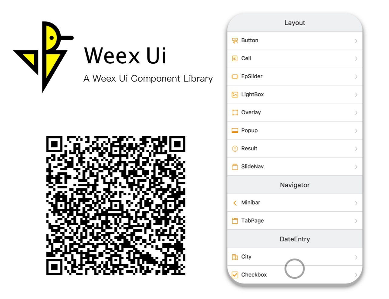
Weex Ui
A rich interaction, lightweight, high performance UI library based on Weex.
Demo
Installation
npm i weex-ui -S
Usage
<template>
  <div>
    <wxc-button text="Open Popup"
                @wxcButtonClicked="buttonClicked">
    </wxc-button>
    <wxc-popup width="500"
               pos="left"
               :show="isShow"
               @wxcPopupOverlayClicked="overlayClicked">
    </wxc-popup>
  </div>
</template>

<script>
  import { WxcButton, WxcPopup } from 'weex-ui';
  // or
  // import WxcButton from 'weex-ui/packages/wxc-button';
  // import WxcPopup from 'weex-ui/packages/wxc-popup';
  module.exports = {
    components: { WxcButton, WxcPopup },
    data: () => ({
      isShow: false
    }),
    methods: {
      buttonClicked () {
        this.isShow = true;
      },
      overlayClicked () {
        this.isShow = false;
      }
    }
  };
</script>
Before use
In order not to pack all the components, you need use babel-plugin-component to import specified component.
At the same time, if you don't install babel-preset-stage-0, also need to install it.
npm i babel-preset-stage-0 babel-plugin-component -D
{
    "presets": ["es2015", "stage-0"],
    "plugins": [
        [
            "component",
            {
                "libraryName": "weex-ui",
                "libDir": "packages",
                "style": false
            }
        ]
    ]
}
More
- If babel-loader in
webpack.config.jshas a exclude for node_modules, please turn on for week-ui asexclude: /node_modules(?!(\/|\\).*(weex).*)/. - In order to get the latest features, please focus on the ChangeLog and often update
weex-uito the latest. - Many questions can be found from faq and issue list, if you find a new bug, just file a issue.
- More experience in Weex construction can be learned from Weex + Ui - Weex Conf 2018 ,welcome to translate it.
Development
npm i
npm run start
Once it has been compiled, a browser window will be opened automatically. You can switch to developer mode to see the demo. And there will be a QR code that you can use to try the demo on your phone in the console.
Support
- Use Weex Ui in your daily work.
- Star it if you like.
-
Join the chat at dingtalk to help solve weex problems.
