vue-simple-progress
A simple, flexible progress bar for Vue.js
vue-simple-progress is designed to be a lightweight Vue.js progress bar requiring minimal configuration.
Browser support
IE 10+ (due to CSS animation support).
Installation
NPM
npm install vue-simple-progress --save
Usage
All styling for this component is done via computed styles in the
Progress.vuecomponent and requires no external CSS files.
ES6
The following examples can also be used with CommonJS by replacing ES6-specific syntax with CommonJS equivalents.
import Vue from 'vue'
import ProgressBar from 'vue-simple-progress'

new Vue({
  components: {
    ProgressBar
  }
})
in markup:
<div id="app">
  <progress-bar></progress-bar>
</div>
Globals (script tag)
Add a script tag pointing to dist/vue-simple-progress.min.js after adding Vue.
Example:
<html>
<head>
  ...
</head>
<body>
  <div id="app">
    <vue-simple-progress></vue-simple-progress>
  </div>

  <script src="path/to/vue.js"></script>
  <script src="path/to/vue-simple-progress.js"></script>
  <script>
    new Vue({
      el: '#app'
    })
  </script>
</body>
</html>
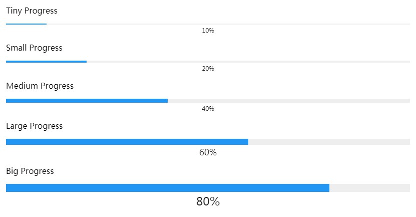
Examples
Medium size
<progress-bar size="medium" val="60" text="60">
Custom bar color
<progress-bar bar-color="#dc720f" val="60" text="60%">
Optional title for accessibility
<progress-bar bar-color="#dc720f" val="60" text="60%" title="60%">
More live code examples on JSFiddle
Options
| Props | Type | Values | Default |
|---|---|---|---|
| val | Number | 0 - max | 0 |
| max | Number | Any number | 100 |
| size | Number | String | tiny, small, medium, large, huge, massive, {n} | 3 |
| bg-color | String | Color | #eee |
| bar-color | String | Color | #2196f3 |
| bar-transition | String | CSS transition | all 0.5s ease |
| spacing | Number | Any Number | 4 |
| text | String | Text to display | (empty string) |
| text-position | String | bottom, top, middle, inside | bottom |
| font-size | Number | Any Number | 13 |
| text-fg-color | String | Color | #222 |