CSS Grid + VueJS
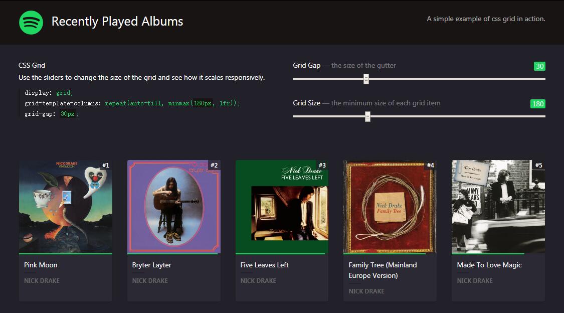
A simple, responsive, example of css grid in use. Made with VueJS and Last.fm APIs.
Use the sliders to change the size of the grid and see how it scales responsively.
Made with
Html
Css/SCSS
Javascript
Html
<div id="app">
<header>
<h1><img src="https://iamketan.com.au/lab/spotify/spotify-icon-green.png" alt="Spotify" title="Spotify"> Recently Played Albums</h1>
<p>A simple example of css grid in action.</p>
</header>
<section id="controls">
<div>
<h4>CSS Grid</h4>
<p>Use the sliders to change the size of the grid and see how it scales responsively.</p>
<code>
<span>display:</span> grid;<br>
<span>grid-template-columns:</span> repeat(auto-fill, minmax(<strong>{{ gridMin }}px</strong>, 1fr));<br>
<span>grid-gap:</span> <strong>{{ gridGap }}px</strong>;
</code>
</div>
<div>
<h4>Grid Gap <em>— the size of the gutter</em> <label for="grid-gap">{{ gridGap }}</label></h4>
<input type="range" id="grid-gap" min="10" max="80" step="5" v-model="gridGap" v-on:change="changeGridGap">
<h4>Grid Size <em>— the minimum size of each grid item</em> <label for="grip-min">{{ gridMin }}</label></h4>
<input type="range" id="grip-min" min="100" max="375" step="5" v-model="gridMin" v-on:change="changeGridMin">
</div>
</section>
<transition-group tag="main" name="card">
<article v-for="(album, index) in albums" :key="index" class="card" >
<a :href="album.url" target="_blank">
<div class="image" v-for="image in album.image" v-if="image.size == 'extralarge'">
<img v-if="image['#text'] !== ''" :src="image['#text']" :alt="album.name" v-on:load="isLoaded()" v-bind:class="{ active: isActive }">
<img v-else src="https://source.unsplash.com/random/300x300" :alt="album.name" v-on:load="isLoaded()" v-bind:class="{ active: isActive }">
</div>
<div class="description">
<span class="playcount">
<span v-bind:style="{width: m_percentage(album.playcount) + '%'}"></span>
</span>
<h3 class="title" :data-mbid="album.mbid">{{ album.name }}</h3>
<p class="artist">{{ album.artist.name }}</p>
</div>
</a>
</article>
</transition-group>
</div>
Css
$background: #222129;
$card: #2B2A34;
$spotify-green: rgb(30, 215, 96);
$spotify-black: rgb(25, 20, 20);

:root {
    --grid-gap: 30px;
    --grid-min: 175px;
}

* {
    margin: 0;
    padding: 0;
    line-height: 1.5em;
}

body {
    -webkit-font-smoothing: antialiased;
    -moz-osx-font-smoothing: grayscale;
    background-color: $background;
    font-family: -apple-system, BlinkMacSystemFont, "Segoe UI", Roboto, Helvetica, Arial, sans-serif, "Apple Color Emoji", "Segoe UI Emoji", "Segoe UI Symbol";
    font-size: 14px;
    color: white;
}

a {
    color: inherit;
    text-decoration: none;
}

h1 {
    font-size: 25px;
    color: white;
}

h3 {
    font-size: 14px;
    margin-bottom: 5px;
}

h4 {
    font-size: 14px;
    margin-bottom: 10px;
}

p {
    margin-bottom: 16px;
}

code {
    display: block;
    font-family: monospace;
    font-size: 14px;
    color: $spotify-green;
    border-left: 2px solid rgba($spotify-black, 0.75);
    padding-left: 10px;
    span {
        color: white;
    }
    strong {
        background-color: $spotify-black;
        padding: 2px;
    }
}

// HEADER
header {
    display: flex;
    align-items: center;
    padding: 20px 4%;
    margin-bottom: 20px;
    background: $spotify-black;
    @media screen and (max-width:768px) {
        flex-flow: column;
    }
    h1, p {
        width: 50%;
        @media screen and (max-width:768px) {
            width: 100%;
        }
    }
    p {
        text-align: right;
        color: rgba(white, 0.65);
        @media screen and (max-width:768px) {
            text-align: left !important;
            margin-top: 10px;
            text-indent: 63px;
        }
    }
    img {
        width: 48px;
        height: 48px;
        vertical-align: middle;
        margin-right: 10px;
    }
}

// GRID CONTROLS
section#controls {
    margin: 3% 2%;
    display: flex;
    & > div {
        width: 50%;
        padding: 0 2%;
        input[type="range"] {
            width: 100%;
            margin-bottom: 30px;
        }
        label {
            background: $spotify-green;
            color: white;
            padding: 2px 4px;
            border-radius: 2px;
            float: right;
        }
    }
    h4 em {
        font-style: normal;
        font-weight: 400;
        color: rgba(white, 0.4);
    }
}

// GRID
#app main {
    display: grid;
    grid-template-columns: repeat(auto-fill, minmax(var(--grid-min), 1fr));
    grid-gap: var(--grid-gap);
    counter-reset: rank;
    margin: 4%;

    article {
        counter-increment: rank;
        position: relative;
        background: $card;
        box-shadow: 0 1px 5px rgba(0,0,0,0.2);
        border-radius: 4px;
        overflow: hidden;
        animation: mouseOut 0.3s ease-in;
        .image {
            position: relative;
            width: 100%;
            &:after {
                // This forces the image container to be a square
                content: '';
                display: block;
                padding-bottom: 100%;
            }
            &:before {
                content: '•••';
                font-size: 24px;
                position: absolute;
                display: flex;
                width: 100%;
                height: 100%;
                align-items: center;
                justify-content: center;
                color: rgba(white, 0.1);
                z-index: 0;
            }
            img {
                position: absolute;
                top: 0;
                left: 0;
                width: 100%;
                z-index: 10;
                opacity: 0;
                &.active {
                    animation: imageFadeIn 0.5s ease-in forwards;
                    animation-delay: 0.5s;
                }
            }
        }
        .description {
            padding-bottom: 10px;
            h3, p {
                padding: 0 10px;
            }
            p.artist {
                color: #666;
                text-transform: uppercase;
                font-size: 11px;
                font-weight: 700;
                margin-bottom: 0;
                &:before {
                    content: '';
                    display: block;
                    width: 25px;
                    height: 2px;
                    margin-bottom: 4px;
                    background: $background;
                }
            }
        }
        &:before {
            content: '#'counter(rank);
            display: block;
            width: 25px;
            height: 20px;
            line-height: 20px;
            background: rgba($background, 0.75);
            color: white;
            position: absolute;
            z-index: 20;
            right: 0px;
            top: 0px;
            text-align: center;
            font-weight: 500;
            font-size: 12px;
        }
        .playcount {
            display: block;
            width: 100%;
            margin-bottom: 10px;
            font-size: 12px;
            span {
                position: relative;
                display: block;
                height: 2px;
                background: $spotify-green;
            }
        }
    }
    article:hover {
        animation: mouseOver 0.3s ease-in forwards;
    }
}

// ANIMATIONS
@keyframes mouseOver {
    0% {
        top: 0;
    }
    100% {
        top: -5px;
    }
}

@keyframes mouseOut {
    0% {
        top: -5px;
    }
    100% {
        top: 0;
    }
}

@keyframes imageFadeIn {
    0% {
        opacity: 0;
    }
    50% {
        opacity: 0.1;
    }
    100% {
        opacity: 1;
    }
}

// VUE TRANSITIONS: CARD FADEIN
.card-enter {
    opacity: 0;
}

.card-enter-to {
    opacity: 1;
}

.card-enter-active {
    transition: opacity 0.3s ease-in;
}
Javascript
var app = new Vue({
    el: '#app',
    data: {
        albums: [],
        isActive: false,
        maxPlayCount: 0,
        gridGap: 30,
        gridMin: 175
    },
    mounted() {
        axios.get('https://iamketan.com.au/lab/spotify/albums')
            .then(response => (this.albums = response.data.topalbums.album, this.maxPlayCount = response.data.topalbums.album[0].playcount));
    },
    methods: {
        isLoaded: function() {
            this.isActive = true;
        },
        m_percentage: function(value) {
            return parseInt((value * 100) / app.$data.maxPlayCount);
        },
        changeGridGap: function() {
            document.querySelector('main').style.setProperty('--grid-gap', this.gridGap + 'px');
        },
        changeGridMin: function() {
            document.querySelector('main').style.setProperty('--grid-min', this.gridMin + 'px');
        }
    },
    computed: {
    },
    filters: {
        percentage: function(value) {
            return parseInt((value * 100) / app.$data.maxPlayCount);
        }
    }
});
Author
Ketan Mistry
Demo
See the Pen CSS Grid + VueJS by Ketan Mistry (@ketanmistry) on CodePen.