Vue-good-table
A simple, clean data table for VueJS (2.x) with essential features like sorting, column filtering, pagination etc.
Live Demo
https://xaksis.github.io/vue-good-demos/#/simple-table
Getting Started
Prerequisites
The plugin is meant to be used with existing Vue 2.x projects. It uses ES6 features so as long as your build process includes a transpiler, you're good to go.
Installing
Install with npm:
npm install --save vue-good-table
import into project:
import Vue from 'vue';
import VueGoodTable from 'vue-good-table';

Vue.use(VueGoodTable);
Example Usage
<template>
  <div>
    <vue-good-table
      title="Demo Table"
      :columns="columns"
      :rows="rows"
      :paginate="true"
      :lineNumbers="true"/>
  </div>
</template>

<script>
export default {
  name: 'test',
  data(){
    return {
      columns: [
        {
          label: 'Name',
          field: 'name',
          filterable: true,
        },
        {
          label: 'Age',
          field: 'age',
          type: 'number',
          html: false,
          filterable: true,
        },
        {
          label: 'Created On',
          field: 'createdAt',
          type: 'date',
          inputFormat: 'YYYYMMDD',
          outputFormat: 'MMM Do YY',
        },
        {
          label: 'Percent',
          field: 'score',
          type: 'percentage',
          html: false,
        },
      ],
      rows: [
        {id:1, name:"John",age:20,createdAt: '201-10-31:9:35 am',score: 0.03343},
        {id:2, name:"Jane",age:24,createdAt: '2011-10-31',score: 0.03343},
        {id:3, name:"Susan",age:16,createdAt: '2011-10-30',score: 0.03343},
        {id:4, name:"Chris",age:55,createdAt: '2011-10-11',score: 0.03343},
        {id:5, name:"Dan",age:40,createdAt: '2011-10-21',score: 0.03343},
        {id:6, name:"John",age:20,createdAt: '2011-10-31',score: 0.03343},
        {id:7, name:"Jane",age:24,createdAt: '20111031'},
        {id:8, name:"Susan",age:16,createdAt: '2013-10-31',score: 0.03343},
        {id:9, name:"Chris",age:55,createdAt: '2012-10-31',score: 0.03343},
        {id:10, name:"Dan",age:40,createdAt: '2011-10-31',score: 0.03343},
        {id:11, name:"John",age:20,createdAt: '2011-10-31',score: 0.03343},
        {id:12, name:"Jane",age:24,createdAt: '2011-07-31',score: 0.03343},
        {id:13, name:"Susan",age:16,createdAt: '2017-02-28',score: 0.03343},
        {id:14, name:"Chris",age:55,createdAt: '',score: 0.03343},
        {id:15, name:"Dan",age:40,createdAt: '2011-10-31',score: 0.03343},
        {id:19, name:"Chris",age:55,createdAt: '2011-10-31',score: 0.03343},
        {id:20, name:"Dan",age:40,createdAt: '2011-10-31',score: 0.03343},
      ],
    };
  },
};
</script>
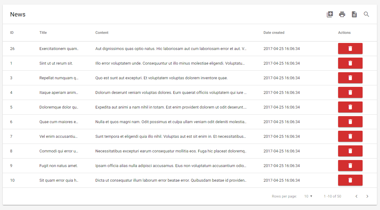
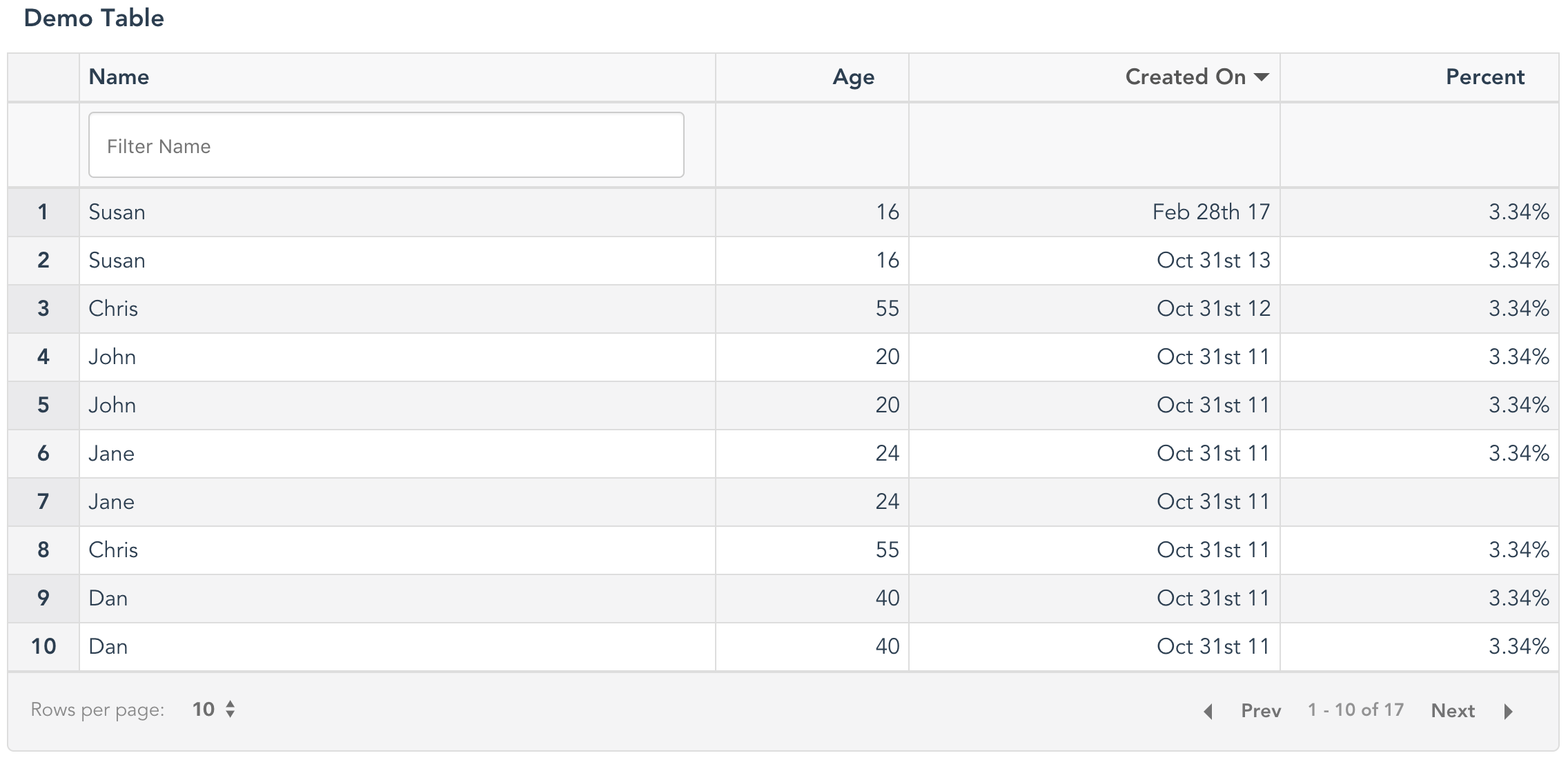
This should result in the screenshot seen above
Note: vue-good-table also supports dynamic td templates where you dictate how to display the cells. Example:
<vue-good-table
  title="Dynamic Table"
  :columns="columns"
  :rows="rows"
  :lineNumbers="true"
  :defaultSortBy="{field: 'age', type: 'asec'}"
  :globalSearch="true"
  :paginate="true"
  styleClass="table condensed table-bordered table-striped">
  <template slot="table-row" scope="props">
    <td>{{ props.row.name }}</td>
    <td class="fancy">{{ props.row.age }}</td>
    <td>{{ props.formattedRow.date }}</td>
    <td>{{ props.index }}</td>
  </template>
</vue-good-table>
Note:
- The original row object can be accessed via
props.row - The currently displayed table row index can be accessed via
props.index. - The original row index can be accessed via
props.row.originalIndex. You can access the original row object by usingrow[props.row.originalIndex]. - You can access the formatted row data (for example - formatted date) via
props.formattedRow
Component Options
| Option | Description | Type, Example |
|---|---|---|
| title | Title shows up above the table | String, "Test Table"If not set, the title region is not created. |
| columns | Array containing objects that describe table columns |
  [
    {
      label: 'Name',
      field: 'name',
      filterable: true,
    }
    //...
  ]
For all column properties, see below
|
| rows | Array containing row objects |
  [
    {
      id:1,
      name:"John",
      age:20
    },
    //...
  ]
|
| paginate | Enable Pagination for table | Boolean |
| perPage | Number of rows per page | Integer (default: 10) |
| onClick | Function to run when a row is clicked |
<vue-good-table
      :columns="columns"
      :onClick="onClickFn"
      :rows="rows"/>
// data
data() {
  return {
   // rows, columns ...
    onClickFn: function(){
      console.log('something');
    },
  };
}
|
| sortable | Enable sorting by clicking column | Boolean |
| styleClass | Allows applying your own classes to table | String default: 'table table-bordered' |
| lineNumbers | Enable sorting by clicking column | Boolean default: false |
| defaultSortBy | Allows specifying a default sort for the table on wakeup | Object, example:
{
  field: 'name',
  type: 'asc' //asc or desc (default: 'asc')
}
|
| Search Options | ||
| globalSearch | Allows a single search input for the whole table Note: enabling this filter disables column filters | Boolean default: false |
| searchTrigger (used with global search) | allows specifying searching on enter key rather than live search for large records | String searchTrigger="enter" |
| externalSearchQuery | Allows global search via your own input field | Usage
    <input type="text" v-model="searchTerm" />
    <vue-good-table
      :columns="columns"
      :paginate="true"
      :externalSearchQuery="searchTerm"
      :rows="rows"/>
  // and in data
  data(){
      return {
        searchTerm: '',
        // rows, columns etc...
      };
  }
|
| Text Options - for those interested in using other languages | ||
| globalSearchPlaceholder | Text for global search input place holder | default: "Search Table" |
| nextText | Text for pagination 'Next' link | default: "Next" |
| prevText | Text for pagination 'Prev' link | default: "Prev" |
| rowsPerPageText | Text for pagination 'Rows per page' label | default: "Rows per page" |
| ofText | Text for pagination 'x of y' label | default: "of" |
Column Options
| Option | Description | Type, example | |
| label (required) | Label to put on column header | String {label: "Name"} |
|
| field (required) | Row object property that this column corresponds to |
Could be:
|
|
| type (optional) | type of column. default: 'text'. This determines the formatting for the column and filter behavior as well |
Possible values:
|
|
| inputFormat (if type is date) | provide the format to parse date string | String eg: 'YYYYMMDD' //where date strings are '20170530' |
|
| outputFormat (if type is date) | provide the format for output date | String eg: 'MMM Do YY' //where date will be output like 'May 30th 17' |
|
| filterable (optional) | enables filtering on column | Boolean | |
| filterTextInput (optional) | provides the column with a filter input | Boolean | |
| filterDropdown (optional) | provides a dropdown for filtering | Boolean | |
| filterOptions (required for filterDropdown) | provides options to dropdown filter filterOptions: ['Blue', 'Red', 'Yellow'] |
Array | |
| filter (optional) | Custom filter, function of two variables: function(data, filterString),
should return true if data matches the filterString, otherwise false. |
          filter: function(data, filterString) {
            var x = parseInt(filterString)
            return data >= x-5 && data <= x+5
          }
would create a filter matching numbers within 5 of the provided value.
| |
| html (optional) | indicates whether this column will require html rendering or not | Boolean, example: if row had a property 'htmlContent' like htmlContent: '<button>Hello</button>', then html: true on the column will render a button |
|
| width (optional) | provide a width value for this column | example: width: '50px' |
|
| hidden (optional) | allow hiding a column on table | Boolean | |
| tdClass (optional) | provide custom class(es) to the td | example: tdClass: 'text-center' |
|
| thClass (optional) | provide custom class(es) to the th | example: thClass: 'custom-th-style' |
Style Options
Vue-good-table allows providing your own css classes for the table via styleClass option but it also has in-built classes that you can make use of
.table

.table .table-bordered

.table .table-stripped

.table .table-stripped .table-bordered .condensed