Vue It Bigger!
A simple image / video lightbox component for Vue.js. Based on vue-image-lightbox.
Features
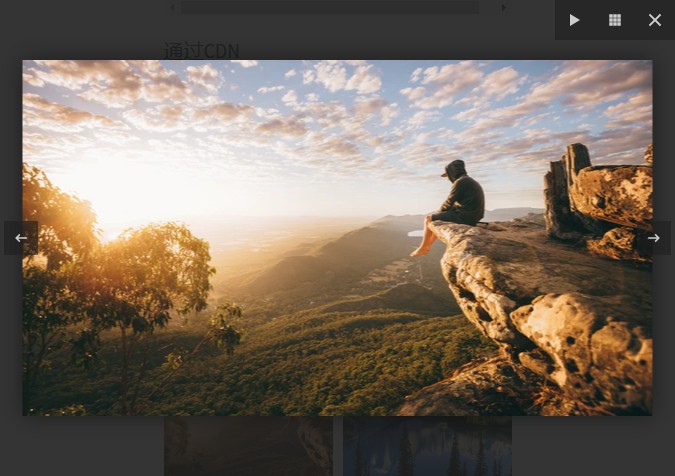
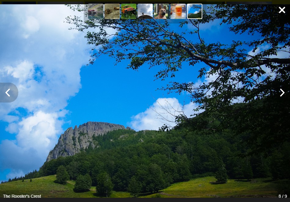
- Unobtrusive interface that disappears after a few seconds, reappears on mouse activity
- Optional thumbnail strip with all of the gallery's media
- Can show an HTML enabled caption under each image or video
- Can play the slideshow automatically
- All of the graphics (previous, next and close buttons) can be customized via slots
- Can skip to next / previous media programatically
Improvements over vue-image-lightbox
- Lightbox opens and closes with a short fade
- Media's width is no longer limited
- When opening the lightbox the media doesn't flicker
- Moved caption bar and image counter off the media to the bottom of the screen
- Moved thumbnails to the top of the screen
- All interface elements have a background for better visibility
- Simpler CSS
Installation
NPM / Yarn
Install the package:
npm install vue-it-bigger
yarn add vue-it-bigger
Then import it in your project at your entry point (main.js normally)
import Vue from 'vue'
and use the lightbox:
import LightBox from 'vue-it-bigger'

export default {
  components: {
    LightBox,
  },
}
Browser global
<script src="path/to/vue.js"></script>
<script src="path/to/dist/vue-it-bigger.js"></script>
Usage
You can simply view App.vue to see how to use vue-it-bigger
Import CSS style
require('vue-it-bigger/dist/vue-it-bigger.min.css')
// Use only when you are using Webpack
How to use:
<LightBox :media="media"></LightBox>
Structure of the media prop:
[
  { // For image
    thumb: 'http://example.com/thumb.jpg',
    src: 'http://example.com/image.jpg',
    caption: 'caption to display. receive <html> <b>tag</b>', // Optional
    srcset: '...' // Optional for displaying responsive images
  },
  { // For video
    thumb: 'https://s3-us-west-1.amazonaws.com/powr/defaults/image-slider2.jpg',
    sources: [
      {
        src: 'https://www.w3schools.com/html/mov_bbb.mp4',
        type: 'video/mp4'
      }
    ],
    type: "video",
    caption: '<h4>Monsters Inc.</h4>',
    width: 800, // Required
    height: 600, // Required
    autoplay: true, // Optional: Autoplay video when the lightbox opens
  }
]
Options
Properties
| name | type | default | description |
|---|---|---|---|
| media | Array | required | Media array to display |
| showLightBox | Boolean | true | Whether to show lightbox or not at the beginning |
| startAt | Number | 0 | Index of the image that you want to start at |
| nThumbs | Number | 7 | Number of thumbnail images |
| showThumbs | Boolean | true | Whether to show thumbnails or not |
| autoPlay | Boolean | false | Move to next image automatically |
| autoPlayTime | Number | 3000 (ms) | Time to stop at an image before move on to next image |
| showCaption | Boolean | false | Whether to show caption or not |
| disableScroll | Boolean | true | set to `true` to avoid scrolling views behind lightbox |
| lengthToLoadMore | Number | 0 | Minimum length unto end to emit load more event |
| closable | Boolean | true | Display the close button at the right top corner or not. ESC clicking-close will also be disabled if closable is set to false. |
| closeText | String | Close (Esc) | Text for the close button |
| previousText | String | Previous | Text for the previous image button |
| nextText | String | Next | Text for the next image button |
| previousThumbText | String | Previous | Text for the previous thumb image button |
| nextThumbText | String | Next | Text for the next thumb image button |
Methods
| name | arguments | description |
|---|---|---|
| nextImage | () | Move to next image |
| previousImage | () | Move to previous image |
| closeLightBox | () | Close lightbox |
| showImage | (index) | Show the image at index |
Slots
close
The content of the close button.
footer
The content of the footer under the image.
slot-scopes
| name | type | description |
|---|---|---|
| current | integer | Number of the current image displayed |
| total | integer | Numbers of the images |
previous
The previous button on the main image.
next
The next button on the main image.
previousThumb
The previous button on the thumbs list.
nextThumb
The next button on the thumbs list.
customCaption
The caption of the current image.
videoIcon
The Icon used for videos
Events
onOpened: Emit when the lightbox is opened.onClosed: Emit when the lightbox is closed.onLastIndex: Emit when the current image is the last one of the list.onFirstIndex: Emit when the current image is the first one of the list.onStartIndex: Emit when the current image is at thestartAtindex (specified in the properties).onLoad: Emit when there arelengthToLoadMoreimages left in the array (specified in the properties). For example, iflengthToLoadMore = 2and there are 7 images in your array, when you reach index 4 (which means there are 2 images left which are not discovered yet), this event will be emitted. After that, if the image array are updated and there are totally 15 images, the event will be emitted at index 12.
Development (NPM / Yarn)
Clone the repository, cd into it and run:
npm run dev
yarn dev