v2-table
A simple table component based Vue 2.x.
Installation
Install the pkg with npm:
npm i --save v2-table beautify-scrollbar
or yarn
yarn add v2-table beautify-scrollbar
Get Started
import Vue from 'vue';

import 'beautify-scrollbar/dist/index.css';
import 'v2-table/dist/index.css';
import V2Table from 'v2-table';

Vue.use(V2Table)
<template>
  <v2-table :data="list">
    <v2-table-column label="Name" prop="name"></v2-table-column>
    <v2-table-column label="Date" prop="date"></v2-table-column>
    <v2-table-column label="Address" prop="address"></v2-table-column>
  </v2-table>
</template>

<script>
  export default {
    data () {
      return {
        list: [{
          date: '2017-12-02',
          name: 'test1',
          address: 'Shenzhen,China'
        }, {
          date: '2017-11-02',
          name: 'test2',
          address: 'Guangzhou,China'
        }, {
          date: '2018-01-02',
          name: 'test3',
          address: 'Shaoyang,Hunan'
        }, {
          date: '2017-10-02',
          name: 'test4',
          address: 'Changsha,Hunan'
        }]
      }
    }
  }
</script>
Available Props
The v2-table component
| Attribute |
Type |
Accepted Values |
Default |
Description |
| data |
Array |
- |
[] |
table data |
| border |
Boolean |
- |
false |
whether show table border |
| stripe |
Boolean |
- |
false |
whether table is striped |
| loading |
Boolean |
- |
false |
show loading component |
| empty-text |
String |
- |
No Data |
Displayed text when data is empty. You can customize this area with slot="empty" |
| default-sort |
Object |
order: ascending/descending |
if prop is set, and order is not set, then order is default to ascending |
set the default sort column and order. property prop is used to set default sort column, property order is used to set default sort order |
| row-class-name |
String/Function({row, rowIndex}) |
- |
- |
function that returns custom class names for a row, or a string assigning class names for every row |
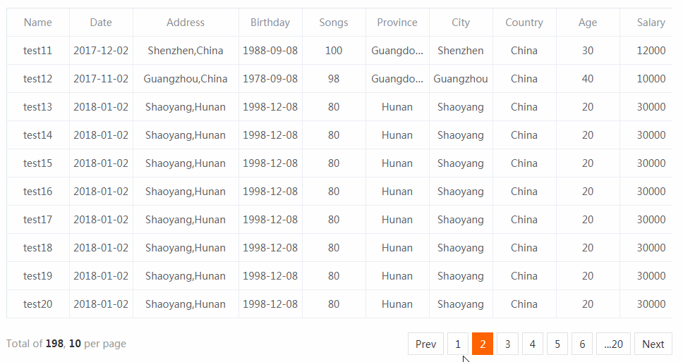
| pagination-info |
Object |
- |
{ text: '', pageSize: 10, nextPageText: 'Next', prevPageText: 'Prev' } |
pagination info for table data |
| shown-pagination |
Boolean |
- |
false |
whether showing pagination of table data |
| total |
Number |
- |
0 |
all data of table, it's needed when shown-pagination is true |
| height |
Number/String |
- |
auto |
table's height |
| row-height |
Number/String |
- |
40 |
row's height |
| show-summary |
Boolean |
- |
false |
whether to display a summary row |
| sum-text |
String |
- |
Sum |
displayed text for the first column of summary row |
| summary-method |
Function({ columns, data }) |
- |
- |
custom summary method |
| lazy-load |
Boolean |
- |
false |
whether enable lazy-load |
Table Events
| Event Name |
Description |
Parameters |
| sort-change |
triggers when table's sorting changes |
{ prop, order } |
| page-change |
triggers when table's page changes |
currentPage |
| select-change |
triggers when selection changes |
rows |
Table Slot
| Name |
Description |
| empty |
custom empty component, it's will show when data is empty |
| loading |
custom loading component, it's will show when loading property of table is true |
The v2-table-column component
| Attribute |
Type |
Accepted Values |
Default |
Description |
| label |
String |
- |
- |
column label |
| prop |
String |
- |
- |
field name |
| width |
String/Number |
- |
- |
column width |
| sortable |
Boolean |
true/false |
false |
whether column can be sorted. |
| align |
String |
left/center/right |
center |
alignment |
| fixed |
String |
left/right |
- |
fixed column to left or right |
| type |
String |
- |
- |
type of the column |
Development
git clone [email protected]:dwqs/v2-table.git

cd v2-table

npm i

npm run dev
GitHub