Vue Preloader
Vue Preloader is a simple and customizable Vue component that allows you to display a preloader or loading indicator while your content is being loaded. This wrapper component provides a convenient way to show a loading animation or message to users during asynchronous operations.
Key Features
-
Full Control Over Functionality: The Vue Preloader component only displays data and does not add any additional functionality. This gives you full control over when and how to display the preloader in your application.
-
Full Control Over Content: The component provides a default preloader with a “Loading…” text, but you can easily implement your own design using the default slot. This means you have the flexibility to customize the preloader’s appearance and add any content you want while data is loading.
Installation
You can install the Vue Preloader component via npm:
npm install vue-preloader
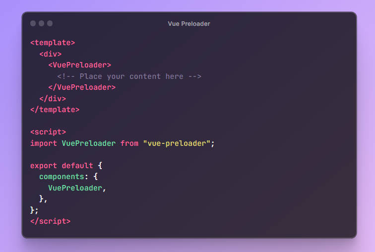
Usage
To use the Vue Preloader component, simply include it in your Vue template and place your content within it. The component provides a default preloader, but you can customize its appearance by using the default slot.
<template>
  <div>
    <VuePreloader>
      <!-- Place your content here -->
    </VuePreloader>
  </div>
</template>

<script>
import VuePreloader from "vue-preloader";

export default {
  components: {
    VuePreloader,
  },
};
</script>

<style>
/* Custom styles can be applied here */
</style>
Slots
The Vue Preloader component includes a slot where you can insert your custom content. By default, it displays a loading animation with the text “Loading…”, but you have full control over what is displayed within the preloader by using the slot.
<template>
  <VuePreloader>
    <!-- Your custom content here -->
  </VuePreloader>
</template>
Styling
The Vue Preloader component comes with some basic styling applied, but you can easily customize its appearance by adding your own styles using the <style> section in your component.
CSS Classes
The following CSS class is available for styling the preloader:
.pre-loader: This class can be used to target the preloader container and apply custom styles to it. You can modify properties such as padding, background color, and more to match your design requirements.
Example:
<style>
/* Custom styles for the preloader */
.pre-loader {
  padding: 10px;
  background-color: #f1f1f1;
  /* Add more styles as needed */
}
</style>
License
This component is open source and available under the MIT License.
Author
Vue Preloader is developed and maintained by Maleesha Gimshan. If you have any questions or suggestions, feel free to reach out.
Contributing
Contributions are highly appreciated and contribute to the thriving open-source community. If you have a suggestion to improve this component, please fork the repository and create a pull request. Alternatively, you can open an issue with the tag “enhancement”. Don’t forget to show your support by giving the project a star! Thank you for your contributions!
- Fork the Project
- Create your Feature Branch (git checkout -b feature/AmazingFeature)
- Commit your changes (git commit -m ‘Add some AmazingFeature’)
- Push to the Branch (git push origin feature/AmazingFeature)
- Open a Pull Request