vue3-simple-typeahead
A Vue3 component for a simple typeahead component. It will show a list of suggested items based on the user input.
The component includes it's own input and when the user types on it the suggested options appear.
Installation
NPM
npm install vue3-simple-typeahead
Browser
You can also use the browser bundle in a script tag.
<script src="https://unpkg.com/vue3-simple-typeahead"></script>
Add installed component to your app
Import the vue3-simple-typeahead component and register it globally in your Vue app. Import the CSS as well if you wish to use the default styling.
import { createApp } from 'vue';
import App from './App.vue';
import SimpleTypeahead from 'vue3-simple-typeahead';
import 'vue3-simple-typeahead/dist/vue3-simple-typeahead.css'; //Optional default CSS

let app = createApp(App);
app.use(SimpleTypeahead);
app.mount('#app');
You can also import vue3-simple-typeahead locally in your component if you prefer.
import SimpleTypeahead from 'vue3-simple-typeahead'
import 'vue3-simple-typeahead/dist/vue3-simple-typeahead.css' //Optional default CSS

export default {
  name: 'my-vue-component',
  ...
  components: {
    SimpleTypeahead
  }
  ...
}
Usage
Use the component on your own app components
<vue3-simple-typeahead
id="typeahead_id"
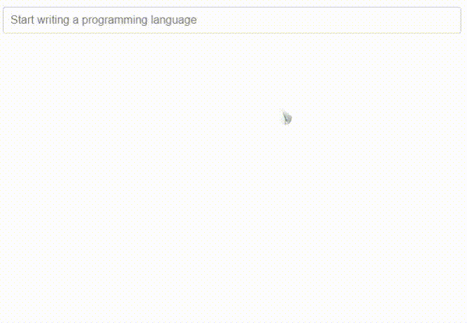
placeholder="Start writing..."
:items="['One','Two','Three',...]"
:minInputLength="1"
:itemProjection="itemProjectionFunction"
@selectItem="selectItemEventHandler"
@onInput="onInputEventHandler"
@onFocus="onFocusEventHandler"
@onBlur="onBlurEventHandler"
>
</vue3-simple-typeahead>
With custom slots template
<vue3-simple-typeahead
	id="typeahead_id"
	placeholder="Start writing..."
	:items="['One','Two','Three',...]"
	:minInputLength="1"
	:itemProjection="itemProjectionFunction"
	@selectItem="selectItemEventHandler"
	@onInput="onInputEventHandler"
	@onFocus="onFocusEventHandler"
	@onBlur="onBlurEventHandler"
>
	<template #list-header>
		LIST HEADER
	</template>
	<template #list-item-text="slot"><span v-html="slot.boldMatchText(slot.itemProjection(slot.item))"></span></template>
	<template #list-footer>
		LIST FOOTER
	</template>
</vue3-simple-typeahead>
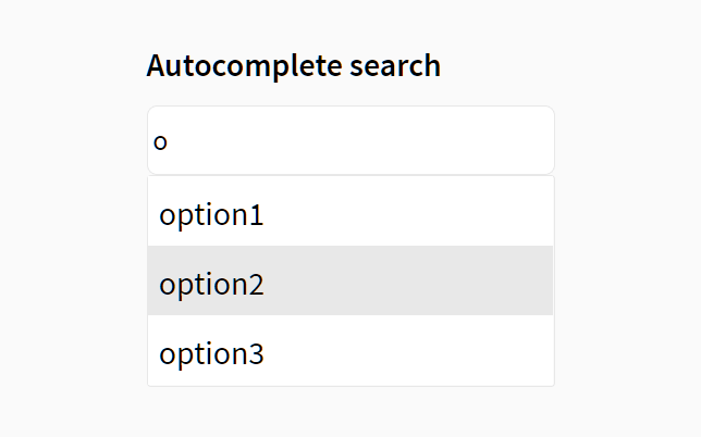
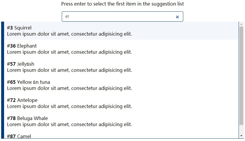
User interaction
When the user types on the typeahead input and the minimum input length is meeted a suggestion list appears below the input with the items that match the user input.
You can continue to type further to filter the selection, but you could use keyboard or mouse input to make your selection.abnf
When the suggestion list show up, you can continue to type to filter the selection or you use the Arrow Up↑ or Arrow Down↓ keys to navigate the list of suggestions. When you have selected the desired element press Enter or TAB to select the current element.
| Control | Effect |
|---|---|
| ↑ | Navigate up on the suggestion list, selecting the previous element |
| ↓ | Navigate down on the suggestion list, selecting the next element |
| Enter | Choose the current element selection |
| TAB | Choose the current element selection |
You can use the mouse instead, simply hover you cursor over the desire element and click on it.

Props
| Prop | Type | Default | Description |
|---|---|---|---|
id |
String | Random id generation | The id for the input control. Can be useful to link with a label for="" |
placeholder |
String | '' |
Placeholder text for the input |
items |
Array (Required) | List of objects or strings with the elements for suggestions | |
defaultItem |
Any | Default item to be selected | |
minInputLength |
Number | 2 | Minimum input length for the suggestion length to appear, the prop value has to be >= 0 |
itemProjection |
Function: String | (item) => {return item;} |
Projection function to map the items to a string value for search and display |
Remember you can always use lower-kebap-case for camelCase props like min-input-length
Events
| Event | Signature | Description |
|---|---|---|
selectItem |
function (item: String): void |
Emitted when the user selects an item from the suggestion list |
onInput |
function (event: Object { input: String, items: Array }): void |
Emitted when the user types anything |
onFocus |
function (event: Object { input: String, items: Array }): void |
Emitted when the input control get the focus |
onBlur |
function (event: Object { input: String, items: Array }): void |
Emitted when the input control lost the focus [When the user select an item, the focus is lost too] |
Slots
| Slot | Parent | Props | Description |
|---|---|---|---|
#list-header |
div.simple-typeahead-list-header |
Slot to be show at top of the suggestion list | |
#list-item-text |
span.simple-typeahead-list-item-text' |
item, itemProjection, boldMatchText |
Slot to customize the text of every item in the suggestion list |
#list-footer |
div.simple-typeahead-list-footer |
Slot to be show at bottom of the suggestion list |
Slot #list-item-text props
| Prop | Type | Description |
|---|---|---|
item |
String or Object | The item of the items array |
itemProjection |
function | Use the item projection function provided as prop to the vue3-simple-typeahead element |
boldMatchText |
function | A function that receives a string and add strong tags to the parts of the text matched by the search criteria |
Styling
Overwrite styles when using the default css included or add custom styles basing your rules on this structure.
div#{:id}_wrapper.simple-typeahead
    input#{:id}.simple-typeahead-input
    div.simple-typeahead-list
        .simple-typeahead-list-header
        .simple-typeahead-list-item &.simple-typeahead-list-item-active
            .simple-typeahead-list-item-text
        .simple-typeahead-list-footer