vue-skeleton-screen
A skeleton screen written in Vue.js and powered by Vuetify.
Usage
//javascript
import SkeletonCard from 'vue-skeleton-screen'
...
export default{
...
	components: {
    	SkeletonCard,
	}
...
};
<!-- html -->
<skeleton-card actions round hover></skeleton-card>
Installatoin
Using npm:
$ npm i --save vue-skeleton-screen
Dependencies
- Vue, This is a component written in vue and can only use for Vue projects. For information, go to https://vuejs.org/.
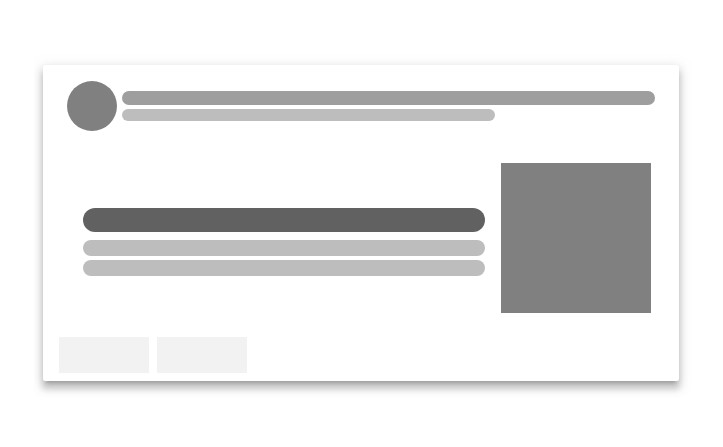
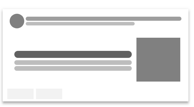
Api
- header
Type: Boolean
Default: true
Description: header with or without a avatar along with a title and subtitle, set to false to hide it.
- avatar
Type: Boolean
Default: true
Description: a round avatar in header, set to false to hide it.
- media
Type: Boolean
Default: true
Description: media is a grey div stands for image to be loaded, set to false to hide it.
- actions
Type: Boolean
Default: false
Description: actions contains two action button place holders, set to true to enable it.
- lines
Type: Number
Default: 2
Description: the lines number in text section.
- round
Type: Boolean
Default: false
Description: set to true if you want rounded corner of the placeholder.
- dark (new in 0.0.4)
Type: Boolean
Default: false
Description: set to true to use dark theme.