vue-table-component
A straightforward Vue component to filter and sort tables.
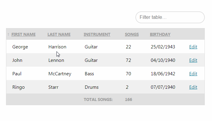
This repo contains a Vue component that can render a filterable and sortable table. It aims to be very lightweight and easy to use. It has support for retrieving data asynchronously and pagination.
Here's an example of how you can use it:
<table-component
     :data="[
          { firstName: 'John', lastName: 'Lennon', instrument: 'Guitar', birthday: '04/10/1940', songs: 72 },
          { firstName: 'Paul', lastName: 'McCartney', instrument: 'Bass', birthday: '18/06/1942', songs: 70 },
          { firstName: 'George', lastName: 'Harrison', instrument: 'Guitar', birthday: '25/02/1943', songs: 22 },
          { firstName: 'Ringo', lastName: 'Starr', instrument: 'Drums', birthday: '07/07/1940', songs: 2 },
     ]"
     sort-by="songs"
     sort-order="asc"
>
     <table-column show="firstName" label="First name"></table-column>
     <table-column show="lastName" label="Last name"></table-column>
     <table-column show="instrument" label="Instrument"></table-column>
     <table-column show="songs" label="Songs" data-type="numeric"></table-column>
     <table-column show="birthday" label="Birthday" data-type="date:DD/MM/YYYY"></table-column>
     <table-column label="" :sortable="false" :filterable="false">
         <template slot-scope="row">
            <a :href="`#${row.firstName}`">Edit</a>
         </template>
     </table-column>
 </table-component>
A cool feature is that the table caches the used filter and sorting for 15 minutes. So if you refresh the page, the filter and sorting will still be used.
Demo
Want to see the component in action? No problem. Here's a demo.
Installation
You can install the package via yarn:
yarn add vue-table-component
or npm:
npm install vue-table-component --save
Next, you must register the component. The most common use case is to do that globally.
//in your app.js or similar file
import Vue from 'vue';
import { TableComponent, TableColumn } from 'vue-table-component';

Vue.component('table-component', TableComponent);
Vue.component('table-column', TableColumn);
Alternatively you can do this to register the components:
import TableComponent from 'vue-table-component';

Vue.use(TableComponent);
Browser Support
vue-table-component has the same browser support as Vue (see https://github.com/vuejs/vue). However, you might need to polyfill the Array.prototype.find method for IE support.
Usage
Here's a simple example on how to use the component.
<table-component
     :data="[
     { firstName: 'John', birthday: '04/10/1940', songs: 72 },
     { firstName: 'Paul', birthday: '18/06/1942', songs: 70 },
     { firstName: 'George', birthday: '25/02/1943', songs: 22 },
     { firstName: 'Ringo', birthday: '07/07/1940', songs: 2 },
     ]"
     sort-by="songs"
     sort-order="asc"
     >
     <table-column show="firstName" label="First name"></table-column>
     <table-column show="songs" label="Songs" data-type="numeric"></table-column>
     <table-column show="birthday" label="Birthday" :filterable="false" data-type="date:DD/MM/YYYY"></table-column>
 </table-component>
This will render a table that is both filterable and sortable. A filter field will be displayed right above the table. If your data contains any html we will filter that out when filtering. You can sort the table by clicking on the column headers. By default it will remember the used filter and sorting for the next 15 minutes.
Props
You can pass these props to table-component:
data: (required) the data the component will operate on. This can either be an array or a functionshow-filter: set this tofalseto not display thefilterfield.show-caption: set this tofalseto not display thecaptionfield which shows the current active filter.sort-by: the property in data on which to initially sort.sort-order: the initial sort order.cache-lifetime: the lifetime in minutes the component will cache the filter and sorting.cache-key: if you use multiple instances oftable-componenton the same page you must set this to a unique value per instance.table-class: the passed value will be added to theclassattribute of the rendered tablethead-class: the passed value will be added to theclassattribute of the rendered table head.tbody-class: the passed value will be added to theclassattribute of the rendered table body.filter-placeholder: the text used as a placeholder in the filter fieldfilter-input-class: additional classes that you will be applied to the filter text inputfilter-no-results: the text displayed when the filtering returns no results
For each table-column a column will be rendered. It can have these props:
show: (required) the property name in the data that needs to be shown in this column.formatter: a function the will receive the value that will be displayed and all column properties. The return value of this function will be displayed. Here's an examplelabel: the label that will be shown on top of the column. Set this to an empty string to display nothing. If this property is not present, the string passed toshowwill be used.data-type: if your column should be sorted numerically set this tonumeric. If your column contains dates set it todate:followed by the format of your datesortable: if you set this tofalsethen the column won't be sorted when clicking the column headersort-by: you can set this to any property present indata. When sorting the column that property will be used to sort on instead of the property inshow.filterable: if this is set tofalsethan this column won't be used when filteringfilter-on: you can set this to any property present indata. When filtering the column that property will be used to filter on instead of the property inshow.hidden: if you set this totruethen the column will be hidden. This is useful when you want to sort by a field but don't want it to be visible.header-class: the passed value will be added to theclassattribute of the columnsthelement.cell-class: the passed value will be added to theclassattribute of the columnstdelement.
Listeners
The table-component currently emits one custom event:
@rowClick: is fired when a row is clicked. Receives the row data as it's event payload.
Modifying the used texts and CSS classes
If you want to modify the built in text or classes you can pass settings globally.
You can use the CSS from the docs as a starting point for your own styling.
import TableComponent from 'vue-table-component';

TableComponent.settings({
    tableClass: '',
    theadClass: '',
    tbodyClass: '',
    filterPlaceholder: 'Filter table…',
    filterNoResults: 'There are no matching rows',
});
You can also provide the custom settings on Vue plugin install hook:
import Vue from 'vue';
import TableComponent from 'vue-table-component';

Vue.use(TableComponent, {
    tableClass: '',
    theadClass: '',
    tbodyClass: '',
    filterPlaceholder: 'Filter table…',
    filterNoResults: 'There are no matching rows',
});
Retrieving data asynchronously
The component can fetch data in an asynchronous manner. The most common use case for this is fetching data from a server.
To use the feature you should pass a function to the data prop. The function will receive an object with filter, sort and page. You can use these parameters to fetch the right data. The function should return an object with the following properties:
data: (required) the data that should be displayed in the table.pagination: (optional) this should be an object with keyscurrentPageandtotalPages. IftotalPagesis higher than 1 pagination links will be displayed.
Here's an example:
<template>
   <div id="app">
       <table-component :data="fetchData">
           <table-column show="firstName" label="First name"></table-column>
       </table-component>
   </div>
</template>

<script>
    import axios from 'axios';

    export default {
        methods: {
            async fetchData({ page, filter, sort }) {
                const response = await axios.get('/my-endpoint', { page });

                // An object that has a `data` and an optional `pagination` property
                return response;
            }
        }
    }
</script>
If you for some reason need to manually refresh the table data, you can call the refresh method on the component.
<table-component :data="fetchData" ref="table">
    <!-- Columns... -->
</table-component>
this.$refs.table.refresh();
Formatting values
You can format values before they get displayed by using scoped slots. Here's a quick example:
<table-component
     :data="[
          { firstName: 'John', songs: 72 },
          { firstName: 'Paul', songs: 70 },
          { firstName: 'George', songs: 22 },
          { firstName: 'Ringo', songs: 2 },
     ]"
>

     <table-column label="My custom column" :sortable="false" :filterable="false">
         <template slot-scope="row">
            {{ row.firstName }} wrote {{ row.songs }} songs.
         </template>
     </table-column>
 </table-component>
Alternatively you can pass a function to the formatter prop. Here's an example Vue component that uses the feature.
<template>
    <table-component
        :data="[{ firstName: 'John' },{ firstName: 'Paul' }]">
        <table-column show="firstName" label="First name" :formatter="formatter"></table-column>
    </table-component>
</template>

<script>
export default {
    methods: {
        formatter(value, rowProperties) {
            return `Hi, I am ${value}`;
        },
    },
}
</script>
This will display values Hi, I am John and Hi, I am Paul.
Adding table footer <tfoot> information
Sometimes it can be useful to add information to the bottom of the table like summary data.
A slot named tfoot is available and it receives all of the rows data to do calculations on the fly or you can show data directly from whatever is available in the parent scope.
<table-component
:data="[{ firstName: 'John', songs: 72 },{ firstName: 'Paul', songs: 70 }]">
<table-column show="firstName" label="First name"></table-column>
<table-column show="songs" label="Songs" data-type="numeric"></table-column>
<template slot="tfoot" slot-scope="{ rows }">
<tr>
<th>Total Songs:</th>
<th>{{ rows.reduce((sum, value) => { return sum + value.data.songs; }, 0) }}</th>
<th> </th>
<th> </th>
</tr>
</template>
</table-component>
OR
<template>
    <table-component
        :data="tableData">
        <table-column show="firstName" label="First name"></table-column>
        <table-column show="songs" label="Songs" data-type="numeric"></table-column>
        <template slot="tfoot">
            <tr>
                <th>Total Songs:</th>
                <th>{{ totalSongs }}</th>
            </tr>
        </template>
    </table-component>
</template>
<script>
export default {
    computed: {
        totalSongs () {
            return this.tableData.reduce(sum, value => {
                return sum + value.songs;
            }, 0);
        }
    },
    data () {
        return {
            tableData: [{ firstName: 'John', songs: 72 },{ firstName: 'Paul', songs: 70 }]
        }
    }
}
</script>
Note: rows slot scope data includes more information gathered by the Table Component (e.g. columns) and rows.data is where the original data information is located.