vue_SwipeModal
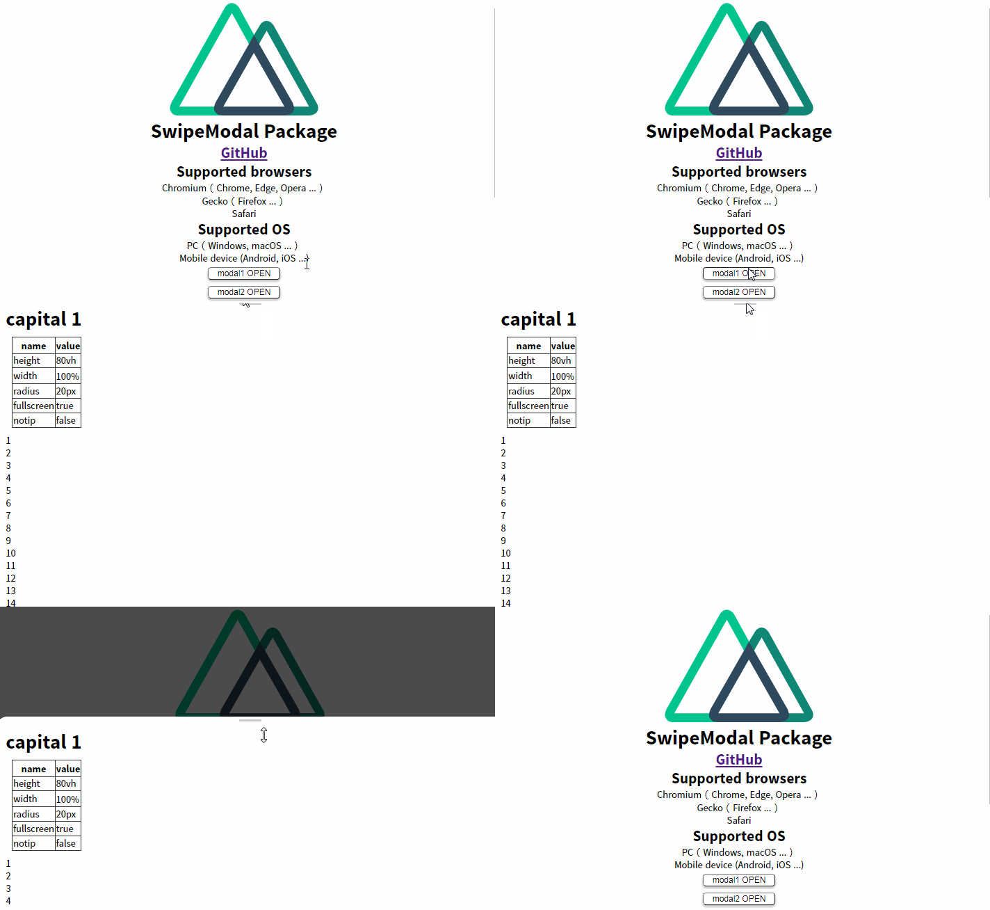
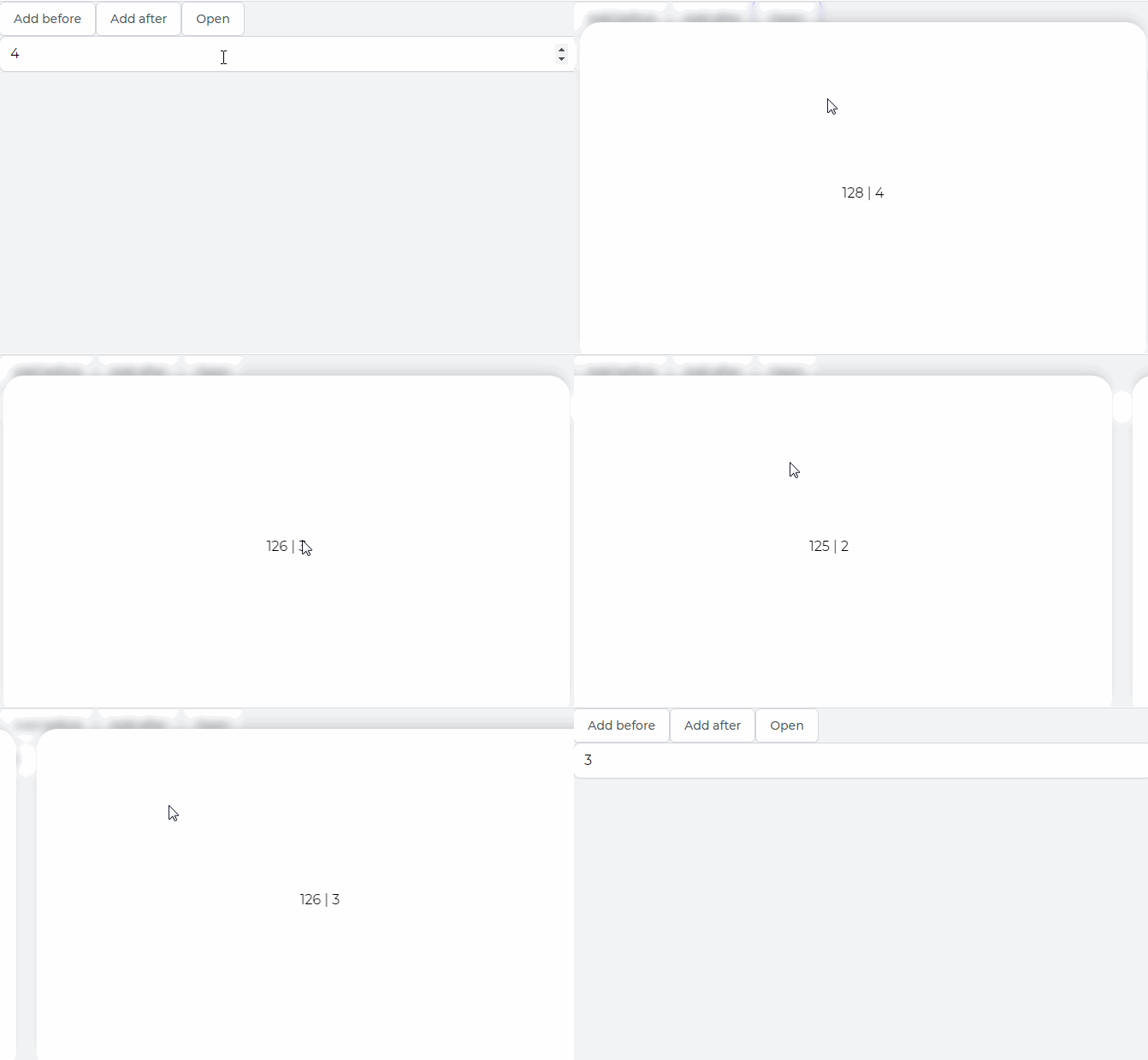
A modal window that can be swiped to close. (Commonly known as: Swipeable Bottom Sheet)
Requirement
| name | version |
|---|---|
| nuxt.js | 2.15.3 |
| core-js | 3.9.1 |
Getting Started
npm i nekoo_vue_swipemodal
<template>
  <div>
    <button @click = "modal = true"> open </ button>

    <swipemodal
      v-model = "modal"
      height = "80vh"
      width = "100%"
      radius = "20px"
    >
      <h1> contents </ h1>
    </ swipemodal>
  </ div>
</ template>

<script>
import swipemodal from'nekoo_vue_swipemodal'
import'nekoo_vue_swipemodal /dist/swipemodal.css'

export default {
  name:'App',

  data () {
    return {
      modal: false
    }
  },

  components: {
    swipemodal
  }
}
</ script>
Installation
| Variable | Data type | Initial value | Description |
|---|---|---|---|
| v-model | Boolean | false | Assign a variable that specifies the opening and closing of modal |
| height | String | auto | Modal height |
| width | String | auto | Modal width |
| max-height | String | null | Maximum modal height |
| max-width | String | null | Maximum modal width |
| radius | String | 20px | Rounded upper corners of Modal |
| color | String | #FFFFFF | Modal background color |
| persistent | Boolean | false | Do you want to close the modal when you click outside the modal? |
| fullscreen | Boolean | false | Do you want the modal to fill the screen? If true, height will be 100vh |
| notip | Boolean | false | Do you want to display the decoration at the top of the modal? If true, it will not be displayed and swipe motion cannot be performed using the mouse. |
