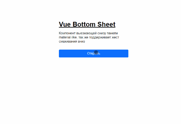
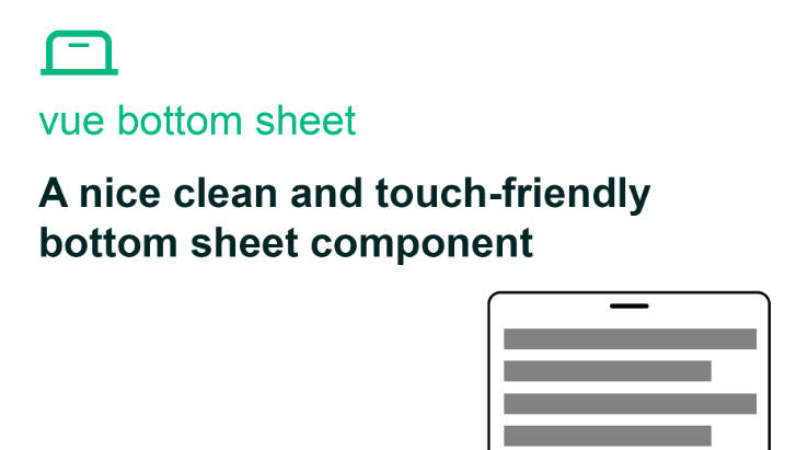
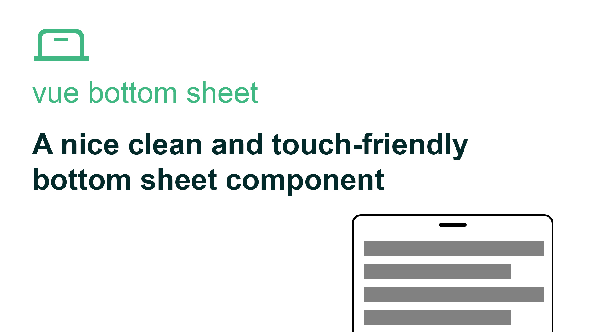
Vue Bottom Sheet Vue 2
A nice clean and touch-friendly bottom sheet component based on Vue.js 2 and hammer.js for Vue 2
Installation
NPM
npm install @webzlodimir/vue-bottom-sheet-vue2
Yarn
yarn add @webzlodimir/vue-bottom-sheet-vue2
Usage
<template>
  <vue-bottom-sheet-vue2 ref="myBottomSheet">
    <h1>Lorem Ipsum</h1>
    <h2>What is Lorem Ipsum?</h2>
    <p>
      <strong>Lorem Ipsum</strong> is simply dummy text
    </p>
  </vue-bottom-sheet-vue2>
</template>

<script>
  import  VueBottomSheetVue2 from "@webzlodimir/vue-bottom-sheet-vue2";

  export default {
    components: {
      VueBottomSheetVue2
    },
    methods: {
      open() {
        this.$refs.myBottomSheet.open();
      },
      close() {
        this.$refs.myBottomSheet.close();
      }
    }
  }
</script>
Props
| Prop | Type | Description | Example | Defaults |
|---|---|---|---|---|
| max-width | Number | Set max-width of component card in px | :max-width="640" |
640 |
| max-height | Number | Sets the maximum height of the window, if not set it takes the height of the content | :max-height="90" |
– |
| can-swipe | Boolean | Enable or disable swipe to close | :can-swipe="false" |
true |
| overlay | Boolean | Enable overlay | :overlay="false" |
true |
| overlay-color | String | Set overlay color with opacity | overlay-color="#0000004D" |
#0000004D |
| overlay-click-close | Boolean | Close window on overlay click | :overlay-click-close="false" |
true |
Events
| Event | Description | Example |
|---|---|---|
| opened | Fire when card component is opened | @opened=”” |
| closed | Fire when card component is closed | @closed=”” |
| dragging-up | Fire while card component dragging up | @dragging-up=”” |
| dragging-down | Fire while card component dragging down | @dragging-down=”” |
Slots
You can use this named slots:
<template>
  <vue-bottom-sheet-vue2 ref="myBottomSheet">
    <template #header>
      <h1>Lorem Ipsum</h1>
    </template>
    <template #default>
      <h2>What is Lorem Ipsum?</h2>
    </template>
    <template #footer>
      <p>
        <strong>Lorem Ipsum</strong> is simply dummy text
      </p>
    </template>
  </vue-bottom-sheet-vue2>
</template>