virtual-keyboard
A virtual keyboard based on Vue 3.2 (and tailwindcss & floating ui).
Installation
npm install @dongivan/virtual-keyboard --saveStyles
With tailwindcss
Set content in your tailwind.config.ts:
module.export = { /* ... */ content: [ /* ... */ "./node_modules/@dongivan/virtual-keyboard/**/*.js", ] /* ... */}
Without tailwindcss
import "@dongivan/virtual-keyboard/default.css";
Components Usage
Just import and use it in your template.
<template> <VirtualKeyboard class="..." @key-pressed="(key) => ..."> <div class="..."> <KeyButton v-for="i of 10" :key="`key-${i - 1}`" :value="i - 1" /> </div> </VirtualKeyboard></template><script setup lang="ts">import { VirtualKeyboard, KeyButton,} from "@dongivan/virtual-keyboard"</script>
You can use KeyboardPage if you have multiple pages of virtual keyboard (remember to use PageButton to change the current page).
<template> <VirtualKeyboard class="..." @key-pressed="(key) => ..."> <KeyboardPage name="num" default> <div class="..."> <KeyButton v-for="i of 10" :key="`key-${i - 1}`" :value="i - 1" /> </div> </KeyboardPage> <KeyboardPage name="eng" default> <div class="..."> <KeyButton v-for="v of 'abcdefghijklmnopqrstuvwxyz'.split('')" :key="`key-${v}`" :value="v" /> </div> </KeyboardPage> <div class="..."> <PageButton value="num" :children="['eng']" /> </div> </VirtualKeyboard></template><script setup lang="ts">import { VirtualKeyboard, KeyButton, KeyboardPage, PageButton,} from "@dongivan/virtual-keyboard"</script>
ShiftButton will shift the current keyboard page (which means each key in current keyboard page will be shifted if it could).
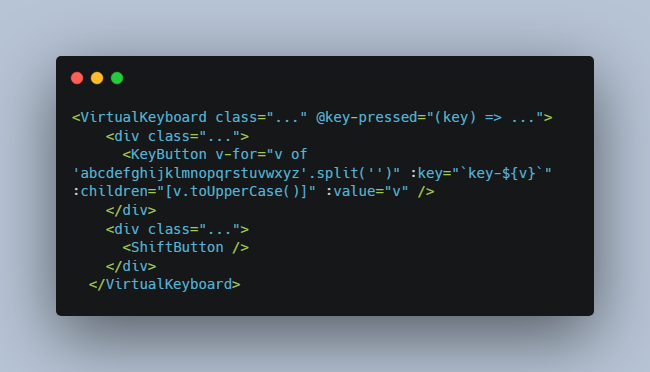
<template> <VirtualKeyboard class="..." @key-pressed="(key) => ..."> <div class="..."> <KeyButton v-for="v of 'abcdefghijklmnopqrstuvwxyz'.split('')" :key="`key-${v}`" :children="[v.toUpperCase()]" :value="v" /> </div> <div class="..."> <ShiftButton /> </div> </VirtualKeyboard></template><script setup lang="ts">import { VirtualKeyboard, KeyButton, ShiftButton,} from "@dongivan/virtual-keyboard"</script>
Config
There is a common prop named config with type VirtualKeyboardConfig in each component. The component will provide the config prop to its children components, and the children will merge it with their own config prop.
type ClassName = string | string[];type ButtonClass = { btn?: ClassName; hover?: ClassName; focus?: ClassName; active?: ClassName;};type HasBadgeClass = { badge?: ClassName; slotBadge?: ClassName;};type VirtualKeyboardConfig = { pageClass?: ClassName; buttonClass?: ButtonClass & HasBadgeClass; childrenContainerClass?: ClassName; childButtonClass?: ButtonClass; childrenContainerOffset?: { mainAxis?: number; crossAxis?: number; alignmentAxis?: number; };};
const defaultConfig: VirtualKeyboardConfig = { pageClass: "flex gap-1 flex-wrap", buttonClass: { btn: "w-fit min-w-[2rem] h-fit min-h-[2rem] p-2 rounded bg-gray-200", active: "bg-gray-400", hover: "bg-gray-300", focus: "ring-2 ring-gray-100", badge: [ "w-0 h-0 rounded-tr border-solid border-[6px] border-transparent border-t-blue-400 border-r-blue-400", ], slotBadge: [ "min-w-[50%] min-h-min scale-75 origin-top-right text-gray-600", ], }, childrenContainerClass: "min-w-full w-max flex gap-1 p-1 border border-solid border-gray-400 rounded-md bg-gray-100", childButtonClass: {}, childrenContainerOffset: { alignmentAxis: 0, mainAxis: 2, },};
Classes in config
There are many classes in VirtualKeyboardConfig, and by default they are in a tailwindcss format.
The type of a class is a ClassName which actually is a string or string[]. The difference between string and string[] is the merge strategy: when a component merging the parent component provided config and its own config, the component will use just the class if it is a string, or merge it with the config of its parent if it is a string[].
For example:
<VirtualKeyboard :config="{ buttonClass: { btn: 'p-2 bg-gray-200' } }"> <KeyButton value="t" :config="{ buttonClass: { btn: 'm-2 bg-gray-300' } }" /></VirtualKeyboard>
Then the KeyButton will has a class 'm-2 bg-gray-300'.
<VirtualKeyboard :config="{ buttonClass: { btn: 'p-2 bg-gray-200' } }"> <KeyButton value="t" :config="{ buttonClass: { btn: ['m-2 bg-gray-300'] } }" /></VirtualKeyboard>
In this situation the KeyButton will has a class 'p-2 m-2 bg-gray-300'. (Here tailwind-merge is used to merge tailwindcss classes.)
Class Keys
| Class Key | Component | Description |
|---|---|---|
| pageClass | KeyboardPage |
|
| buttonClass | KeyButton, PageButton, ShiftButton |
ButtonClass & HasBadgeClass |
| childrenContainerClass | KeyButton, PageButton |
|
| childButtonClass | KeyButton, PageButton |
ButtonClass |
ButtonClass Type
The values of buttonClass and childButtonClass are an object (with the type ButtonClass) describing the classes of buttons. Different sub keys are used in different scenarios. If the childButtonClass is not set, the component will use the value of the buttonClass for the children button elements.
| Sub Key | Scenario |
|---|---|
| btn | the default scenario |
| hover | when the mouse is over the button |
| focus | when the button is focused |
| active | when the button is clicking down by the mouse, or is touching |
HasBadgeClass Type
The value of buttonClass is also with the type HasBadgeClass which describes the badge of the button. The default class of the badge will always has "absolute top-0 right-0", so if you do not want to overwrite it, use string[] as the default config.
| Sub Key | Scenario |
|---|---|
| badge | when the badge has no slots |
| slotBadge | when the badge has a slot |
Floating UI and childrenContainerOffset
VirtualKeyboard uses Floating UI to show the children elements of a button, so there is a childrenContainerOffset key in the config to set the position of the floating elements. Its value will send to the offset Middleware of Floating UI as the params.
Components
There are 5 main Vue componenets: VirtualKeyboard, KeyButton, KeyboardPage, PageButton and ShiftButton.
VirtualKeyboard acts as a root component so you have to put the other components in it. You should add key-pressed listener to it and other components will not emit any events(they use Vue project/inject to communicate with each other.).
KeyButton acts as a common button.
The other 3 components are all optional, you can use them in your case.
Component VirtualKeyboard
Props
| Prop | Type | Default | Description |
|---|---|---|---|
| config | VirtualKeyboardConfig |
undefined |
The common config of current keyboard. Every child components will use it as default config . A default config will be used if it is set to undefined |
Events
| Event | payloads | Description |
|---|---|---|
| key-pressed | (key: string) |
This event will be emitted a key (which is a child of the VirtualKeyboard ) is pressed |
Slots
VirtualKeyboard has only a default slot. You should put all the children components in it.
Classes & Styles
Just use class & style attribute.
Component KeyButton
Props
| Prop | Type | Default | Description |
|---|---|---|---|
| value | string |
required | This value will be emitted in the key-pressed event of VirtualKeyboard. And it will be set as the label if the label is “” and the slot (#btn-${value}) is not set. |
| label | string |
“” | The label of this key button. |
| children | (string|ButtonType)[] |
[] | The children buttons of this key button. The label strategy is just like the KeyButton. |
| shiftIndex | number |
0 | When the VirtualKeyboard is shifted, the children[shiftIndex] will replace the current key button. |
| active | boolean |
false |
The config.buttonClass.active class will be add to the button element if this prop is true. |
| badge | "auto"|"hide"|"triangle"|"slot" |
"auto" |
The badge is a symbol on the right-top of the KeyButton, and it will be visible if badge !== "hide" and the KeyButton has at least one child.- "triangle" will add config.buttonClass.badge to the badge of the key button; – "slot" will add config.buttonClass.badgeSlot; – "auto" will add config.buttonClass.badgeSlot if there are only one child, or add config.buttonClass.badge if there are more than one child; – "hide" will hide the badge. |
| config | VirtualKeyboardConfig |
undefined |
The config of this KeyButton. It will be merged with any provided config by parent components. |
Slots
Use the default slot for the default value and the named slot (as btn-${child}) for the children if you want to show an icon or something else on the button or the child button.
For example:
<KeyButton value="u" :children="['ǖ', 'ǘ', { value: 'ǚ', label: 'letter ǚ'}, 'ǜ']" > <template>letter u</template> <template #btn-ǘ>letter ǘ</template> <template #[`btn-ǜ`]>letter ǜ</template></KeyButton>
Classes & Styles
You can use class & style (includes :class & :style) on the KeyButton component, however it is difficult to set the children elements, so I recommend you to use config.buttonClass, config.childrenContainerClass and config.childButtonClass to set the class of KeyButton. The tailwindcss is used in this lib, so it is also recommended to use it when you want to set the class.
Component KeyboardPage
You should use this component when your virtual keyboard has multiple layouts (or pages). Each KeyboardPage has a prop named name, and it will be visible when the current page of its parent VirtualKeyboard equals to this prop (which means that you can have multiple KeyboardPage with the same name, and they will be all visible if the current page of VirtualKeyboard equals to it).
Props
| Prop | Type | Default | Description |
|---|---|---|---|
| name | string |
required | The name of this page. |
| default | boolean |
false |
Set it to true if the KeyboardPage should be visible as default page. |
| pageClass | string|string[] |
“” | The HTML class of the KeyboardPage root element. It will be merged with config.pageClass. |
| config | VirtualKeyboardConfig |
undefined |
The config of this KeyboardPage. It will be merged with any provided config by parent components. |
Slots
KeyboardPage has only a default slot. You should put all the children components in it.
Classes & Styles
The same as the classes & styles of KeyButton components, except the KeyboardPage uses config.pageClass instead of config.buttonClass. And furthermore you can use the prop pageClass.
Component PageButton
VirtualKeyboard provides a changePage function (with the type ChangePageFunction) for its children components using provide/inject of Vue, and PageButton will call this function if it is pressed.
PageButton will automatically set the button to active when the current page of VirutalKeyboard equals to its name, and it will also show the correct label (or slot) of the current page.
Props
The props of PageButton are almost the same as KeyButton, except PageButton does not have props active and shiftIndex.
Slots
The same as KeyButton.
Classes & Styles
The same as KeyButton.
Component ShiftButton
As the same of PageButton, VirtualKeyboard provides a shiftKeyboard function (with the type ShiftKeyboardFunction)and ShiftButton will call this function if it is pressed.
Props
| Prop | Type | Default | Description |
|---|---|---|---|
| label | string |
“Shift” | The label of the shift button. |
| config | VirtualKeyboardConfig |
undefined |
The config of this ShiftButton. It will be merged with any provided config by parent components. |
Slots
ShiftButton has only a default slot which is scoped. It can be used to show icons or something else.
| Scoped Prop | Type | Description |
|---|---|---|
| isShifted | boolean |
whether the VirtualKeyboard is shifted |
Classes & Styles
The same as KeyButton except ShiftButton does not have children buttons.