vue-easeljs
A Vue.js plugin to control an HTML5 canvas using EaselJS.
Getting Started
Install vue-easeljs
On the command line:
npm install vue-easeljs --save
In app.js:
Vue.use(require('vue-easeljs'));
In your Vue.js code start with an easel-canvas component. Other components
reside within it.
The earliest components are hidden by later components whenever they overlap.
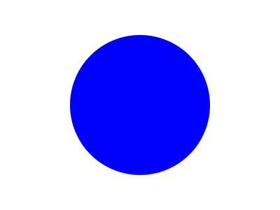
<easel-canvas width="400" height="300">
    <easel-shape
        :x="200"
        :y="150"
        form="circle"
        fill="blue"
        :dimensions="20"
        :align="['center','center']"
    >
    </easel-shape>
</easel-canvas>
 See Live Demo
Components
easel-bitmap
Show a static image.
Attributes:
- align - array, controls what point of the image the x and y refer to. Default: ['top', 'left'].
- alpha - 0 to 1, controls the opacity of the image. Default: 1, completely opaque.
- flip - 'horizontal'|'vertical'|'both'|'', flips the image.
- image - relative or absolute URL to an image file. Required.
- rotation - degrees, rotates the image. Default: 0.
- scale - number, resizes the image. Default: 1.
- shadow - array, cast an image-shaped shadow. Format: [color, xOffset, yOffset, amountOfBluriness]. Default: null.
- x - number, horizontal position based on the origin of the parent component. Default: 0.
- y - number, vertical position based on the origin of the parent component. Default: 0.
Example:
<easel-bitmap
    image="/images/awesome-background.jpg"
    :x="0"
    :y="0"
    :align="['left','top']"
>
</easel-bitmap>
 See Live Demo
easel-canvas
Give the vue-easeljs components a place to live.
Attributes:
- anti-alias: boolean, whether or not edges should be smoothed on scaled images. Default: true.
- height: number, the pixel height of the canvas on the page. Default: 300.
- width: number, the pixel width of the canvas on the page. Default: 150.
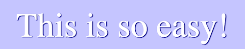
Example:
<easel-canvas width="500" height="100">
    <easel-shape
        form="rect"
        :dimensions="[500,100]"
        :x="0"
        :y="0"
        fill="#CCCCFF"
    >
    </easel-shape>
    <easel-text
        text="This is so easy!"
        :x="250"
        :y="75"
        font="70px Calibri"
        color="white"
        :shadow="['#000088',3,2,3]"
        :align="['center', 'alphabetical']"
    >
    </easel-text>
</easel-canvas>
 See Live Demo
easel-container
Group other vue-easel components together and manipulate them as one.
Attributes:
- alpha - 0 to 1, controls the opacity of the container. Default: 1, completely opaque.
- flip - 'horizontal'|'vertical'|'both'|'', flips the container.
- rotation - degrees, rotates the container. Default: 0.
- scale - number, resizes the container. Default: 1.
- shadow - array, cast a shadow of all contained components. Format: [color, xOffset, yOffset, amountOfBluriness]. Default: null.
- x - number, horizontal position based on the origin of the parent component. Default: 0.
- y - number, vertical position based on the origin of the parent component. Default: 0.
Example:
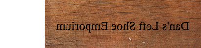
<easel-container
    flip="horizontal"
    scale=".5"
    :x="250"
    :y="50"
>
    <easel-bitmap
        image="/images/wooden-sign-texture.png"
    >
    </easel-bitmap>
    <easel-text
        text="Dan's Left Shoe Emporium"
        font="50px 'Times New Roman'"
        :y="25"
    >
    </easel-text>
</easel-container>
 See Live Demo
easel-shape
Show a shape.
Attributes:
- align - array, controls what point of the shape the x and y refer to. Default: ['top', 'left'].
- alpha - 0 to 1, controls the opacity of the shape. Default: 1, completely opaque.
- dimensions - Depends on the form. See below. Required.
- fill - color, the inside of the shape
- flip - 'horizontal'|'vertical'|'both'|'', flips the shape.
- form - 'circle'|'ellipse'|'rect'|'star'. Required.
- rotation - degrees, rotates the shape. Default: 0.
- scale - number, resizes the shape. Default: 1.
- shadow - array, cast a same-shape shadow. Format: [color, xOffset, yOffset, amountOfBluriness]. Default: null.
- stroke - color, the outline of the shape.
- x - number, horizontal position based on the origin of the parent component. Default: 0.
- y - number, vertical position based on the origin of the parent component. Default: 0.
Dimensions for:
- circle - number, the radius of the circle
- ellipse - array, the width and height of the ellipse. Format: [width, height].
- rect - array, the width and height of the rectangle. Optionally include the radius of rounded corners. Format: [width, height], or [width, height, allRadiuses], or [width, height, topLeftRadius, topRightRadius, bottomRightRadius, bottomLeftRadius].
- star - array, the radius, sides count, and point size of a "star". Use point size 0 to draw a simple polygon. Max point size is 1.
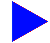
Example, to draw a blue triangle with red stroke:
<easel-shape
    form="star"
    :dimensions="[100, 3, 0]"
    fill="blue"
    stroke="red"
    :x="100"
    :y="100"
>
 See Live Demo
easel-sprite
Show a moving image. An easel-sprite must reside in an easel-sprite-sheet node. The easel-sprite-sheet defines the animations that can be used by the easel-sprite.
Attributes:
- align - array, controls what point of the image the x and y refer to. Default: ['top', 'left'].
- alpha - 0 to 1, controls the opacity of the image. Default: 1, completely opaque.
- animation - string, name of the animation to run from the
easel-sprite-sheet. Required. - flip - 'horizontal'|'vertical'|'both'|'', flips the image.
- rotation - degrees, rotates the image. Default: 0.
- scale - number, resizes the image. Default: 1.
- shadow - array, cast an image-shaped shadow. Format: [color, xOffset, yOffset, amountOfBluriness]. Default: null.
- x - number, horizontal position based on the origin of the parent component. Default: 0.
- y - number, vertical position based on the origin of the parent component. Default: 0.
Example:
See the easel-sprite-sheet example below.
easel-sprite-sheet
Define image animations for use in a sprite.
Attributes:
- animations - object, defines names for animations. Each animation is a series of frames. Format: {<animationName>: [frame1, frame2, ...], ...}.
- framerate - number, the speed the animation should play at.
- frames - mixed, usually an object with format: {width: width, height: height}. Required.
- images - array, relative or absolute URL's to image files. Required.
In-depth:
EaselJS provides a lot of options for defining sprite sheets, to allow you to
format the images in whatever way suits you.
A sprite sheet is a single image with a set of images on it that will be used
in rotation to show an animation.
The friendliest approach is to layout the images in a grid. For example, if
a character requires 32x32 pixels to show, a sprite sheet might have 10
images of the character in a 320x32 pixel image. (Or a 32x320 image. Or a
160x64 image. EaselJS will figure it out.)
In that case the following definition will do nicely:
<easel-sprite-sheet
    :images="['/images/character.png']"
    :frames="{width:32,height:32}"
    ...
>
But sometimes frames have space between them or margins around them. In these
cases, you'll need to specify more information.
In this example, there is space and margin between the frames.
<easel-sprite-sheet
    :images="['/images/lots-of-characters.png']"
    :frames="{width:32,height:32,spacing:5,margin:10}"
    ...
>
Other times, the frames are different sizes or are on different images.
In that case, this format will be required:
<easel-sprite-sheet
    :images="['/images/thomasChugging.png','/images/thomasBraking.png']"
    :frames="[
        // x, y, width, height, imageIndex
        [0, 0, 64, 32, 0],
        [0, 32, 64, 32, 0],
        ...
    ]"
    ...
>
Animations give names to a series of frames. The name is used in the
easel-sprite component to determine what to show.
The value of an animation is a number, array, or object.
If the animation is just one frame, a number is appropriate.
If the animation is multiple frames laid out in order in the sprite sheet,
then the array short form can be used. The first two values are the start and
end of the animation. The third value is an optional next animation to begin
when this one is done. The fourth is speed.
If the animation uses frames that are not in order, use an object with the
field frames and the optional next and speed.
animations: {
    stand: 0,
    run: [1, 4, "stand"],
    fall: {
        frames: [5, 1, 0, 2],
    },
}
Example:
<easel-sprite-sheet
    :images="['images/lastguardian-all.png']"
    :frames="{width:32,height:32}"
    :animations="{
        stand: 7,
        walk: [6, 7],
        walkAndStand: [6, 7, 'stand'],
        confusion: {
            frames: [5, 1, 0, 2],
        },
    }"
    :framerate="4"
>
    <easel-sprite
        :x="32"
        :y="32"
        animation="walkAndStand"
    >
    </easel-sprite>
>
</easel-sprite-sheet>
 See Live Demo
easel-text
Show some text.
Attributes:
- align - array, controls what point of the text the x and y refer to. Default: ['top', 'left'].
- alpha - 0 to 1, controls the opacity of the text. Default: 1, completely opaque.
- color - color, the color to use for the text.
- flip - 'horizontal'|'vertical'|'both'|'', flips the text.
- font - string, size and family of the font. Format: "Npx family".
- rotation - degrees, rotates the text. Default: 0.
- scale - number, resizes the text. Default: 1.
- shadow - array, cast a text-shaped shadow. Format: [color, xOffset, yOffset, amountOfBluriness]. Default: null.
- text - string, the text to display.
- x - number, horizontal position based on the origin of the parent component. Default: 0.
- y - number, vertical position based on the origin of the parent component. Default: 0.
Example:
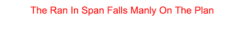
<easel-text
    text="The Ran In Span Falls Manly On The Plan"
    :x="250"
    :y="32"
    font="20px Arial"
    color="red"
>
</easel-text>
 See Live Demo
Align attribute
All visible components can accept an align attribute. The align attribute
defaults to ['left', 'top'].
The field is formatted as [horizontal-alignment, vertical-alignment].
Alignment options:
- horizontal: left, center, right
- vertical: top, center, bottom
The 'easel-text' component has some special alignment options:
- horizontal: start, end, left, right, center
- vertical: top, hanging, middle, alphabetic, ideographic, bottom
These are described in the
whatwg
spec for HTML5 canvases.
Events
All visible components and the canvas itself emit Vue.js events with an event object.
- added - Fired when the component is added to its parent.
- animationend - (easel-sprite only) - Fired when an animation completes.
- change - (easel-sprite only) - Fired when an animation changes.
- click - Fired when the component is clicked or tapped.
- dblclick - Fired when the component is double-clicked or tapped.
- mousedown - Fired when the component is clicked down.
- mouseout - Fired when the mouse leaves a component's hit area.
- mouseover - Fired when the mouse enters a component's hit area.
- pressmove - Fired when the component is dragged.
- pressup - Fired when the component is unclicked.
- removed - Fired when the component is removed from its parent.
- rollout - Fired when the mouse leaves a component's hit area.
- rollover - Fired when the mouse enters a comopnent's hit area.
- tick - Fired many times a second to keep the components in sync. Using this event can impact performance.
Modifiers such as .stop usually work with the events.
These events will be made available in the future.
- drawend
- drawstart
- mouseenter
- mouseleave
- stagemousedown
- stagemousemove
- stagemouseup
- tickend
- tickstart
Pending
These plans are merely dreams:
- Percentages
- Caching shapes
- Pre-load images
- Masks
- Mouse cursors
- Hit areas
There are no plans to implement these features:
- Filters
- BitmapText
- Buttons
- Complex Vector Paths
- MovieClip