vue-accessible-color-picker
An accessible Vue.js color picker component.
Installation
npm install vue-accessible-color-picker
Usage
Register component locally
In a Vue single file component (SFC), import the ColorPicker component and register it via the components property on the Vue instance. You can then use it in the file’s template section.
<template>
  <ColorPicker />
</template>

<script>
import { ColorPicker } from 'vue-accessible-color-picker';

export default {
  components: {
    ColorPicker,
  },
}
</script>
Unstyled component:
If you want to use the unstyled variant of the component, you need to adjust the import statement slightly:
import { ColorPicker } from 'vue-accessible-color-picker/dist/vue-accessible-color-picker-unstyled';
Register component globally
Registering a component globally allows you to use it in all Vue templates without the need to register it via an SFC’s components property first.
In your Vue project’s main.js (i.e. where you call new Vue(…)), import the ColorPicker component and register it with Vue.component.
import { ColorPickerPlugin } from 'vue-accessible-color-picker';

Vue.component('ColorPickerPlugin', ColorPickerPlugin)
Unstyled component:
import { ColorPickerPlugin } from 'vue-accessible-color-picker/dist/vue-accessible-color-picker-unstyled';

Vue.component('ColorPickerPlugin', ColorPickerPlugin)
Documentation
Props
color
-
Description: Sets the color of the color picker. You can pass any valid CSS color string or an object matching the internal color representation for an HSL, HWB, or RGB color.
-
Type:
stringorobject -
Required:
false -
Default:
null -
Usage:
<color-picker color="hsl(270 100% 50% / 0.8)" /><color-picker color="#f80b" /><color-picker :color="{ h: 0.75, s: 1, l: 0.5, a: 0.8 }" /><template> <color-picker :color="color" @color-change="updateColor" /> </template> <script> export default { data() { return { color: 'hsl(270 100% 50% / 0.8)', } }, methods: { updateColor (eventData) { this.color = eventData.cssColor } }, } </script>
visibleFormats
-
Description: A list of visible color formats. Controls for which formats the color
inputelements are shown and in which order the formats will be cycled through when activating the format switch button. -
Type:
array -
Required:
false -
Default:
['hex', 'hsl', 'hwb', 'rgb'] -
Usage:
<color-picker :visible-formats="['hsl', 'hwb']" />
id
-
Description: The ID value will be used to prefix all
inputelements’idandlabelelements’forattribute values. Set this prop if you use multiple instances of thecolor-pickercomponent on one page. -
Type:
string -
Required:
false -
Default:
'color-picker' -
Usage:
<color-picker id="color-picker-1" />
Events
color-change
-
Description: An
inputevent is emitted each time the internal colors object is updated. -
Data: The event emits an object containing both the internal colors object and a CSS color value as a string based on the currently active format.
{ colors: { hex: string, hsl: object, hsv: object, hwb: object, rgb: object, }, cssColor: string, } -
Usage:
<template>
  <color-picker color="hsl(270 100% 50% / 0.8)" @color-change="updateColor" />
</template>

<script>
export default {
  methods: {
    updateColor (eventData) {
      console.log(eventData)
    }
  },
}
</script>
Slots
hue-range-input-label
-
Description: Overrides the content of the hue range input’s
labelelement. The slot content is placed inside aspanelement. -
Default content:
Hue
alpha-range-input-label
-
Description: Overrides the content of the alpha range input’s
labelelement. The slot content is placed inside aspanelement. -
Default content:
Alpha
copy-button
-
Description: Overrides the content of the copy button element.
-
Default content:
Copy color
format-switch-button
-
Description: Overrides the content of the format switch button element.
-
Default content:
Switch format
Browser support
| IE | Edge | Edge (Chromium) | Firefox | Chrome | Safari |
|---|---|---|---|---|---|
| no | 16 | 79 | 55 | 49 | 9.1 |
The component’s browser support is due to the use of CSS custom properties and spread syntax in object literals.
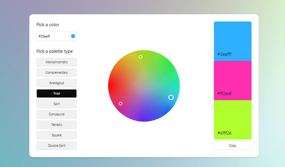
Design
The color picker consists of the following main elements:
-
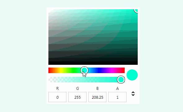
Color space:
For fine-tuning the saturation and lightness/value, a slice of the HSV cylinder for the currently selected hue is shown.
The HSV cylinder is more convenient for this task as it shows a color at 100% saturation and 100% value in the top right corner (i.e. one can drag the color space thumb into the corner as a quasi shortcut). The HSL cylinder’s slice has the this colors at the halfway point of the Y axis (i.e. at 50% lightness) which isn’t easy to hit.
-
Hue slider:
A slider for selecting the current hue. This rotates the HSV cylinder; thus, it changes the slice of the HSV cylinder that’s shown in the color space.
-
Alpha slider:
A slider for selecting the current alpha value.
-
Copy button:
Copies the color formatted as a CSS color string in the active format.
-
Color inputs:
A set of text fields which allow you to enter the individual components of each color. The text fields are shown based on the active format.
-
Switch format button:
Cycles through the available color formats (currently HEX, HSL, HWB, and RGB).