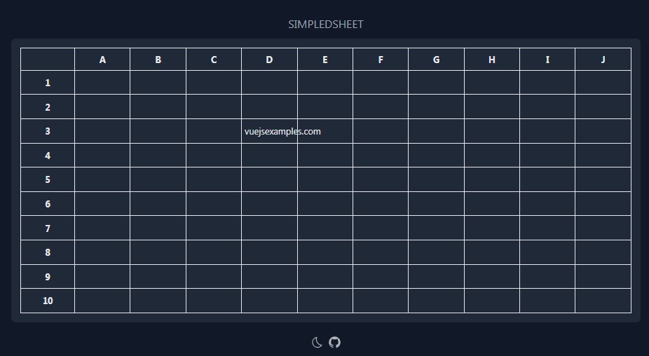
VueJs Spreadsheet
An easier Spreadsheet in Vue.js
Do not hesitate to :star: my repo
Project setup
yarn add vuejs-spreadsheet

npm i vuejs-spreadsheet
<script>
  import VueTable from 'vuejs-spreadsheet';
  export default {
    name: 'app',
    data() {
    },
    components: {
      VueTable,
    },
  };
</script>
Wiki :mortar_board:
| Props | Type | Description |
|---|---|---|
| :tbody-data | Array | That contains data |
| :headers | Array | That contains headers |
| :custom-options | Object | That contains Options |
| :style-wrap-vue-table | Object | That contains style of the wrapper tableVue |
| :disable-cells | Array | That contains the headerKey you want to disable |
| :disable-sort-thead | Array | That contains the disabled th |
| :loading | Boolean | True => Hidden TbodyData / show slot loader |
| :parent-scroll-element | Object | That contains the HTML attribute which overflow-y: scroll (by-default is 'html') |
.... | | That contains a top and left position you want to add to the select
:select-position | Object | That contains a top and left position you want to add to the select
:submenu-tbody | Array | That contains the submenu-tbody
:submenu-thead | Array | That contains the submenu-thead
| Options | Type | Description |
|---|---|---|
| :fuse-options | Object | That contains an object of fuse configuration look on her website: http://fusejs.io/ |
| :new-data | Object | That contains the type of data when you have empty cell in a row |
| :sort-header | Boolean | That activates sort button on header |
| :tbody-index | Boolean | That displays the index of each row on the left of the table |
| :trad | Object | That contains an object of translating |
| Function | Type | Description |
|---|---|---|
| v-on:tbody-change-data | Function | Fired when data undergo modifications |
| v-on:tbody-input-change | Function | When the input changes |
| v-on:tbody-select-change | Function | When the select change |
| v-on:handle-up-drag-size-header | Function | Fired when the header size changed |
| v-on:thead-td-sort | Function | When you press the button sort |
| v-on:tbody-up-dragtofill | Function | Fired when pressed up on dragToFill |
| v-on:tbody-move-dragtofill | Function | Fired when moved on dragToFill |
| v-on:tbody-nav-backspace | Function | When you press backspace on cell (event, actualElement, actualCol, rowIndex, colIndex) |
| v-on:tbody-nav-multiple-backspace | Function | Fired when the multiple cell are delete |
| v-on:tbody-submenu-click-{#} | Function | {#} - Name of the function declared on submenu-tbody |
Example
  <vue-table
    :tbody-data="Array"
    :headers="Array"
    :custom-options="Object"
    :style-wrap-vue-table="Object"
    :disable-cells="Array"
    :disable-sort-thead="Array"
    :loading="Boolean"
    :parent-scroll-element="Object"
    :select-position="Object"
    :submenu-tbody="Array"
    :submenu-thead="Array"
    v-on:tbody-change-data="changeData"
    v-on:tbody-submenu-click-change-color="changeColorTbody"
    v-on:tbody-submenu-click-change-value="changeValueTbody"
    v-on:thead-submenu-click-change-color="changeColorThead"
    v-on:thead-submenu-click-change-value="changeValueThead"
    v-on:thead-td-sort="sortProduct">

    // if your want to add an specific header
    <div slot="header">
      Specific Header
    </div>

    // if your want to add a loader
    <div slot="loader">
      Loader
    </div>
  </vue-table>
Options :honeybee:
  customOptions: {
    dragToFill: true,
    tbodyIndex: true,
    sortHeader: true,
    trad: {
      lang: 'fr',
      en: {
        select: {
          placeholder: 'Search by typing',
        },
      },
      fr: {
        select: {
          placeholder: 'Taper pour chercher',
        },
      },
    },
    newData: {
      type: 'input',
      value: '',
      active: false,
      style: {
        color: '#000',
      },
    },
    fuseOptions: {
      shouldSort: true,
      threshold: 0.2,
      location: 0,
      distance: 30,
      maxPatternLength: 64,
      minMatchCharLength: 1,
      findAllMatches: false,
      tokenize: false,
      keys: [
        'value',
      ],
    },
  },
Headers :tiger:
| Name | Type | Description |
|---|---|---|
| headerName | String | The chosen header name |
| headerkey | String | The Slugify version of the headerName |
| style | Object | The style of the td |
- width         | String  | Indicate the width of ``<th>``
- minWidth      | String  | minWidth must be equal to width
disabled | Boolean | optional - Disabled cell
Example
headers: [
  {
    headerName: 'Image',
    headerKey: 'img',
    style: {
      width: '100px'
      minWidth: '100px'
    },
  },
  {
    headerName: 'Nom',
    headerKey: 'name',
    style: {
      width: '100px'
      minWidth: '100px'
    },
  },
  {
    headerName: 'Prénom',
    headerKey: 'surname',
    style: {
      width: '100px'
      minWidth: '100px'
    },
  },
  {
    headerName: 'Age',
    headerKey: 'age',
    style: {
      width: '100px'
      minWidth: '100px'
    },
  },
  {
    headerName: 'Born',
    headerKey: 'born',
    style: {
      width: '100px'
      minWidth: '100px'
    },
  },
],
Data :honeybee:
| Name | Type | Description |
|---|---|---|
| key | String | The key of the object written in Slugify |
| type | String | The type of data rendered (<textarea>, <img>, <select>) |
| value(img/input) | String | The value of the object in String Type |
| value(select) | Array | The value of the object in Array Type |
| selectOptions | Array | That contains objects {value: ~, label: ~} |
| style | Object | The Style of the cell |
| active | Boolean | Of the cell, false by default |
| handleSearch | Boolean | - Activates search when selected |
| disabled | Boolean | optional - Disabled cell |
Example
products: [
  {
    img: {
      type: 'img',
      value: 'https://via.placeholder.com/350x150',
      active: false,
      disabled: true,
    },
    name: {
      type: 'input',
      value: 'John',
      active: false,
      style: {
        color: '#000',
      },
    },
    surname: {
      type: 'input',
      value: 'Doe',
      active: false,
      style: {
        color: '#000',
      },
    },
    age: {
      type: 'select',
      handleSearch: true,
      selectOptions: [
        {
          value: 'paris',
          label: 'Paris',
        },
        {
          value: 'new-york',
          label: 'New York',
        },
      ],
      value: 'paris',
      active: false,
    },
    born: {
      type: 'select',
      handleSearch: true,
      selectOptions: [
        {
          value: 'france',
          label: 'France',
        },
        {
          value: 'usa',
          label: 'United States of America',
        },
      ],
      value: 'france',
      active: false,
    },
  },
],
New Data :tiger:
Example
Same Object describe on the top
If you choose an input
newData: {
  type: 'input',
  value: '',
  active: false,
  style: {
    color: '#000',
    background: '#cfffcf',
  },
},
submenu :monkey_face:
| Name | Type | Description |
|---|---|---|
| type | String | The type of data rendered (<button> |
| value | String | The value of the function |
| function | String | The name of the function called when you click on the button - Written in Slugify |
| disabled | Array | Each object which you want to hide on the submenu |
| subtitle | String | Of the select |
| selectOptions | Array | That contains objects {value: ~, label: ~} |
| buttonOption | Object | Description |
| . value | String | The value of the button |
| . function | String | The name of the function called when you click on the button - Written in Slugify |
| . style | Object | The style of the button |
Example
  submenuTbody: [
    {
      type: 'button',
      value: 'Change Color',
      function: 'change-color',
      disabled: ['img'],
    },
  ],
  submenuThead: [
    {
      type: 'button',
      value: 'Change Color',
      function: 'change-color',
      disabled: ['img', 'name'],
    },
    {
      type: 'select',
      disabled: ['img'],
      subtitle: 'Select state:',
      selectOptions: [
        {
          value: 'new-york',
          label: 'new-york',
        },
        {
          value: 'france',
          label: 'france',
        },
      ],
      value: 'new-york',
      buttonOption: {
        value: 'change city',
        function: 'change-city',
        style: {
          display: 'block',
        },
      },
    },
  ],
Example :mortar_board: :tiger:
<template>
  <div id="app">
    <vue-table
      :tbody-data="products"
      :headers="headers"
      :custom-options="customOptions"
      :style-wrap-vue-table="styleWrapVueTable"
      :disable-cells="disableCells"
      :disable-sort-thead="disableSortThead"
      :loading="loading"
      :parent-scroll-element="parentScrollElement"
      :select-position="selectPosition"
      :submenu-tbody="submenuTbody"
      :submenu-thead="submenuThead"
      v-on:tbody-change-data="changeData"
      v-on:tbody-submenu-click-change-color="changeColorTbody"
      v-on:tbody-submenu-click-change-value="changeValueTbody"
      v-on:thead-submenu-click-change-color="changeColorThead"
      v-on:thead-submenu-click-change-value="changeValueThead"
      v-on:thead-td-sort="sortProduct">
    <div slot="header">
      Specific Header
    </div>
    <div slot="loader">
      Loader
    </div>
    </vue-table>
  </div>
</template>

<script>

import VueTable from 'vuejs-spreadsheet';

export default {
  name: 'app',
  data() {
    return {
      customOptions: {
        tbodyIndex: true,
        sortHeader: true,
        trad: {
          lang: 'fr',
          en: {
            select: {
              placeholder: 'Search by typing',
            },
          },
          fr: {
            select: {
              placeholder: 'Taper pour chercher',
            },
          },
        },
        newData: {
          type: 'input',
          value: '',
          active: false,
          style: {
            color: '#000',
          },
        },
        fuseOptions: {
          shouldSort: true,
          threshold: 0.2,
          location: 0,
          distance: 30,
          maxPatternLength: 64,
          minMatchCharLength: 1,
          findAllMatches: false,
          tokenize: false,
          keys: [
            'value',
          ],
        },
      },
      submenuTbody: [
        {
          type: 'button',
          value: 'change color',
          function: 'change-color',
          disabled: ['img'],
        },
        {
          type: 'button',
          value: 'change value',
          function: 'change-value',
          disabled: ['img', 'name'],
        },
      ],
      submenuThead: [
        {
          type: 'button',
          value: 'change color',
          function: 'change-color',
          disabled: ['a'],
        },
        {
          type: 'select',
          disabled: ['a'],
          subtitle: 'Select state:',
          selectOptions: [
            {
              value: 'new-york',
              label: 'new-york',
            },
            {
              value: 'france',
              label: 'france',
            },
          ],
          value: 'new-york',
          buttonOption: {
            value: 'change city',
            function: 'change-city',
            style: {
              display: 'block',
            },
          },
        },
        {
          type: 'button',
          value: 'change value',
          function: 'change-value',
          disabled: ['a', 'b'],
        },
      ],
      disableCells: ['a'],
      loading: false,
      parentScrollElement: {
        attribute: 'html',
        positionTop: 0,
      },
      selectPosition: {
        top: 0,
        left: 0,
      },
      disableSortThead: ['a'],
      styleWrapVueTable: {
        color: '15px',
      },
      headers: [
        {
          headerName: 'A',
          headerKey: 'a',
          style: {
            width: '200px',
            minWidth: '200px',
            color: '#000',
          },
        },
        {
          headerName: 'B',
          headerKey: 'b',
          style: {
            width: '200px',
            minWidth: '200px',
            color: '#000',
          },
        },
        {
          headerName: 'C',
          headerKey: 'c',
          style: {
            width: '200px',
            minWidth: '200px',
            color: '#000',
          },
        },
        {
          headerName: 'D',
          headerKey: 'd',
          style: {
            width: '200px',
            minWidth: '200px',
            color: '#000',
          },
        },
        {
          headerName: 'E',
          headerKey: 'e',
          style: {
            width: '200px',
            minWidth: '200px',
            color: '#000',
          },
        },
        {
          headerName: 'F',
          headerKey: 'f',
          style: {
            width: '200px',
            minWidth: '200px',
            color: '#000',
          },
        },
        {
          headerName: 'G',
          headerKey: 'g',
          style: {
            width: '200px',
            minWidth: '200px',
            color: '#000',
          },
        },
      ],
      products: [
        {
          a: {
            type: 'img',
            value: 'https://via.placeholder.com/350x150',
            active: false,
          },
          c: {
            type: 'input',
            value: 'Paris',
            active: false,
            style: {
              color: '#000',
            },
          },
          d: {
            type: 'input',
            value: 'France',
            active: false,
            style: {
              color: '#000',
            },
          },
          e: {
            type: 'input',
            value: 'Boe',
            active: false,
            style: {
              color: '#000',
            },
          },
          f: {
            type: 'select',
            handleSearch: true,
            selectOptions: [
              {
                value: 'Harry Potter',
                label: 'harry potter',
              },
              {
                value: 'Hermione Granger',
                label: 'hermione granger',
              },
              {
                value: 'Ron Whisley',
                label: 'ron whisley',
              },
              {
                value: 'Dobby',
                label: 'dobby',
              },
              {
                value: 'Hagrid',
                label: 'hagrid',
              },
              {
                value: 'Professeur Rogue',
                label: 'professeur rogue',
              },
              {
                value: 'Professeur Mcgonagal',
                label: 'professeur mcgonagal',
              },
              {
                value: 'Professeur Dumbledor',
                label: 'professeur dumbledor',
              },
            ],
            value: 'professeur dumbledor',
            active: false,
          },
          g: {
            type: 'select',
            handleSearch: true,
            selectOptions: [
              {
                value: 1980,
                label: 1980,
              },
              {
                value: 1981,
                label: 1981,
              },
              {
                value: 1982,
                label: 1982,
              },
              {
                value: 1983,
                label: 1983,
                active: true,
              },
              {
                value: 1984,
                label: 1984,
              },
            ],
            value: 1983,
            active: false,
          },
        },
      ],
    };
  },
  components: {
    VueTable,
  },
  mounted() {
    this.loading = true;
    setTimeout(() => {
      this.loading = false;
    }, 300);
  },
  methods: {
    changeData(row, header) {
      console.log(row, header);
    },
    sortProduct(event, header, colIndex) {
      console.log('sort product');
    },
    // callback
    changeColorThead(event, header, colIndex) {
      this.headers[colIndex].style.color = '#e40000';
    },
    changeColorTbody(event, header, rowIndex, colIndex) {
      this.products[rowIndex][header].style = {};
      this.products[rowIndex][header].style.color = '#e40000';
    },
    changeValueTbody(event, header, rowIndex, colIndex) {
      this.products[rowIndex][header].value = 'T-shirt';
    },
    changeValueThead(event, entry, colIndex) {
      this.headers[colIndex].headerName = 'T-shirt';
    },
  },
};
</script>

<style lang="scss">
::-moz-selection {
  color: #2c3e50;
  background: transparent;
}
::selection {
  color: #2c3e50;
  background: transparent;
}
</style>