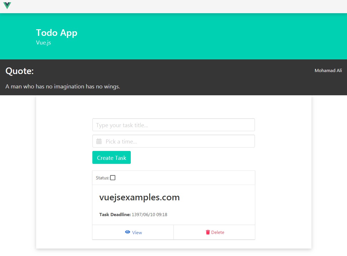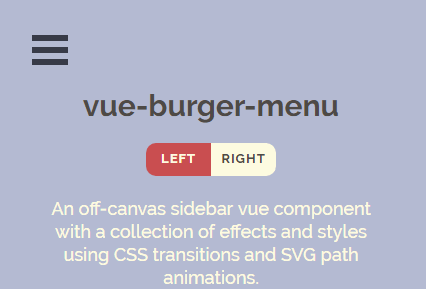
vue-burger-menu
An off-canvas sidebar Vue component with a collection of effects and styles using CSS transitions and SVG path animations.
To build the examples locally, run:
yarn
yarn serve
Then open localhost:8080 in a browser
Installation
npm install vue-burger-menu --save
yarn add vue-burger-menu
Usage
Items should be passed as child elements of the components
import { Slide } from 'vue-burger-menu'  // import the CSS transitions you wish to use, in this case we are using `Slide`

export default {
    components: {
        Slide // Register your component
    }
}
In your template
<template>
    <Slide>
      <a id="home" href="#">
        <span>Home</span>
      </a>
    </Slide>
</template>
Animations
The example above imported slide which renders a menu that slides in on the page when the burger icon is clicked. To use a different animation you can subsitute slide with any of the following
- slide
ATTENTION - the below animations are in WIP
- stack
- elastic
- bubble
- push
- pushRotate
- scaleDown
- scaleRotate
- fallDown
- reveal
Position
The menu opens from left by default. To have it open from the right, use the right prop. It's just a boolean so you don't need to specify a value.
<Slide right/>
Width
You can specify the width of the menu with the width prop. The default is 300px
<Slide width="400">
Open state
You can control whether the sidebar is open or closed with the isOpen prop. This is useful if you need to close the menu after a user clicks on an item in it, for example, or if you want to open the menu from some other button in addition to the standard burger icon. The default value is false
// To render the menu open

<Slide isOpen>
Close on Escape
By default, the menu will close when the Escape key is pressed. To disable this behavior, you can pass the disableCloseOnEsc prop. This is useful in cases where you want the menu to be open all the time, for example if you're implementing a responsive menu that behaves differently depending on the browser width.
<Slide disableEsc />
Overlay
You can turn off the default overlay with noOverlay.
<Slide noOverlay />
Styling
Visual styles (color, font etc) need to be supplied with the help of CSS
CSS
The component has following helper class
 .bm-burger-button {
      position: fixed;
      width: 36px;
      height: 30px;
      left: 36px;
      top: 36px;
      cursor: pointer;
    }
    .bm-burger-bars {
      background-color: #373a47;
    }
    .line-style {
      position: absolute;
      height: 20%;
      left: 0;
      right: 0;
    }
    .cross-style {
      position: absolute;
      top: 12px;
      right: 2px;
      cursor: pointer;
    }
    .bm-cross {
      background: #bdc3c7;
    }
    .bm-cross-button {
      height: 24px;
      width: 24px;
    }
    .bm-menu {
      height: 100%; /* 100% Full-height */
      width: 0; /* 0 width - change this with JavaScript */
      position: fixed; /* Stay in place */
      z-index: 1000; /* Stay on top */
      top: 0;
      left: 0;
      background-color: rgb(63, 63, 65); /* Black*/
      overflow-x: hidden; /* Disable horizontal scroll */
      padding-top: 60px; /* Place content 60px from the top */
      transition: 0.5s; /*0.5 second transition effect to slide in the sidenav*/
    }

    .bm-overlay {
      background: rgba(0, 0, 0, 0.3);
    }
    .bm-item-list {
      color: #b8b7ad;
      margin-left: 10%;
      font-size: 20px;
    }
    .bm-item-list > * {
      display: flex;
      text-decoration: none;
      padding: 0.7em;
    }
    .bm-item-list > * > span {
      margin-left: 10px;
      font-weight: 700;
      color: white;
    }
Browser Support
Chrome and Firefox have full support, but Safari and IE have strange behavior for some of the menus.