REST-ADMIN
An Powerful Admin Dashboard based on Vue.js and Boostrap v4.
REST-ADMIN is trying to make it easier to built an admin dashboard for any backend services. All you need to do is just provide a RESTful api for it.
username:password admin:admin
Screenshots
| - | - |
|---|---|
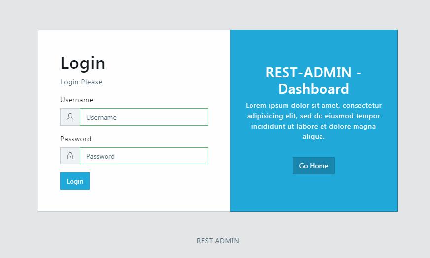
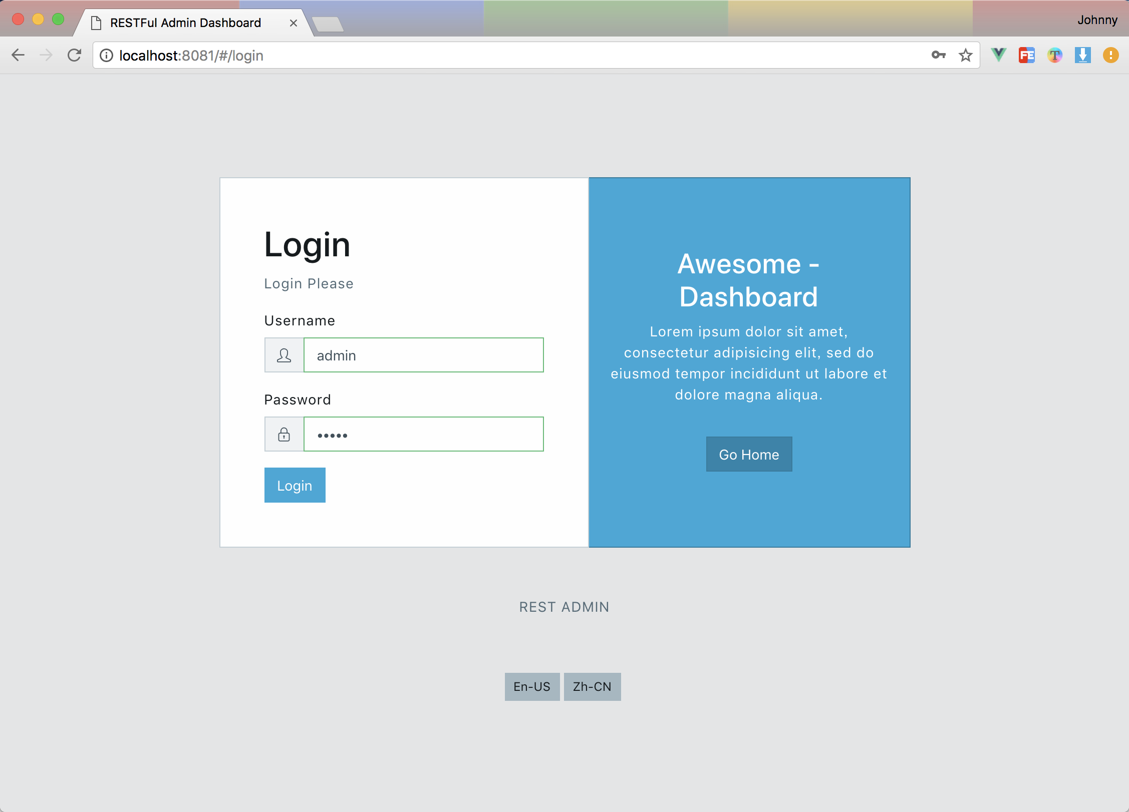 Login Page Login Page |
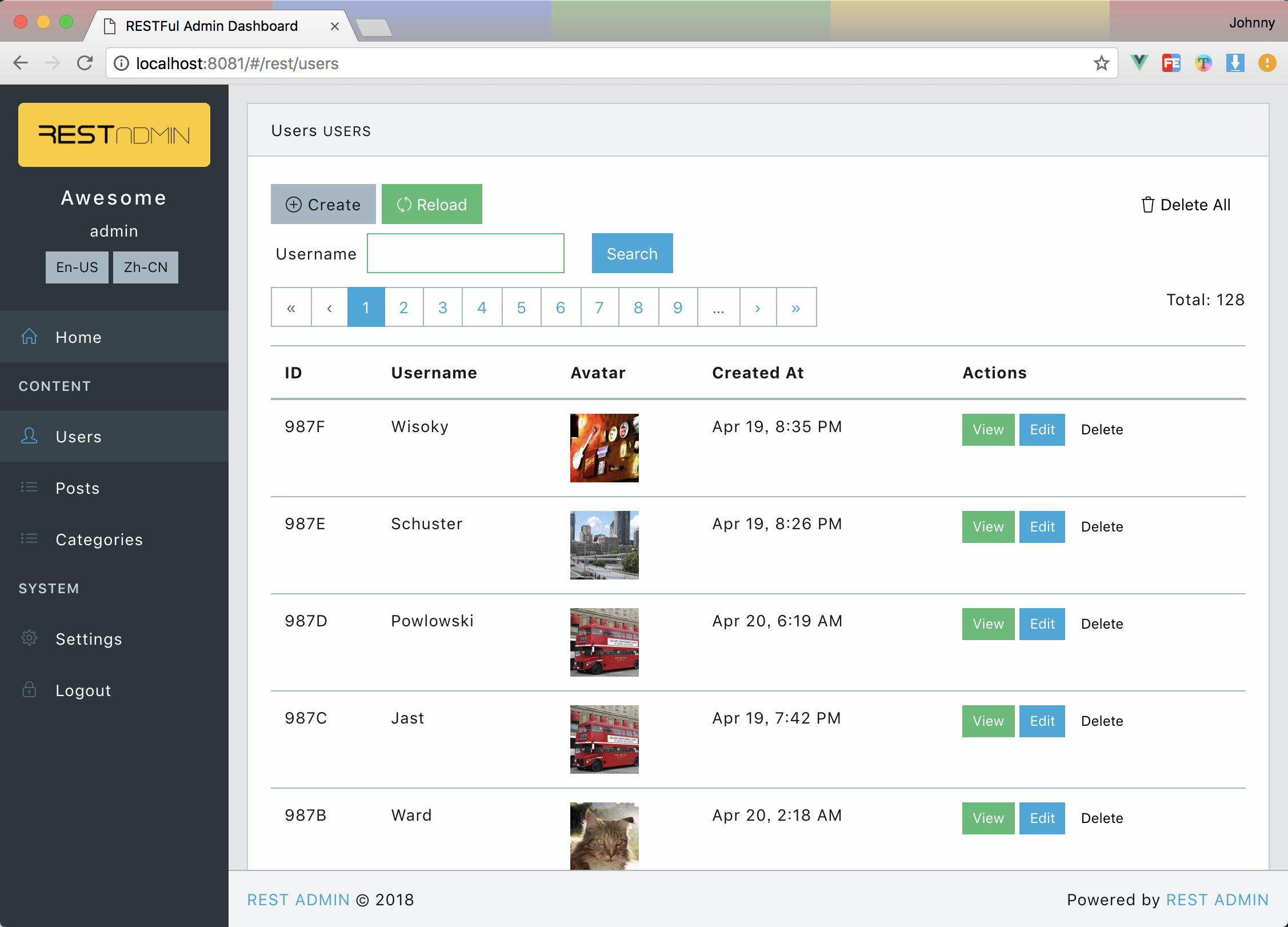 Data Table for users Data Table for users |
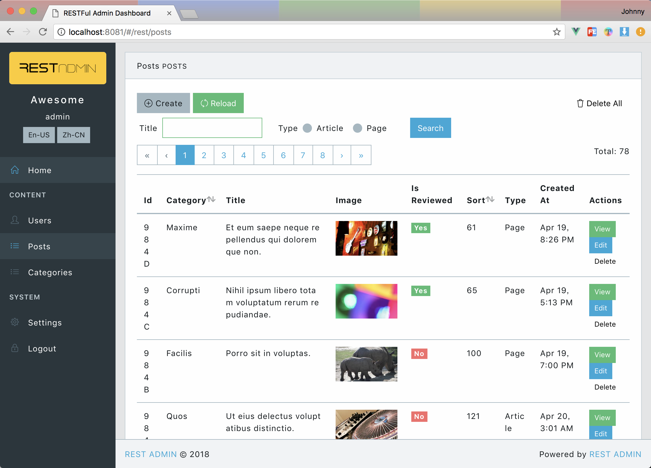 Data Table for posts Data Table for posts |
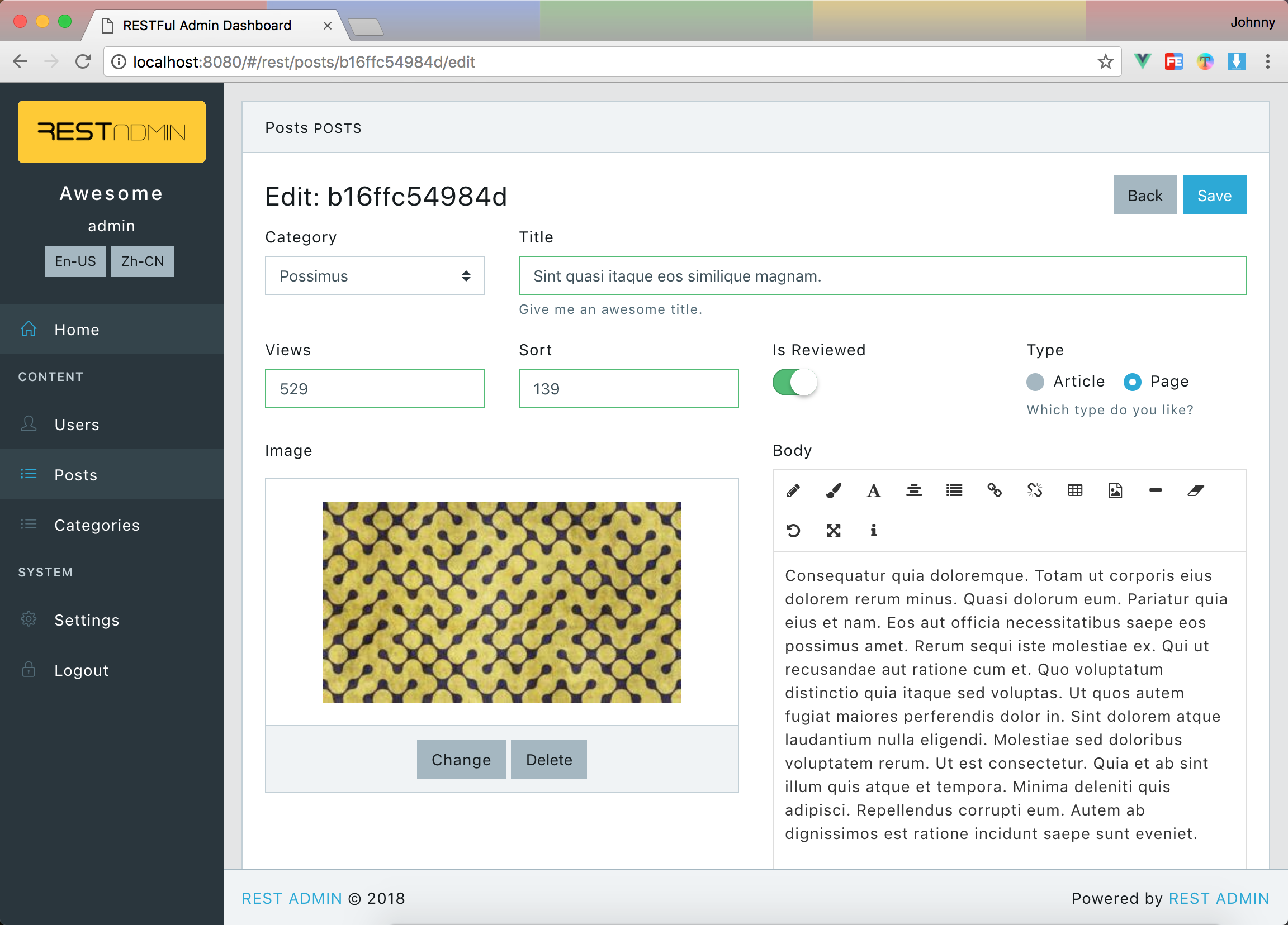 Data Form for post Data Form for post |
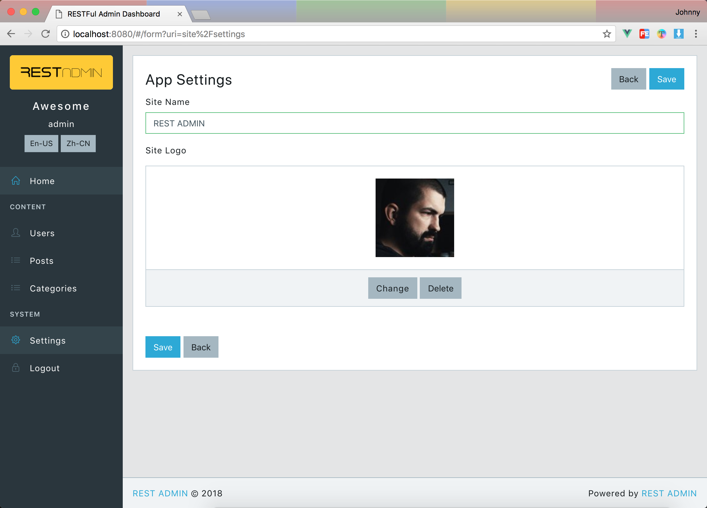 Custom Form Custom Form |
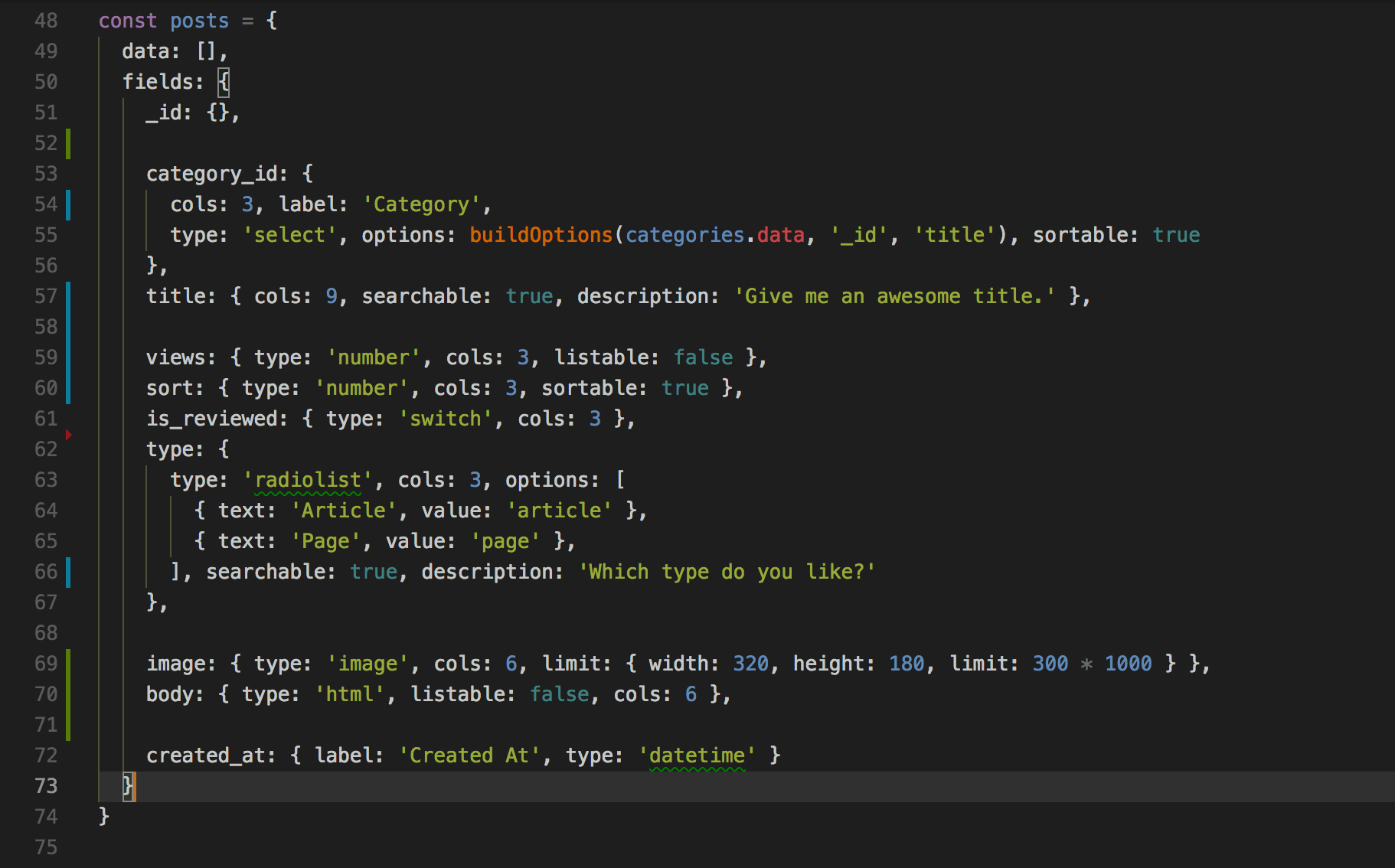 Sample Fields of posts Sample Fields of posts |
Features
- Based on the latest Bootstrap(v4) and Vue.js, it means you can easily change any skin based on bootstrap css framework.
- Plain vue.js project, can be used for any backend restful api.
- Powerful Data Table with sorting, pagination, searching, display images...
- Powerful Data Form Builder can display/edit any value of text, image, boolean...
- Fully support for Resource-based CRUD option.
- English based fully i18n support.
- Highly Configurable site info. Such as: site name, logo, Menu and footer...
- Production ready. It has been used in two projects in our company.
Quick Start
git clone [email protected]:wxs77577/rest-admin.git
cd rest-admin
code . # open with vscode [optional]
npm i # or cnpm i

# start with local test api server
npm run test-api # start test api server
npm run local # start rest admin client
or you have an exists rest api endpot.
API_URI=http://localhost:5555/admin/api/ npm run dev
The default username and password of test-api is
adminandadmin
Build
API_URI=http://localhost:5555/admin/api/ npm run build
Then just copy /dist/admin folder to the anywhere.
There is a built-in restful api based on
expressfor test.
Fields Definition
Used in listing tables and editing forms
Default PRIMARY_KEY field is_id, feel free to change it in/src/config.json
Example:
{
  "_id": { "label": "ID" },
  "title": { "label": "Title" },
  "type": { "label": "Type", "type": "select", "options": [
    { "text": "Vue", "value": "vue" },
    { "text": "React", "value": "react" },
    { "text": "Angular", "value": "angular" },
  ]},
  "body": { "type": "html" },
  "steps": { "type": "array", "fields": {
    "name": { "label": "Name" },
    "date": { "label": "date" }
  }},

  "_actions": { // define table view, it's optional.
    "buttons": { // define buttons as `false` to hide in actions colum
      "delete": false,
      "edit": false
    },
    "toolbar": { // define actions in top toolbar table view
      "extra": [ // add extra buttons
        { "to": "/form?uri=vouchers/generate", "label": "Generate Vouchers" } //properties of `<b-button>`
      ]
    }
  }
}
Field properties
labelTitle for displaycolscolumn width, total is 12.input_colscolumn width of input control.typeField type, accepted values and additional properties for some fields.selectraw html<select>tag from b-select ofbootstrap-vueoptionse.g.[{ "text": "Label", "value": "1" }]
select2vue-select, likeselect2in jQueryoptionse.g.[{ "text": "Label", "value": "1" }]
treevue-treeselectoptionsusetextandvalueinsteadlabelandide.g.[{ "text": "Label", "value": "1", "children": [ { "text": "Item1", "value": "2" } ] }]
datevue2-datepicker supports date rangeswitchA iOS-liked switch componenthtmlAn WYSIWYG html editor from vue-html5-editorarrayArray valuesfieldschild fields definationis_tabledisplay as a table ?
radiolistoptionse.g.[{ "text": "Label", "value": "1" }]
checkboxlistoptionse.g.[{ "text": "Label", "value": "1" }]
checkboxfileFile uploaderlimitdefine file limit options of size in byets, e.g.{ size: 1000000 }
imageImage file uploader with preview.limitdefine file limit options of width height and size in byets, e.g.{ "width": 320, "height": 180, size: 1000000 }
audiolikeimagelimitdefine file limit options of size in byets, e.g.{ size: 1000000 }
videolikeimagelimitdefine file limit options of size in byets, e.g.{ size: 1000000 }
textareanumbertext
required- Any other properties accepted in https://bootstrap-vue.js.org/docs/components/form-input, please notice that every kind of field component has it's own properties.