Vue Collapse Transition
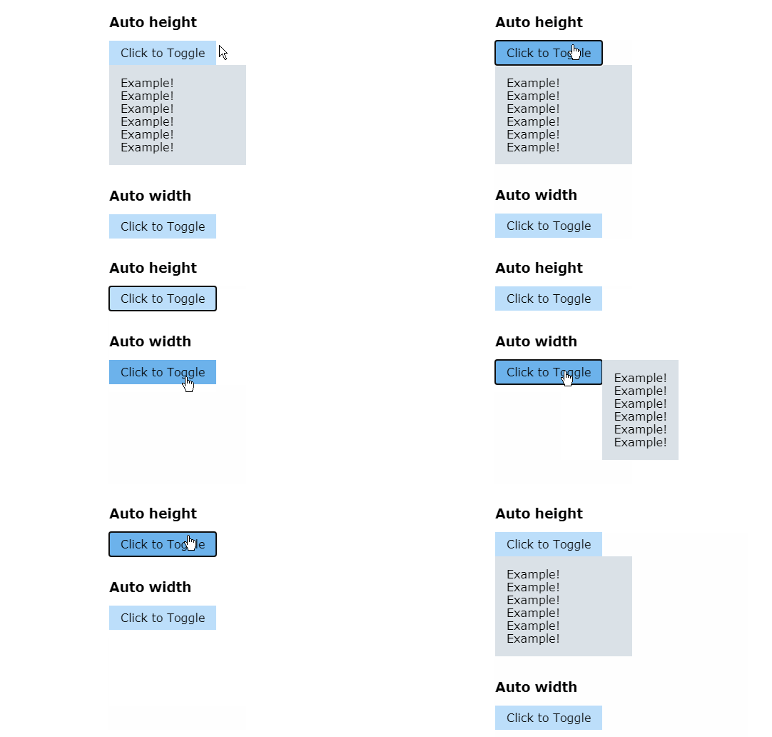
This custom VueJS transition component wraps the built-in transition. It collapses elements horizontally or vertically. Works with both fixed and 'auto' width or height!
? Install
Using NPM:
npm i @ivanv/vue-collapse-transition
Via CDN:
<script src="https://unpkg.com/@ivanv/vue-collapse-transition"></script>
? Usage
Wrap the container you wish to make collapsable with the <collapse-transition> tag.
When you toggle the v-show boolean value, the transition will automatically trigger.
<template>
  <div>
    <button @click="isOpen = !isOpen">
      Toggle
    </button>

    <collapse-transition>
      <div v-show="isOpen">
        This div will open and close smoothly!
      </div>
    </collapse-transition>
  </div>
</template>

<script>
  import { CollapseTransition } from "@ivanv/vue-collapse-transition"

  export default {
    components: {
      CollapseTransition,
    },
    data() {
      return {
        isOpen: false, // closed by default
      }
    }
  }
</script>
It's up to you how you want to position the collapsable element with CSS.
⚙️ Options
☑️ Collapse Vertically or Horizontally
Set the dimension attribute to height or width.
Default: height
<collapse-transition dimension="height">
  <!-- ... -->
</collapse-transition>
If you collapse the width of a container, the content of its children might wrap on new lines. To remedy this, you can either add a fixed height to the children or use the CSS rule
white-space: nowrap.
☑️ Class Names
Vue will also set the usual transition classes. By default, the transition name is collapse, so the classes would be like collapse-enter and collapse-leave-to. You can choose another name if you wish.
<collapse-transition name="slide">
  <!-- ... -->
</collapse-transition>
☑️ Transition Duration
How long should the transition take in milliseconds.
Default: 300
<collapse-transition :duration="300">
  <!-- ... -->
</collapse-transition>
☑️ Transition Easing
The CSS transition-timing-function (easing) to use.
Default: ease-in-out
<collapse-transition easing="ease-in-out">
  <!-- ... -->
</collapse-transition>


