

Vue Collapsed
Dynamic CSS height transition from 0 to auto and vice versa. Accordion ready.
Examples and Demo – Stackblitz
? Requires Vue v3.0.0 or above.
Get Started
npm i -S vue-collapsed
# yarn add vue-collapsed
# pnpm install vue-collapsed
Register it globally:
import { Collapse } from 'vue-collapsed'

createApp(App).component('Collapse', Collapse).mount('#app')
Or import it locally:
import { Collapse } from 'vue-collapsed'
Props
| name | description | type | required |
|---|---|---|---|
when |
Boolean value to control collapse | boolean | ✅ |
as |
Element tag to use instead of div |
keyof HTMLElementTagNameMap | ❌ |
onExpanded |
Callback on expand transition completed | () => void | ❌ |
onCollapsed |
Callback on collapse transition completed | () => void | ❌ |
Usage
All you need is to pass a reactive boolean to when and add a class with an height transition-property:
<template>
  <Collapse :when="isOpen" class="my-class">
    <p>This is a paragraph.</p>
  </Collapse>
</template>

<style>
.my-class {
  transition: height 300ms cubic-bezier(0.3, 0, 0.6, 1);
}
</style>
Auto Duration
Vue Collapsed automatically calculates the optimal duration according to the content height. You can use it by referencing the variable --vc-auto-duration:
.collapse {
  transition: height var(--vc-auto-duration) ease-out;
}
Example – Single Element
<script setup>
import { ref } from 'vue'
import { Collapse } from 'vue-collapsed'

const isOpen = ref(false) // Initial value

function handleCollapse() {
  isOpen.value = !isOpen.value
}
</script>

<template>
  <div>
    <button @click="handleCollapse">This a button.</button>
    <Collapse :when="isOpen" class="collapse">
      <p>This is a paragraph.</p>
    </Collapse>
  </div>
</template>

<style>
.collapse {
  transition: height var(--vc-auto-duration) cubic-bezier(0.3, 0, 0.6, 1);
}
</style>
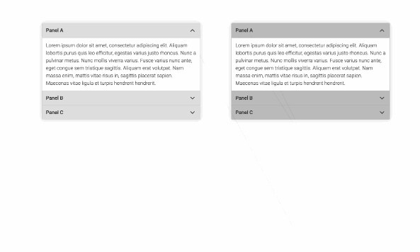
Example – Accordion
<script setup>
import { reactive } from 'vue'
import { Collapse } from 'vue-collapsed'

const questions = reactive([
  {
    title: 'Question one',
    answer: 'Answer one',
    isExpanded: false // Initial value
  },
  {
    title: 'Question two',
    answer: 'Answer two',
    isExpanded: false
  },
  {
    title: 'Question three',
    answer: 'Answer three',
    isExpanded: false
  }
])

function handleAccordion(selectedIndex) {
  questions.forEach((_, index) => {
    questions[index].isExpanded = index === selectedIndex ? !questions[index].isExpanded : false
  })
}

/**
 * For individual control you might use:
 *
 * function handleMultiple(index) {
 *   questions[index].isExpanded = !questions[index].isExpanded
 * }
 */
</script>

<template>
  <div v-for="(question, index) in questions" :key="question.title">
    <button @click="() => handleAccordion(index)">
      {{ question.title }}
    </button>
    <Collapse :when="questions[index].isExpanded" class="collapse">
      <p>
        {{ question.answer }}
      </p>
    </Collapse>
  </div>
</template>

<style>
.collapse {
  transition: height 600ms cubic-bezier(0.3, 0, 0.6, 1);
}
</style>
Example – Callbacks
<script setup>
// ...

const sectionsRef = ref([])

function pushToRef(ref) {
  sectionsRef.value.push(ref)
}

function scrollIntoView(index) {
  sectionsRef.value[index].scrollIntoView({ behavior: 'smooth' })
}
</script>

<template>
  <div v-for="(question, index) in questions" :key="question.title" :ref="pushToRef">
    <button @click="() => handleAccordion(index)">
      {{ question.title }}
    </button>
    <Collapse
      :when="questions[index].isExpanded"
      :onExpanded="() => scrollIntoView(index)"
      class="collapse"
    >
      <p>
        {{ question.answer }}
      </p>
    </Collapse>
  </div>
</template>

<style>
.collapse {
  transition: height 600ms cubic-bezier(0.3, 0, 0.6, 1);
}
</style>
Make it accessible
<script setup>
import { ref, computed } from 'vue'
import { Collapse } from 'vue-collapsed'

const isOpen = ref(false)

const toggleAttrs = computed(() => ({
  'aria-expanded': isOpen.value,
  'aria-controls': 'my-collapse-id'
}))

const collapseAttrs = {
  id: 'my-collapse-id',
  role: 'region'
}

function handleCollapse() {
  isOpen.value = !isOpen.value
}
</script>

<template>
  <div>
    <button v-bind="toggleAttrs" @click="handleCollapse">This a panel.</button>
    <Collapse v-bind="collapseAttrs" :when="isOpen" class="collapse">
      <p>This is a paragraph.</p>
    </Collapse>
  </div>
</template>

<style>
.collapse {
  transition: height 600ms cubic-bezier(0.3, 0, 0.6, 1);
}
</style>
License
MIT Licensed. (c) Simone Mastromattei 2022.