Vue 3 rich accordion component
Demo | Repository | NPM | YouTube
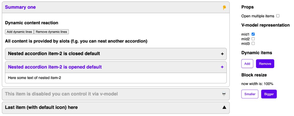
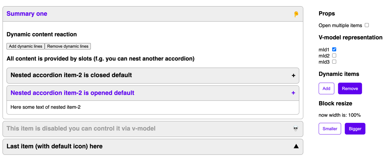
Features
- Zero dependency
- SSR friendly
- Nuxt friendly
- Fully typed with typescript
- Block resize friendly
- v-model controlled
- Default-open feature
- Dynamic content reaction
- Dynamic items allowed
- Animated (optional, controlled by css)
- Exclude closed item's content from tab loop
- All content is provided by slots
- Css fully customizable
- W3C validator passed
Installation
via yarn
yarn add vue3-rich-accordion
or via npm
npm i vue3-rich-accordion
Adding to project
via plugin// ./src/main.ts
import { createApp } from "vue";
import App from "./App.vue";
import { useAccordion } from "vue3-rich-accordion";
import "vue3-rich-accordion/accordion-library-styles.css";
//import "vue3-rich-accordion/accordion-library-styles.scss"; if you wanna to use scss
const app = createApp(App);
app.use(useAccordion);
app.mount("#app");
or you can use via importing sfc
// SomeVueComponent.vue
<script setup>
    import { AccordionList, AccordionItem } from "vue3-rich-accordion";
</script>
Usage
You can see the full example on demo page
Also you can see code example in AccordionSandbox.vue
Props
    interface IAccordionListProps {
    openMultipleItems ? : boolean;      // if true you can open multiple items same time
    state ? : Record<string, boolean>;  // representing list state {"id1": true, "id2": false} - means 1 item is opened and 2 one is closed
    setClosePropertyTime ? : number;    // do not touch if everything is ok. it is used to order closing and animation
}

interface IAccordionItemProps {
    id?: string;                //Custom id. It is the key in the state object of AccordionList
    defaultOpened?: boolean;    // if provided item would be opened by default.
    disabled?: boolean          // is item disabled or not
}
Slots
<AccordionItem>
    <template #summary>Item summary</template>
    <template #icon>☝️</template>
    <h3>Main content</h3>
</AccordionItem>
Customization + Styles
You can use default styles viaimport "vue3-rich-accordion/accordion-library-styles.css";
//import "vue3-rich-accordion/accordion-library-styles.scss"; if you wanna to use scss
You also can clone this files and change for your design
Default icon is described in styles, you can change it via styles customization