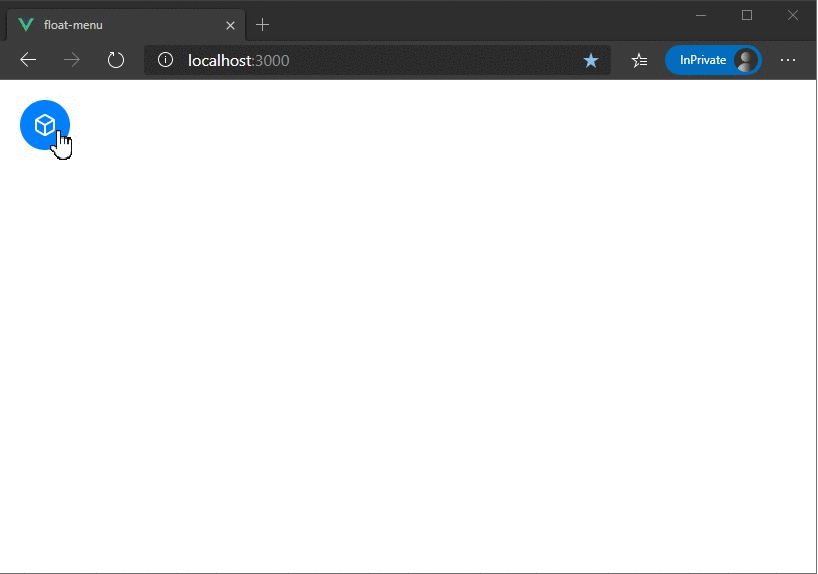
float-menu
Customizable floating menu for Vue 3.
Features
✅ Draggable Menu Handle - Drag and easily place the Menu anywhere on screen.
✅ Smart Menu - Detects the top & bottom edges of the screen and flips the menu automatically.
✅ Smart Placement - The Menu head automatically adjusts itself and always stays inside the viewport.
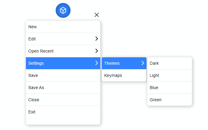
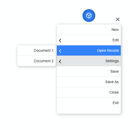
✅ Nested Menus - Support for Nested menus up to any levels. It is always advisable to keep the nesting to a Minimum to have a good UX.
✅ Composition API - Built using the latest Composition API from Vue 3.
⚙ Installation
yarn install vue-float-menu
? Getting Started
float-menu has some great defaults. Please check the props list for details on all available options.
The following snippet sets the default position of the menu as top left and default menu direction as bottom.
  <float-menu
    :position="'top left'"
    :dimension="50"
    :menu="menu"
    menu-direction="bottom"
  >
    <BoxIcon />
  </float-menu>
? Demo
Props
| Prop | Type | Description |
|---|---|---|
| dimension | number | dimension of the Menu Head. |
| position | String | Initial position of the Menu Head. can be any one of the following values top left, top right, bottom left, bottom right |
| fixed | Boolean | Disables dragging and the Menu will be fixed. |
| menu-orientation | String | prop to set the Menu's orientation. can be top or bottom. |
| menu-dimension | Object | prop to set the width and minimum height of the Menu. |
| menu-data | Object | Array data to generate the nested menu's. |
| on-selected | Function | Hook that is called on selection. |
| flip-on-edges | Boolean | Flips the Menu content automatically, when there is no space to display nested menus. |
Dimension
dimension prop can be used to set the width and height of the menu head. The prop takes a single number value to set the height and width of the Menu Head.
  <float-menu :dimension=50>
    <BoxIcon />
  </float-menu>
Position
The position prop can be used to set the initial position of the Menu Head. The prop can accept any one of the following values.
top left(default)top rightbottom leftbottom right
  <float-menu :dimension=50 :position="'bottom right'">
    <BoxIcon />
  </float-menu>
Fixed menu
To disable dragging and make the Menu Head static, set fixed to true. This prop is disabled by default.
  <float-menu :dimension=50 :position="'bottom right'" :fixed="true">
    <BoxIcon />
  </float-menu>
Menu orientation
sets the default menu orientation. can be set to either top or bottom.
  <float-menu :dimension=50 :position="'bottom right'" menu-orientation="bottom">
    <BoxIcon />
  </float-menu>
Menu head dimension
prop to set the height and width of the menu.
  <float-menu
    :dimension=50
    :position="'bottom right'"
    :menu-dimension="{height: 400, width: 300}">
    menu-orientation="bottom"
    <BoxIcon />
  </float-menu>
menu-data
This prop is used to create the nested menu structure. prop accepts an Array of type MenuItem
MenuItem type
type MenuItem {
  name: string;
  subMenu?: `Menu`;
  id?: string;
  showSubMenu?: boolean;
  selected?: boolean;
}
| property | description |
|---|---|
| name | display name of the menu item. |
| id | unique id of each menu item. this is auto generated by the component. |
| selected | flag to highlight a sub-menu selection. |
| showSubMenu | flag to show/hide the sub-menu. |
| subMenu | data for the sub-menu |
Menu type
type Menu = {
  items: MenuItem[];
};
| property | description |
|---|---|
| items | collection of menu items |
  <float-menu
    :dimension=50
    :position="'bottom right'"
    :menu-dimension="{height: 400, width: 300}"
    :menu-data="{ items: [{ name: 'File' }, { name: 'Open' }, { name: 'Themes', subMenu: { items: [{  name: 'Dark' }]}}]}"
    menu-orientation="bottom">
    <BoxIcon />
  </float-menu>
on-select
hook for the menu item selection event.
  <float-menu
    :dimension=50
    :position="'bottom right'"
    :menu-dimension="{height: 400, width: 300}"
    :menu-data="{items: [{name: 'File'}, {name: 'Open'}]}"
    on-select="handleSelection"
    menu-orientation="bottom">
    <BoxIcon />
  </float-menu>
Auto flip on edges
setting this prop flips the menu content on the right edges of the screen. This is useful you have nested menus of many levels.
  <float-menu
    :dimension=50
    :position="'bottom right'"
    :flip-on-edges
    on-select="handleSelection"
    menu-orientation="bottom">
    <BoxIcon />
  </float-menu>
Custom icon
To customize the Menu Icon, simply pass any content in between the float-menu tags. Here we render a custom icon.
  <float-menu
    :dimension=50
    menu-orientation="bottom">
    <BoxIcon />
  </float-menu>
  <float-menu
    :dimension=50
    menu-orientation="bottom">
    Click Me
  </float-menu>