Vue Data Table
Data Table package with server-side processing and VueJS components. Build fast any complex table based on a JSON template.

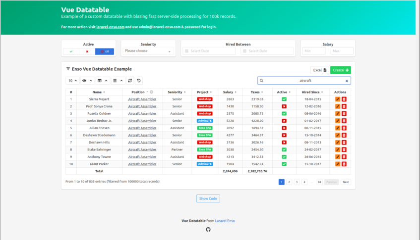
click on the photo to view a short demo in compatible browsers

Features
- efficient server side data loading
- multi-column searching
- multi-column sorting
- configurable pagination
- user customizable column visibility
- configurable action buttons
- beautiful tag rendering for boolean flags
- can display and format numbers as money values, and the formatting can be customized via the template
- full customization via the use of scoped slots for your columns
- smart resizing & auto-hide based on screen width. Data is still accessible under an optional child row
- tooltips for columns/rows
- front-end translations for labels and even data
- configurable, on-the-fly view modes: compact, striped, bordered, hover
- configurable column alignment from the template left / center / right
- preferences/state save for each table in the browser's localStorage
- server-side Excel exporting of the table data, using your current sorting and filtering choices, with email delivery and optional push notifications
- reloading of data on demand
- smart management of huge datasets, with configurable limit
- posibility to define actions that apply to the entire, filtered, dataset
- Enso Enum computation
- Laravel accessors for the main query model
- the configuration template for each table has been designed to be as light and straightforward as possible without losing
out on features - thorough validation of the JSON template with developer friendly messages, in order to avoid misconfiguration issues
- can be used independently of the Enso ecosystem
In the future
- PDF export alongside the XLSX report
Considering
- editable table cells, with input, date-picker, select, checkbox support
Installation
Enso
If you're using Laravel Enso, this package is already included,
so no further installation is required
Independently
Note: the following steps assume you have some experience with Laravel and VueJS.
Outside of Laravel Enso, the following dependencies are required:
- Bulma for styling
- Axios for AJAX requests
- Lodash for debounce
- Font Awesome 5 for the icons
- Akryum v-tooltip for displaying tooltips
- Css element queries - resize detector for responsiveness
- accounting.js for formatting numbers as money values
Next:
-
composer require laravel-enso/vuedatatableto pull in the package and its dependencies -
php artisan vendor:publish --tag=enso-assetsto publish resources -
php artisan vendor:publish --tag=vuedatatable-configto publish the configuration file -
import, include, setup the resources and dependencies
import axios from 'axios';
import VueTable from './components/enso/vuedatatable/VueTable.vue';
import Toastr from './components/enso/bulma/toastr';

import fontawesome from '@fortawesome/fontawesome';
import FontAwesomeIcon from '@fortawesome/vue-fontawesome';

Vue.component('fa', FontAwesomeIcon);

Vue.use(Toastr, {
    position: 'right',
    duration: 3000,
    closeButton: true,
});

window.axios = axios;
Note on Font Awesome: Each icon used in the datatable should be available (imported) in the page/component where
vue-table is used, for example:import { faSearch, faSync, faAngleDown, faInfoCircle } from '@fortawesome/fontawesome-free-solid/shakable.es'; fontawesome.library.add(faSearch, faSync, faAngleDown, faInfoCircle);Please read the official Font Awesome
documentation for further details. -
Create the JSON table configuration template.
Example: exampleTable.json
-
Create the table controller which defines the query and gives the path to the JSON template
class UserTableController extends Controller
{
    use Datatable, Excel;

    protected $tableClass = UserTable::class;
}
Example: TableController.php
-
Create the table builder class, which must extend the abstract
Tableclass, set the$templatePathvariable
and implement thequerymethodclass UserTable extends Table { protected $templatePath = __DIR__.'/../Templates/users.json'; public function query() { return User::select(\DB::raw( 'users.id as "dtRowId", owners.name as owner, users.first_name, users.last_name, users.phone, users.email, roles.name as role, users.is_active' ))->join('owners', 'users.owner_id', '=', 'owners.id') ->join('roles', 'users.role_id', '=', 'roles.id'); } }Example: ExampleTable
-
Declare the route in your route file, to present your controller's methods
Route::get('init', 'TableController@init')->name('init');
Route::get('data', 'TableController@data')->name('data');
Route::get('exportExcel', 'TableController@exportExcel')->name('exportExcel');
Full example: web.php
-
Place the vuedatatable
VueJScomponent in your page/component:<vue-table class="box" path="administration.users.initTable" id="users"> </vue-table>Example: index.blade.php
Usage
The Vue Data Table component works by pulling its configuration through an initialization request.
After loading its configuration through that first request, it makes another request for pulling in its data,
based on its configuration.
If UI changes occur that require the reload of the data (such as when searching, sorting, etc) or the loading of
additional data, such as when changing to the next page of results, another request for data is made.
This means that the configuration is not re-read as long as the component is not re-drawn.
For the data editor functionality (N/A), separate requests will be used.
Note: In order to make the above requests, named routes are required.
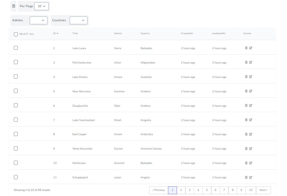
Configurable huge resultset management
When you have huge resultsets, the table component will take longer to respond to the user input. In order to improve
the user experience, when we have more results than the limit set in the configuration (in the fullInfoRecordLimit key),
the back-end builder no longer computes the number filtered and any totals for that table.
However, a blue information icon becomes available in the list of table buttons, that allows the user to
request this computed information.
Since this is an extreme case with tables this big and is a seldom situation, the configuration for the limit is global.
Configuration
The package comes with with a publishable configuration file which you may update in order to fit your
project requirements. The various options are explained below.
return [

    'validations' => 'local',
    'labels' => [
        'crtNo'   => '#',
        'actions' => 'Actions',
    ],
    'lengthMenu' => [
        10, 15, 20, 25, 30,
    ],
    "method": "GET",
    'buttons' => [
        'global' => [
            'create' => [
                'icon' => 'plus',
                'class' => 'is-success',
                'routeSuffix' => 'create',
                'event' => 'create',
                'action' => 'router',
                'label' => 'Create',
            ],
            'excel' => [
                'icon' => 'file-excel',
                'class' => null,
                'routeSuffix' => 'exportExcel',
                'event' => 'export-excel',
                'action' => 'export',
                'label' => 'Excel',
            ],
            'action' => [
                'icon' => 'check',
                'class' => null,
                'routeSuffix' => 'action',
                'event' => 'custom-action',
                'postEvent' => 'custom-action-done',
                'action' => 'ajax',
                'method' => 'PATCH',
                'label' => 'Action',
            ],
        ],
        'row' => [
            'show' => [
                'icon' => 'eye',
                'class' => 'is-success',
                'routeSuffix' => 'show',
                'event' => 'show',
                'action' => 'router',
            ],
            'edit' => [
                'icon' => 'pencil-alt',
                'class' => 'is-warning',
                'routeSuffix' => 'edit',
                'event' => 'edit',
                'action' => 'router',
            ],
            'destroy' => [
                'icon' => 'trash-alt',
                'class' => 'is-danger',
                'routeSuffix' => 'destroy',
                'event' => 'destroy',
                'action' => 'ajax',
                'method' => 'DELETE',
                'message' => 'The selected record is about to be deleted. Are you sure?',
                'confirmation' => true,
                'postEvent' => 'destroyed',
            ],
            'download' => [
                'icon' => 'cloud-download-alt',
                'class' => 'is-primary',
                'routeSuffix' => 'download',
                'event' => 'download',
                'action' => 'href',
            ],
        ],
    ],
    'style' => [
        'default' => [
            'striped', 'hover', 'bordered', 'center',
        ],
        'mapping' => [
            'left' => 'has-text-left',
            'center' => 'has-text-centered',
            'right' => 'has-text-right',
            'compact' => 'is-narrow',
            'striped' => 'is-striped',
            'bordered' => 'is-bordered',
            'hover' => 'is-hoverable',
        ],
    ],
    'export' => [
        'path' => 'exports',
        'limit' => 20000,
        'maxExecutionTime' => 100,
        'notifications' => ['broadcast', 'database'],
    ],
    'dateFormat' => 'd-m-Y',
    'fullInfoRecordLimit' => 100000,
];
validations
is a string, values may be always/local, default local. When parsing the template, the given options are validated because we want to avoid misconfiguration leading to unexpected results. It makes sense to run the validator just during development, however, if you want to also run it in production, you may configure that here.
labels
is an array of options for the header names of the implicit columns. Note that these labels are also translated if a translation function is given to the VueJS component, through the i18n parameter. Options:
crtNois the current line number, default#actions, is the last table column that contains the row's buttons, defaultActions
lengthMenu
is an array of numbers, default [10, 15, 20, 25, 30] representing the pagination options for the table. For each table's JSON template, the lengthMenu parameter is also available, and, if given, it will have higher priority over the global configuration. This allows for some tables to have a different pagination than the default.
method
is a either "GET" or "POST". If you're working with larger tables sometimes the URI can get too long and you may run in a 414 Exception. This option allows to configure the request method for fetching data in a local table, and if is given it will have higher priority over the global configuration.
buttons
is an array of button configurations, with 2 types:
global, these buttons are the buttons that are rendered above the search input, global for the whole table, which do not depend on the data of a particular row. Defaults:create, button for creating a new resourceexcel, button for exporting the contents of the table. Note: The export process takes into account your current sorting and filtering.
row, these are the buttons rendered in theactioncolumn, and defaults include:
show,edit,destroy,download
style
is an array of style configurations, with 2 sections:
default, array of classes, default is['striped', 'hover', 'bordered', 'center'], that are applied by default for all tables. Note that you should set only one alignment specific class in the default.mapping, array of configurations for the styles. While designed for/with Bulma, you may specify here custom classes in order to personalize your tables
export
is an array of configuration options for exporting the contents of a file. Note: The export process takes into account your current sorting and filtering. Available options:
path, string, folder where the temporary export file is saved, defaultexports. This folder is expected to reside instorage/applimit, number, the maximum limit of results that are exported, default 20000. You may want to tweak this depending on the time the export takes, the size of the file, etc.maxExecutionTime, number, max number of seconds for the php script to run, before it times out. You may need to adjust this depending on how big your reports are.notifications, array of notification options, default['broadcast', 'database']. Note that
email notifications are always used for sending the actual export file, so you should take into account email attachment size and mail server timeout / other limitations when choosing values for the export.
dateFormat
is a string, with the date format for date columns, which will be used when displaying date values
fullInfoRecordLimit
is a numeric limit, representing the top resultset limit when the computation of the filtered & totals functionality
becomes disabled by default and is made avaible on-demand.
Template
{
    "routePrefix": "route.prefix",
    "readSuffix": "read.suffix",
    "writeSuffix": "write.suffix",
    "name": "Table Name",
    "icon": "list-alt",
    "crtNo": true,
    "auth": false,
    "lengthMenu": [10, 15, 20, 25, 30],
    "method": "POST",
    "appends": ["customAttribute"],
    "buttons": [
        "show", "create", "edit", "destroy", "download", "exportExcel",
        {
            "type": "row",
            "icon": "bell",
            "class": "has-text-purple",
            "routeSuffix": "custom",
            "event": "custom-event",
            "action": "router",
            "fullRoute": "optional.full.route",
            "label": "Button Label",
            "confirmation": false,
            "message": "Are you sure?",
            "method": "GET/PUT/PATCH/POST/DELETE",
            "params": {
                "first": "foo",
                "second": "bar"
            }
        }
    ],
    "columns": [
        {
            "label": "Name",
            "data": "table.column",
            "name": "columnAlias",
            "meta": ["searchable", "sortable", "translation", "boolean", "slot", "rogue", "editable", "total", "date","icon", "clickable", "tooltip"],
            "enum": "EnumClass",
            "tooltip": "My Tooltip Column Detail",
            "class": "is-custom-class",
            "align": "right",
            "money": {
                "symbol": "$",
                "decimal": ".",
                "thousand": ",",
                "precision": 2,
                "format": "%s%v"
            }
        }
    ]
}
Options:
routePrefix, required, string, the common route segment, used for both read and write (N/A)readSuffix, required, string, the route endpoint, that gets concatenated to theroutePrefixwriteSuffix, optional, string, the route endpoint, that gets concatenated to theroutePrefix.
This is only needed when using the editor (N/A).name, optional, string, the title used for the table.icon, optional, string or array of strings, expects Font Awesome icon classes
(make sure the used class is avaible in the page, via a local or global import)crtNo, optional, boolean, flag for showing the current line numberauth, optional, boolean, flag for removing auth when using in enso contextlengthMenu, optional, array, list of options for the table pagination. If missing, the default values in the
global configuration are used. If given, the template values have higher precedence over the global configurationmethod, optional, string, either "GET" or "POST". If missing, the default value in the
global configuration is used.appends- optional, array, list of appended attributes that need to be added to the query results.
Note that the appended attributes are available from the main query model.
Also note, that in order the if the appended attributes use any of the model's relationships,
the raw table query should also select the id as id (this is a Laravel requirement).buttons, optional, array, list of buttons that need to be rendered. See below for more in-depth informationcolumns, required, array, list of column configurations. See below for more in-depth informationdebounce, optional, number, the time in milliseconds that is used for the debounce when reloading data for the table,
for example when typing in the search box or changing filters, default100
Buttons
There are several type of buttons, depending on how you classify them.
By configuration:
simple, declared as a string, representing one of the string buttons from the config.
Example:"show", "create", "edit", "destroy", "download", "exportExcel"complex, declared as an object, with several attributes.
By position:
row, buttons that are rendered on each row, in the actions column.
Example:"show", "edit", "destroy", "download", or custom buttons with thetype:"row"configuration.global, buttons that are rendered above the search input, at the top of the table VueJS component.
Example:"create", "exportExcel", or custom buttons with thetype:"global"configuration.
By action:
router, buttons that trigger an action/navigation through the VueJS router,"action": "router"href, buttons that trigger an action/navigation through a plain HTML linkexport, buttons that trigger an exportajax, buttons that trigger an ajax request.
The configuration options for buttons are, as follows:
type: required, string, available options arerow/globalicon: required, string, expects Font Awesome icon classes (ensure classes are available in the page)class: required, string, expects CSS styling classesrouteSuffix: optional, string, if given, gets appended to theroutePrefixparamevent: optional, string, the name of an event that is emitted on click, which allows for custom in-page handling,
outside of the tablepostEvent: optional, string, the name of the event that is emitted after the completion of the ajax request
(only applies to ajax type of buttons)action: optional, string, available options arerouter/href/export/ajax.
Depending on the chosen options, other parameters could be requiredfullRoute: optional, string, if given, is used independently from theroutePrefixparamlabel: optional, string, should be given only for global buttonsconfirmation: optional, boolean, flag for showing a confirmation modal before processing the action, such as deletionmessage: optional, string, used in conjunction withconfirmation, when you want to customize the modal's messagemethod: optional, string, should be given if you haveactionset asajax,
available options are:"GET"/"PUT" /"PATCH" /"POST" /"DELETE"params: optional, object, used if action =router, object is added to route params object
Columns
The columns configuration attribute is required, and expects an array of configuration objects.
Each configuration object may have the following attributes:
label, required, string, the column name used in the table header. This will be translated if a translation function
is available.data, required, string, the table + column wherefrom data gets pulled, in the query. For example 'users.email'name, required, string, the alias for that column's data, given in the select queryenum, optional, string, the class name of the enumeration used to transform/map the values of that column/attribute.
For example, you may use this mechanism to show labels instead of integer values, for an attribute that holds
the type for a model/table.tooltip, optional, the text used for this column header's tooltipclass, optional, will be applied on the tables<td>align, optional, a value in ["left", "center", "right"], will be applied to the column including header and footer. It has higher priority than the global templatealignattributemeta, optional, array of string tags/options, allowing further transformations:searchable, optional, marks this column as searchable. If not searchable, a column is not used when
using the table search functionalitysortable, optional, marks this column as sortable. If not sortable, the controls to sort are
not available for sortingtranslation, optional, marks this column's values as translatable.
Thei18nparameter translation function should be given to the VueJS table component in order for this to workboolean, optional, marks this column as boolean, which means it will be rendered as suchslot, optional, renders a scoped slot for the named after the specified column, exposing as propscolumn(object),row(array) andloading(boolean)rogue, optional, marks this column as a rogue column. This marks the column as hidden for display,
while still being available and used for searchingeditable, optional, marks this column as editable (N/A)total, optional, if flagged, calculates a total for this columnrender, optional, flags this column for custom rendering, allowing for unlimited customization
of the data in this column.
The column name and the whole row data are available as function parameters, and the render function should return HTMLdate, optional, marks the data of the column as dates,icon, optional, if given, it renders a Font Awesome 5 icon as contents, using the 'column.icon' as the icon's classclickable, optional, flags the column as clickable, which means it makes it - you guessed it - clickable.
When clicked, it emits theclickedevent, with the column & row as event payload
money, optional, object, is the configuration object used for formatting numbers as money values.
Since this is achieved via the accounting.js library, you should take a look at its documentation
here
The VueJS Component
The VueTable component takes the following parameters:
id, required, string, identification for this table, is used to store the preferences in the browser's local storagepath, required, string, the URI for the table initialization requestfilters, optional, object, reactive options that, if available, are sent along with the getTableData request and
are used to filter results. Note that the selected values for the filters may be a value or an array
(in which case aWHERE INlogic is applied when filtering)params, optional, object, reactive parameters, that, if available, are sent along with the getTableData request and
are be used to filter resultsintervals, optional, object, reactive parameters, that, if available are used for interval filtering of the resultsi18n, optional, function, that is used for translating labels, headers, and table data
The default value (function) for this parameter simply returns its argument as the translated value if used outside of
Enso while within Enso it will use it's translation function.
Examples:
filters- reactive object of the following format"filters": { "table": { "field_1" : '', "field_2" : '', } }params- extra parameters sent to the back-end for custom logic / queries"params": { "orders": { dispatched: '' } }intervals- wheredbDateFormatis REQUIRED if the filter values are dates. The given format has to match the database date format"intervalFilters": { "table":{ "created_at": { "min":"value", "max":"value", "dbDateFormat": "Y-m-d" }, "amount": { "min": 0, "max": 1000 } } }
The Events
For integration with other in-page components, the datatable component can emit serveral events,
depending on the configuration:
draw, with no payload, after each retrieval of the table data, such as when first loading the initial chunk,
when loading the next 'page' of data, when reloading after a filter has changed, etc.input, with the search input as payload, when using the search boxupdate-length, with the selected length, when changing the pagination lengthupdate-visibility, with no payload, when changing the columns visibilityreload, with no payload, when reloading the tablereset, with no payload, when resetting the table preferencesrequest-full-info, with no payload, when clicking on the button that load all information for a table working with a huge data setclicked, with the column and the whole row as payload, when clicking on a clickable table cell,
as configured in the template (also see the Columns section above)- custom events, with no payload, for
ajaxtype of buttons,
as configured in the template (also see the Buttons section above). - custom events, with the whole row the button is positioned on as payload,
for buttons that have a meta event property (the even name is the property value)
The query
In your TableBuilder implementation, the query must look like this:
public function query()
{
    return Owner::select(\DB::raw('id as "dtRowId", id, name, description, is_active, created_at'));
}
Keep in mind that at this stage, we're returning a QueryBuilder not a collection of results.
If you need custom logic based on the request you have a request() getter available in the TableBuilder.
Further Examples
You may see the vue data table in action, with the code for the Owners page, right here:
- data controller
- table template
- front-end vue page
- live result (if you're not already logged in, use
[email protected]andpassword)
Feel free to look around at the various packages in the laravel-enso repository, to find more examples.
Actions
While you may have action buttons on each table row, sometimes you may wish to have custom actions, for the entire
resultset of the table.
It is important to note that the action will be applied for ALL the FILTERED results,
even the ones that might not be visible on the current page of the table (if there is more than one page).
In-depth example
In order to achieve this functionality, we've included an example below,
where we add a new button for the owners table:
-
Update your table JSON template, to include the button(s) for the action(s)
...
"buttons": [
        "excel", "create", "edit", "destroy",
        {
            "type": "global",
            "icon": "check",
            "class": null,
            "routeSuffix": "myAction",
            "event": "custom-action",
            "postEvent": "custom-action-done",
            "action": "ajax",
            "method": "PATCH",
            "label": "My Action"
        }
]
...
Customize the attributes as required, keeping in mind:
- the method should match the action performed and needs to be the same as when defining the route
- the suffix is what you'll need to use when defining the route (more on that below)
Note that, if needed, you may define several buttons in a similar fashion.
-
Add a new
Actionimplementation class, where you actually process the results.class OwnerMyAction extends Action { public function process() { \Log::info($this->data()); } }This needs to extend the abstract
LaravelEnso\VueDatatable\app\Classes\Actionclass,
and implement theprocessmethod.
The process method will be called for each available chunk of data, and the respective chunk is retrieved via
the publicdatamethod.The
datamethod will return an array of the IDs in a chunk.Depending on your requirements, you may do the processing here or even generate jobs that will do the processing
asynchronously. -
Add a new controller for the action
class OwnerMyActionController extends Controller
{
    use Datatable, Action;

    protected $tableClass = OwnerTable::class;
    protected $actionClass = OwnerMyAction::class;
    protected $chunk = 2;
}
The controller manages the VueJS component's action request.
You require:- the
DatatableandActiontrait - the
$tableClassvariable, for the query - the
$actionClassvariable, for your particular action implementation (from step 2) - the
$chunkvariable is optional, and represents the number of results in a chunk of data,
the maximum available at any time, within theprocessmethod of your action implementation.
Be default, a chunk of1000is used if the variable is missing.
Note that you may also reuse your TableController if you prefer and have only one 'action' for a given table.
Additional Advanced Details
The
Actiontrait defines anactionmethod that is a bit of a wrapper, and looks like this:public function action(Request $request) { (new $this->actionClass()) ->request($request->all()) ->class($this->tableClass) ->chunk($this->chunk ?? 1000) ->run(); }If for any reason you want to handle more than one action through the same controller,
you may declare multiple actionClasses, create multiple action methods that achieve the same process as the above,
and, in conjuction with the proper routes, it can be done. - the
-
Add the new route
Route::patch('myAction', 'OwnerMyActionController@action')
                            ->name('myAction');
Remember to place the route nested correctly, considering the possible uri and route name prefixes,
as well as the controller namespace.In this example, the url called for the Owners table will be 'administration/owners/myAction' and
the name of the route will be 'administration.owners.myAction'. -
Create the new permission
Navigate in the app tosystem/permissionsand add the newadministration.owners.myActionpermission. -
That's it.
The default action button
If you take a look the package config file, you'll notice that there already is a global action button defined.
If you want to use it, you make skip the definition of a button at #1 step above, instead just declare "action"
and continue with the other steps, taking into account the
changed suffix (the route and permissions need to be altered).
Defining reusable action buttons
Similarly to the default action button, you may define other 'global' action buttons in the datable configuration,
that can then be used as needed in any table templates in your project.
Publishes
php artisan vendor:publish --tag=vuedatatable-config- the component configurationphp artisan vendor:publish --tag=tables- the example table json config and builderphp artisan vendor:publish --tag=vuedatatable-assets- all the VueJS components and assetsphp artisan vendor:publish --tag=enso-assets- a common alias for when wanting to update the VueJS components,
once a newer version is released, usually used with the--forceflagphp artisan vendor:publish --tag=vuedatatable-mail- the templates used for notificationsphp artisan vendor:publish --tag=enso-mail- a common alias for when wanting to update the templates
used for notifications