v-shared-element
Declarative shared-element transitions between pages for Vue.js.
Uses illusory under the hood.

Install
npm
$ npm i v-shared-element
or
CDN
<script src="https://unpkg.com/illusory"></script>
<script src="https://unpkg.com/v-shared-element"></script>
Register the plugin
Vue.js + vue-router
//main.js

import Vue from 'vue'
import {
    SharedElementRouteGuard,
    SharedElementDirective
} from 'v-shared-element'

Vue.use(SharedElementDirective)

const router = new VueRouter({ ... })

router.beforeEach(SharedElementRouteGuard)
or
Nuxt.js
Create a file in ~/plugins named v-shared-element.client.js
// ~/plugins/v-shared-element.client.js

import Vue from 'vue';
import { SharedElementDirective, NuxtSharedElementRouteGuard } from 'v-shared-element';

Vue.use(SharedElementDirective);

export default NuxtSharedElementRouteGuard;
Then add it in your nuxt.config.js
export default {
  plugins: ['~/plugins/v-shared-element.client.js'],
}
Usage
Add v-shared-element:<namespace> to an element to transform it into a shared-element. On another page add the directive to an element and use the same namespace. That's it, you're done (there are more options below if you need them).
Note: A given namespace should only be used once per-page. See below for usage with
v-for.
Also,keep-aliveroutes need special treatment (see below).
<div v-shared-element:namespace></div>
Usage with v-for
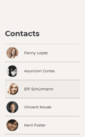
Suppose you have a list of contacts and you want all the profile pictures to be shared-elements.
Use "dynamic directive arguments" to give a different namespace to each contact in the list (this is typically the same ID used for v-for's :key prop).
<img
  :src="contact.profile"
  v-shared-element:[contact.id]
/>
Detailed example
<template>
  <div>
    <h1>Contacts</h1>
    <ul>
      <li
        v-for="contact in contacts"
        :key="contact.id"
      >
        <img
          :src="contact.profile"
          v-shared-element:[contact.id]
        />
        <span>{{ contact.name }}</span>
      </li>
    </ul>
  </div>
</template>

<script>
export default {
  data() {
    return {
      contacts: [
        {
          id: '11bf5b37-e0b8-42e0-8dcf-dc8c4aefc000',
          profile: './user/11bf5b37-e0b8-42e0-8dcf-dc8c4aefc000/profile',
          name: 'John Doe'
        },
        ...
      ]
    }
  }
}
</script>
Usage with keep-alive
If you have routes that use <keep-alive>, you must add some additional code. Otherwise, the transition will only run once, and not run again while the component remains alive.
To fix this, use sharedElementMixin on routes that are "kept alive".
Using sharedElementMixin
Import the mixin into to any components on your keep-alive routes that contain shared-elements. Then, in those components, pass $keepSharedElementAlive—a method provided by the mixin—as an option to every v-shared-element directive on that route. Everything should now work as you would expect.
Note: This is only necessary for routes that are kept alive. For example, if
/homeis kept alive but/aboutis not, then only/homeneeds to import the mixin.
keep-alive example
<template>
    <div>
        <img
            src="logo.png"
            v-shared-element:logo="{ $keepSharedElementAlive }"
        />
    </div>
</template>

<script>
import { sharedElementMixin } from 'v-shared-element'

export default {
    mixins: [sharedElementMixin]
}
</script>
Options
Options can be applied globally (when you register the plugin) and/or on each individual shared-element.
A note on option hierarchy
- Per-element options always override global options.
- Per-element options on the page being navigated away from take precedence.
- The only exception to this is
includeChildrensince it applies to each element individually.
If you're navigating from
/hometo/about, per-element options specified in/homewill override those specified in/about. - The only exception to this is
Setting global options
// In main.js or ~/plugins/v-shared-element.client.js

...

Vue.use(SharedElementDirective, {
  /* options */
});

...
Setting per-element options
<img
  src="logo.png"
  v-shared-element:logo="{
    /* options */
  }"
/>
Summary
| option | type | default |
|---|---|---|
| easing | string |
"ease" |
| duration | string |
"300ms" |
| endDuration | string |
"150ms" |
| zIndex | number |
1 |
| compositeOnly | boolean |
false |
| includeChildren | boolean |
false |
| ignoreTransparency | boolean \| string[] |
["img"] |
| restrictToViewport | boolean |
false |
Details
easing
-
type:
string -
default:
"ease"A CSS easing-function defining the acceleration curve of the transition (e.g.
"ease-in","cubic-bezier(.29, 1.01, 1, -0.68)").
duration
-
type:
string -
default:
"300ms"A CSS time denoting the amount of time the transition should take (e.g.
"0.5s","250ms").
endDuration
-
type:
string | false -
default:
"100ms"A CSS time denoting the duration of the "fade out" stage of the animation to blend the duplicated element with the real one. Set to
falseor"0s"to disable the fade out effect.Note: This option only applies if
includeChildrenisfalse.
zIndex
-
type:
number -
default:
1The
z-indexto be used for the shared-element during the animation.
compositeOnly
-
type:
boolean -
default:
falseSetting this to
truewill limit the transition totransformandopacityproperties only (improves performance).compositeOnly: true(notice thatborder-radiusis not animated)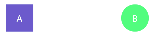
includeChildren
-
type:
boolean -
default:
falsev-shared-elementworks by cloning each element (and its computed styles) then positioning the clones over the original element. By default, only the root node—the one that has the directive on it—will be cloned. SettingincludeChildrentotruewill also clone the root node's entire subtree (this is needed to clone text elements such ash1).includeChildren: false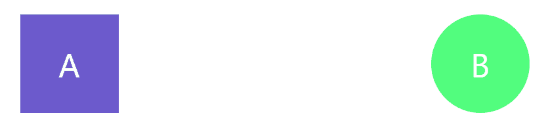
includeChildren: true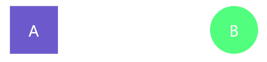
ignoreTransparency
-
type:
boolean | string[] -
default:
["img"]Typically, if you're navigating from
/hometo/about, then the clone of the shared-element on/aboutwill fade in and the clone from/homewill remain atopacity: 1.
However, if the shared-element on/homehas abackground-colorwith an alpha channel (e.g.rgba(0, 0, 0, 0.5)), or nobackground-colorat all, then the clone of the/homeelement will fade out while the clone of the element from/aboutfades in. This is usually what you want unless the element has a background thatv-shared-elementcan't detect. This could happen if the element is acting as a container for an<img>element but has no background of its own, or it has abackground-imagewithout abackground-colorspecified. In this case, settingignoreTransparencytotruewill override this behavior. You can also specify an array of HTML tag-names (e.g.["img", "div", "button"]) to automatically set this option totruefor those elements (astring[]like this is best used as a global option).Try setting this to
trueif you see a "flash" half-way through the transition.
restrictToViewport
-
type:
boolean -
default:
falseBy default, all shared-elements, with a matching element on the next page, will be activated when the route changes—regardless of their position in the document. With
restrictToViewportset totrue, only those elements which are in the viewport will be activated (those outside the viewport will behave as normal elements).Recommended:
Setting this totruemakes navigation feel smoother.
This setting is disabled by default to preserve backwards compatibility.restrictToViewport: true
Usage with page transitions
Thanks to @719media for figuring out how to make this work.
This section assumes you have an understanding of Vue's transition component.
In your CSS
.page-enter-active {
  transition: opacity 150ms ease 150ms;
}

.page-leave-active {
  position: absolute;
  transition: opacity 150ms ease;
}

.page-leave-to,
.page-enter {
  opacity: 0;
}
For Vue.js + vue-router
// App.vue (or equivalent)

<div id="app">
  <transition
    name="page"
    @before-leave="beforeLeave"
    @after-leave="afterLeave"
  >
    <router-view></router-view>
  </transition>
</div>

<script>
export default {
  methods: {
    beforeLeave(el) {
      const {top} = el.getBoundingClientRect();
      el.style.position = "fixed";
      el.style.top = `${top}px`;
      el.style.left = 0;
      el.style.right = 0;
      el.style.zIndex = '-1';
    },
    afterLeave(el) {
      el.style.position = '';
      el.style.top = '';
      el.style.left = '';
      el.style.right = '';
      el.style.zIndex = '';
    }
  }
}
</script>
or
For Nuxt.js
// nuxt.config.js

export default {
  pageTransition: {
    name: 'page',
    mode: '',
    beforeLeave(el) {
      const {top} = el.getBoundingClientRect();
      el.style.position = "fixed";
      el.style.top = `${top}px`;
      el.style.left = 0;
      el.style.right = 0;
      el.style.zIndex = '-1';
    },
    afterLeave(el) {
      el.style.position = '';
      el.style.top = '';
      el.style.left = '';
      el.style.right = '';
      el.style.zIndex = '';
    }
  }
}
Important note about page transitions
If the total duration of the page transition is longer than the duration of a shared-element on that page, things will get weird. You have been warned.
illusory
v-shared-element derives its element-morphing powers from its sister project illusory.
illusory comes bundled with v-shared-element as Vue instance methods.
For more information on how to use it, see the illusory documentation or the illusory example page.
illusory is exposed on the Vue instance as $illusory and $createIllusoryElement.
For example:
<template>
  <div>
    <div ref="from"></div>
    <div ref="to"></div>
    <button @click="morph">Morph!</button>
  </div>
</template>

<script>
  export default {
    methods: {
      morph() {
        this.$illusory(this.$refs.from, this.$refs.to)
      }
    }
  }
</script>
Asking question and reporting bugs
If you're experiencing any problems, or have general questions about the plugin, feel free open a new issue (but search through the existing ones first, as your question may have been answered already).
Note that issues related to the
$illusoryand$createIllusoryElementshould be opened on the illusory repository instead.
How to contributing
Development setup
-
Fork and clone the repo.
$ git clone https://github.com/<your username>/v-shared-element.git -
Install the dependencies
$ npm install -
Create a new branch for your pull request
$ git checkout -b pr/your-branch-name
Common NPM Scripts
npm run build— Runs the build script.npm run dev— Runs the build script in watch mode.npm run test— Runs the tests.npm run format— Fixes any code formatting issues.npm run lint— Lints the code.
Web page for development
Run npm link so you can use it in other local projects.
Method one
You can either create a new Vue.js or Nuxt.js project and use npm link v-shared-element to test your changes.
or
Method two
Clone the repo again, this time into a new directory. Then and run the following:
$ git checkout example
$ npm install
$ npm link v-shared-element
$ npm run dev
You should now have the example page running on localhost.
Hot reload will be triggered by changes made to v-shared-element.