@voerro/vue-notifications
Easily display notifications to your users.
Installation
Install via npm:
npm install @voerro/vue-notifications --save-dev
Register component:
import Notifications from '@voerro/vue-notifications'

Vue.component('notifications', Notifications);
Basic Usage
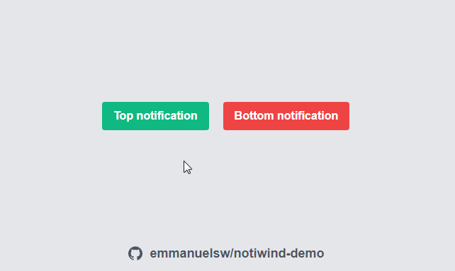
Put this anywhere within the HTML of your Vue app:
<notifications></notifications>
If you want to show a notification on page load:
<notifications
    first-notification="A notification on page load"></notifications>
To show a notification from JavaScript:
notify('Data has been successfully saved!');
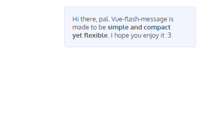
You're not limited to plain text - HTML is supported.
Component Properties
There is a number of properties you can pass to the component in a similar manner we passed the "first-notification" in the example above.
| Property | Default Value | Possible Values | Description |
|---|---|---|---|
| position | 'bottom-right' | 'top-left', 'top-center', 'top-right', 'bottom-left', 'bottom-center', 'bottom-right' | Position of the notifications on the page. |
| hide-after | 5000 | 'never', integer number | Number of milliseconds before a notification disappears. 'never' - notifications won't disappear automatically, users will have to close them manually. |
| theme | 'light-blue' | 'black', 'white', 'blue-grey', 'grey', 'brown', 'deep-orange', 'orange', 'amber', 'yellow', 'lime', 'light-green', 'green', 'teal', 'cyan', 'light-blue', 'blue', 'indigo', 'deep-purple', 'purple', 'pink', 'red' | Color theme for the notifications. Uses Material colors. |
| single | undefined | 'true' | Set to 'true' to only show one notification at a time (the last one) |
| sound | undefined | 'path-to-a-sound-file' | A path to a sound file which will be played every time a new notification is shown. |
| first-notification | undefined | string | A text of a notification which will be shown on page load. |
| first-theme | undefined | string | A theme of a notification which will be shown on page load. |
JavaScript Options
Instead of just passing a string to the notify() method you can also pass an object with options. This way you can customize each individual notification. For example:
notify({
    text: 'Could not save the data!',
    theme: 'red'
});
Available options:
- text
- theme
- hideAfter
Styling
You can easily create your own color themes for the notifications. Pass the name of the custom theme with the properties, for example theme="ocean-blue". Then write CSS for the class .voerro-notification-theme-ocean-blue.
.voerro-notification-theme-ocean-blue {
    background: #2962FF;
    color: #fff;
}
Also, each notification has .voerro-notification class, in case you want to change the style further. This is the default styling:
.voerro-notification {
    margin: .5rem 0;
    padding: 1rem;

    border-radius: .3rem;
    box-shadow: 0 0 1rem 0rem rgb(0, 0, 0, 0.5);
    filter: opacity(90%);
}
License
This is open-sourced software licensed under the MIT license.