Easy Watermark
issues
-
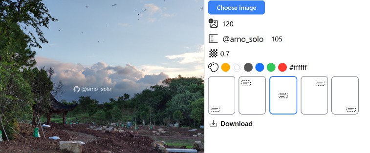
Hitting the download button does not provide any feedback
-
Try a grey background for the image area so you can actually see the text even when you don’t have an image selected
-
Line up the sliders
-
It’s not perfect for mobile https://i.imgur.com/i787DFx.jpg (the top of the image is cut off).
-
dark theme
-
It would be nice to inform the user that the first two sliders are for sizing, so maybe add (px) unit after the number
-
You need to differentiate the Add icon and @your_name fields somehow. It’s not immediately obvious that you can interact with them.


