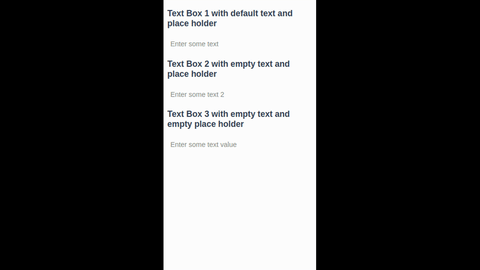
vue-quick-edit
In-place editing with native HTML inputs. Inspired by x-editable
Features
- [x] In-place editing
- [x] Multiple input types
- [x] Native element property bindings
- [x] Theming with CSS overrides or even apply your own classes
- [x] Customize with slots
- [x] Keyboard support
- [ ] Visual feedback when value gets changed or value is invalid
Install
$ npm install --save vue-quick-edit
Global include
import QuickEdit from 'vue-quick-edit';

Vue.component('quick-edit', QuickEdit);
Local include
import QuickEdit from 'vue-quick-edit';

export default {
  components: {
    QuickEdit,
  },
};
Usage
<quick-edit v-model="myValue"><quick-edit>
Properties
| Name | Type | Default | Description |
|---|---|---|---|
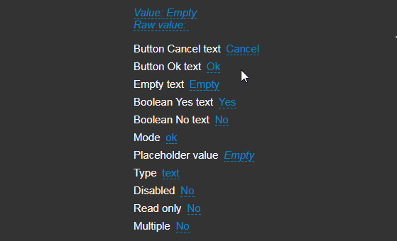
| buttonCancelText | String | Cancel | The text on the Cancel button. |
| buttonOkText | String | Ok | The text on the Ok button. |
| booleanYesText | String | Yes | The text for true when you configure type="boolean". |
| booleanNoText | String | No | The text for false when you configure type="boolean" |
| emptyText | String | Empty | The text to display when there is a falsy value in the v-model directive. |
| classes | Object | See Description | buttonCancel: 'vue-quick-edit__button--cancel' buttonOk: 'vue-quick-edit__button--ok' buttons: 'vue-quick-edit__buttons' input: 'vue-quick-edit__input' link: 'vue-quick-edit__link' wrapper: 'vue-quick-edit' |
| mode | String | ok | Specify what the input should do when the user clicks outside of the component. Possible options are ok,cancel or ignore. |
| options | Array | [] | The options to display for a select, checkbox or radio type. This can be an array of strings or an array of objects with text & value as properties. |
| placeholderValue | String | '' |
When you pass a placeholder to a select it will display the placeholder as the first default option, you can set the value of this option with placeholderValue. |
| type | String | input | This can be input, textarea, select, checkbox, radio, boolean or any other type you can pass to input. |
| validator | Function | true | |
| v-model | String, Array, Boolean, Number | '' |
The value . |
Events
| Name | Parameters | Description |
|---|---|---|
| close | Current value | Fires when the user has interacted with the "ok" or "close" button. |
| input | Current value | Fires when the user has interacted with the "ok" button. |
| show | Current value | Fires when the user has interacted with the display label. |
| raw-input | Current input value | Fires the current input value when the user has interacted with the "ok" button. |
Slots
| Name | Default | Description |
|---|---|---|
| default | {{ value || emptyText }} |
The display value. Available slot props value and raw-value. |
| button-ok | {{ buttonOkText }} |
A slot to use HTML as a the Ok button text, useful for FontAwesome. |
| button-cancel | {{ buttonCancelText }} |
A slot to use HTML as the Cancel button text, useful for FontAwesome. |
| prepend | `` | Prepend HTML before the display text |
| append | `` | Append HTML after the display text |
Theming
Custom theme
For example just override this class in your style
.vue-quick-edit__link--is-clickable {
  color: #BADA55;
}
Bootstrap theme
Set up the classes for the corresponding elements
vueQuickEditClasses: {
  wrapper: 'form-group form-inline',
  input: 'form-control input-sm',
  buttons: 'btn-group btn-group-sm',
  buttonOk: 'btn btn-primary',
  buttonCancel: 'btn btn-link',
},
Maybe add specific overrides for bootstrap
.form-group {
  margin-bottom: 0;
}
.btn-group {
  display: inline-block;
}
Use it like this
<quick-edit :classes="vueQuickEditClasses"><quick-edit>