vue-picture-input
Mobile-friendly picture file input Vue.js component with image preview, drag and drop, EXIF orientation, and more.
Installation
npm
npm install --save vue-picture-input
yarn
yarn add vue-picture-input
Usage
<template>
  <div class="hello">
    <picture-input
      ref="pictureInput"
      width="600"
      height="600"
      margin="16"
      accept="image/jpeg,image/png"
      size="10"
      button-class="btn"
      :custom-strings="{
        upload: '<h1>Bummer!</h1>',
        drag: 'Drag a ? GIF or GTFO'
      }"
      @change="onChange">
    </picture-input>
  </div>
</template>
<script>
import PictureInput from 'vue-picture-input'

export default {
  name: 'app',
  data () {
    return {
    }
  },
  components: {
    PictureInput
  },
  methods: {
    onChange (image) {
      console.log('New picture selected!')
      if (image) {
        console.log('Picture loaded.')
        this.image = image
      } else {
        console.log('FileReader API not supported: use the <form>, Luke!')
      }
    }
  }
}
</script>
You can also use it directly in the browser through unpkg's CDN (or jsDelivr):
<!DOCTYPE html>
<html>
<head>
  <script src="https://unpkg.com/vue"></script>
  <script src="https://unpkg.com/vue-picture-input"></script>
  <title>In the browser!</title>
</head>
<body>
  <div id="app">
    <p>{{ message }}</p>
    <picture-input></picture-input>
  </div>
  <script>
    var app = new Vue({
      el: '#app',
      data: {
        message: 'Hello Vue!'
      },
      components: {
        'picture-input': PictureInput
      }
    })
  </script>
</body>
</html>
Example project
Try it on CodeSandbox: https://codesandbox.io/s/github/alessiomaffeis/vue-picture-input-example
Props
- width, height: (pixels, optional) the maximum width and height of the preview container. The picture will be resized and centered to cover this area. If not specified, the preview container will expand to full width, 1:1 square ratio.
- crop: (boolean, optional) set :crop="false" if you wish to disable cropping. The image will be resized and centered in order to be fully contained in the preview container. Default value: true.
- margin: (pixels, optional) the margin around the preview container. Default value: 0.
- radius: (percentage, optional) The border-radius value for the container. Set radius="50" to get a circular container. Default value: 0.
- plain: (boolean, optional) Set :plain="true" to remove the inner border and text. Default value: false.
- accept: (media type, optional) the accepted image type(s), e.g. image/jpeg, image/gif, etc. Default value: 'image/*'.
- size: (MB, optional) the maximum accepted file size in megabytes.
- removable: (boolean, optional) set :removable="true" if you want to display a "Remove Photo" button. Default value: false.
- hideChangeButton: (boolean, optional) set :hideChangeButton="true" if you want to hide the "Change Photo" button. Default value: false.
- id, name: (string, optional) the id and name attributes of the HTML input element.
- buttonClass: (string, optional) the class which will be applied to the 'Change Photo' button.
Default value: 'btn btn-primary button'. - removeButtonClass: (string, optional) the class which will be applied to the 'Remove Photo' button.
Default value: 'btn btn-secondary button secondary'. - prefill: (image url or File object, optional) use this to specify the path to a default image (or a File object) to prefill the input with. Default value: empty.
- prefillOptions: (object, optional) use this if you prefill with a data uri scheme to specify a file name and a media or file type:
  fileName: (string, optional) the file name
  fileType: (string, optional) the file type of the image, i.e. "png", or
  mediaType: (string, optional) the media type of the image, i.e. "image/png"
- toggleAspectRatio: (boolean, optional) set :toggleAspectRatio="true" to show a button for toggling the canvas aspect ratio (Landscape/Portrait) on a non-square canvas. Default value: false.
- autoToggleAspectRatio: (boolean, optional) set :autoToggleAspectRatio="true" to enable automatic canvas aspect ratio change to match the selected picture's. Default value: false.
- changeOnClick: (boolean, optional) set :changeOnClick="true" to open image selector when user click on the image. Default value: true.
- aspectButtonClass: (string, optional) the class which will be applied to the 'Landscape/Portrait' button.
Default value: 'btn btn-secondary button secondary'. - zIndex: (number, optional) The base z-index value. In case of issues with your layout, change :zIndex="..." to a value that suits you better. Default value: 10000.
- alertOnError: (boolean, optional) Set :alertOnError="false" to disable displaying alerts on attemps to select file with
wrong type or too big.
Default value: true. - customStrings: (object, optional) use this to provide one or more custom strings (see the example above). Here are the available strings and their default values:
{
upload: '<p>Your device does not support file uploading.</p>', // HTML allowed
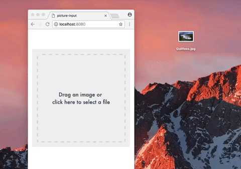
drag: 'Drag an image or <br>click here to select a file', // HTML allowed
tap: 'Tap here to select a photo <br>from your gallery', // HTML allowed
change: 'Change Photo', // Text only
remove: 'Remove Photo', // Text only
select: 'Select a Photo', // Text only
selected: '<p>Photo successfully selected!</p>', // HTML allowed
fileSize: 'The file size exceeds the limit', // Text only
fileType: 'This file type is not supported.', // Text only
aspect: 'Landscape/Portrait' // Text only
}
Events
- change: emitted on (successful) picture change (prefill excluded). The image is passed along with the event as a Base64 Data URI string. If you need to access the underlying image from the parent component, add a ref attribute to picture-input (see the example above). You may want to use this.$refs.pictureInput.image (Base64 Data URI string) or this.$refs.pictureInput.file (File Object)
- prefill: emitted on default image prefill.
- remove: emitted on picture remove.
- click: emitted on picture click.
- error: emitted on error, along with an object with type, message, and optional additional parameters.
TODOs
- Client-side resizing and cropping
- Add tests