slidev-component-poll

Poll component for Slidev.


Installation
npm i slidev-component-poll
Configuration
Create a ./setup/main.ts file in your Slidev project and register the plugin:
import { defineAppSetup } from '@slidev/types'
import Poll from 'slidev-component-poll'

export default defineAppSetup(({ app, router }) => {
  app.use(Poll)
})
slidev-component-poll uses a serverRef to allow communication with multiple clients, but you will need to defined the default value in your own project.
For that you need to create a vite.config.ts file with (see here for more information):
import { defineConfig } from 'vite';

export default defineConfig({
  slidev: {
    serverRef: {
      state: {
        poll: {}
      }
    }
  }
});
Components
You can create a poll by using the Poll component.
But if this component does not suit your needs, you can use individual sub-components.
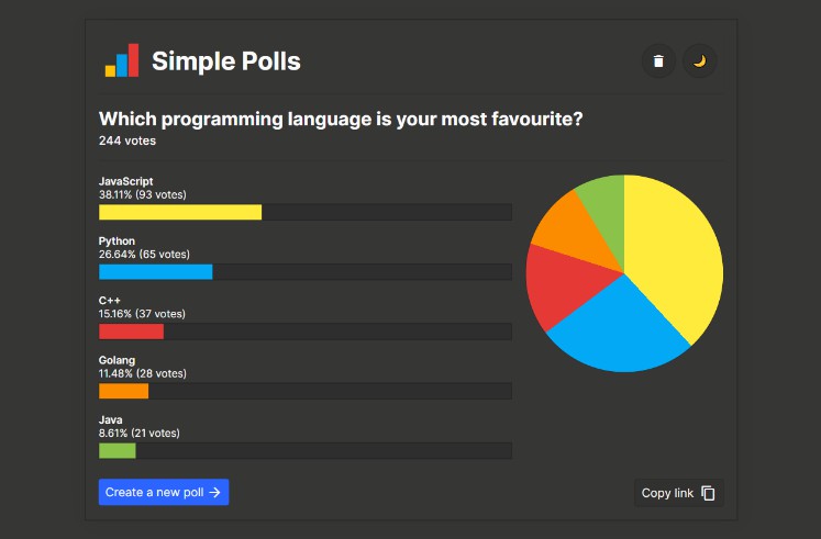
Poll
All in one component for poll:
<Poll question="What is your favorite color ?" :answers="['Red', 'Green', 'Blue']" />
Parameters:
question(string, required): The question displayed as title.answers(string[], required): The available answers to the question.editable(boolean, default:false): Can someone’s answer be edited by this same person ?multiple(boolean, default:false): Can someone select multiple answers (displays checkbox instead of radio buttons).controlled(boolean, default:false): Iftruethe poll will not be opened at the start, use controls to open and close the poll (see below for more information).reopenable(boolean, default:false): Can the poll be reopened after being closed ? (old results are kept)clearable(boolean, default:false): Can the poll be cleared after being closed ? (results will be cleared and poll can be reopened again)
Sub-components
PollQuestion
Sub-component used by the Poll component.
If you intend to create your own poll component by using sub-components, the PollQuestion component is the only required component.
This component displays the form with the choices of the answers:
<PollQuestion id="1" :answers="['Red', 'Green', 'Blue']" />
Parameters:
id(string, required): Used to link sub-components together.answers(string[], required): The available answers to the question.editable(boolean, default:false): Can someone’s answer be edited by this same person ?multiple(boolean, default:false): Can someone select multiple answers (displays checkbox instead of radio buttons).controlled(boolean, default:false): Iftruethe poll will not be opened at the start, use controls to open and close the poll (see below for more information).
PollResults
Sub-component used by the Poll component.
This component displays the results of the poll:
<PollResults id="1" />
Parameters:
id(string, required): Used to link sub-components together.
PollResult
Sub-component used by the PollResults component.
This component displays one line of result:
<PollResult id="1" />
Parameters:
answer(string, required): Answer to display for that result.count(number, required): Number of vote for that result.percentage(number, required): Percentage value for that result (votes / total).
PollTitle
Sub-component used by the Poll component.
This component displays the question of the poll:
<PollTitle question="What is your favorite color ?" />
Parameters:
id(string, required): Used to link sub-components together.
PollControl
Sub-component used by the Poll component.
This component displays the controls of the poll (should be used with controlled=true on the PollQuestion component):
<PollTitle question="What is your favorite color ?" />
Parameters:
question(string, required): Question to display.reopenable(boolean, default:false): Can the poll be reopened after being closed ? (old results are kept)clearable(boolean, default:false): Can the poll be cleared after being closed ? (results will be cleared and poll can be reopened again)presenterOnly(boolean, default:false): Only display the component on the presenter page.
Usage
When using sub-components you have to link them by using the same id parameter.
Example:
<PollTitle question="What is your favorite color ?"/>
<PollQuestion id="1" :answers="['Red', 'Green', 'Blue']" />
<PollResults id="1" />
Controlled forms
When using controlled=true the poll can be controlled meaning that its state can be changed.
The poll can have three state:
CLEARED: Starting state, no results recorded and no result can be recorded, waiting to be opened.OPEN: Poll is open, and results can be received.CLOSED: Poll is closed, and results can not be received anymore.
If you run the slidev server with remote access (and you should if you want other people to answer your poll), then you can control the state of the poll from the presenter view.
When remote control is enabled, the presenter button is not shown, so people does not have direct access to the presenter view.
But anyone who tap the presenter view URL in its browser can access the presenter view, and then control the state of your poll.
If you want to prevent that, you can start the server with --remote=[your_password] and in that case the presenter view is a little more secured.
When using a password, the controls will also be displayed on the presentation but only if the password query parameter in the URL is correct.
We can sum up the following cases:
- presentation view without password (or wrong password): controls are not shown
- presentation view with correct password (if any is set): controls are shown
- presenter view: controls are shown