Vue.D3.Sunburst
Vue.D3.Sunburst provides a reusable vue sunburst charts component relying on D3.js.
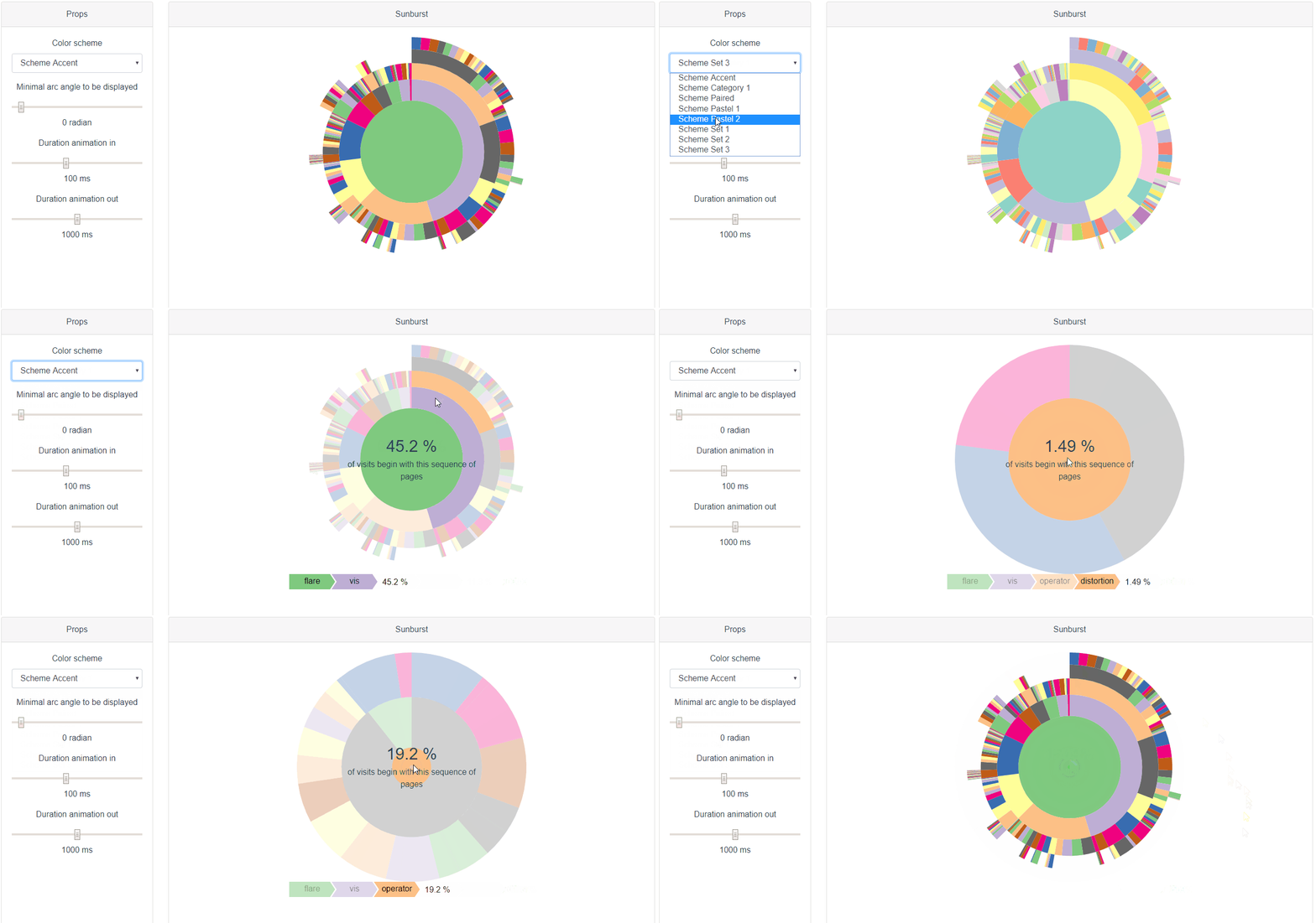
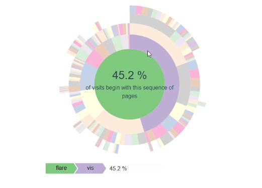
Sunburst is the main component of this library and display sunburst chart based on data props using children property for hierarchy, name property for naming and size property for arcs size.
Sunburst component provides three optional slots:
legendandtopslots are intended to be used to display additional information such as legenddefault slotis intended to receive renderless component providing behavior: for example, highlighting on mouse over or zoom on click
Components providing standard and reusable features are provided.
Features
- Reactive to data changes
- Responsive to size changes
- Customizable with slot or exposed methods and events
- Zoomable
Install
npm i vue-d3-sunburst
Usage
<sunburst :data="data">

  <!-- Add behaviors -->
  <template slot-scope="{ nodes, actions }">
    <highlightOnHover :nodes="nodes" :actions="actions" />
    <zoomOnClick :nodes="nodes" :actions="actions" />
  </template>

  <!-- Add information to be displayed on top the graph -->
  <nodeInfoDisplayer slot="top" slot-scope="{ nodes }" :current="nodes.mouseOver" :root="nodes.root" description="of visits begin with this sequence of pages" />

  <!-- Add bottom legend -->
  <breadcrumbTrail slot="legend" slot-scope="{ nodes, colorGetter, width }" :current="nodes.mouseOver" :root="nodes.root" :colorGetter="colorGetter" :from="nodes.clicked" :width="width" />

</sunburst>
import {
  breadcrumbTrail,
  highlightOnHover,
  nodeInfoDisplayer,
  sunburst,
  zoomOnClick
} from 'vue-d3-sunburst'

export default {
  components: {
    breadcrumbTrail,
    highlightOnHover,
    nodeInfoDisplayer,
    sunburst,
    zoomOnClick
  },
  data() {
    return {
      tree:  {
      "name": "flare",
        "children": [
          {
            "name": "analytics",
            "children": [
              {
                "name": "cluster",
                "children": [
                  { "name": "AgglomerativeCluster", "size": 3938 },
                  { "name": "CommunityStructure", "size": 3812 },
                  { "name": "HierarchicalCluster", "size": 6714 },
                  { "name": "MergeEdge", "size": 743 }
                ]
              },
              {
                "name": "graph",
                "children": [
                  { "name": "BetweennessCentrality", "size": 3534 },
                  { "name": "LinkDistance", "size": 5731 },
                  { "name": "MaxFlowMinCut", "size": 7840 },
                  { "name": "ShortestPaths", "size": 5914 },
                  { "name": "SpanningTree", "size": 3416 }
                ]
              },
              {
                "name": "optimization",
                "children": [
                  { "name": "AspectRatioBanker", "size": 7074 }
                ]
              }
            ]
          }
        ]
      }
    }
  }
}
Gotchas
This component is responsive and will adjust to resizing. In order for this to work properly, you must define for this component or its parent wether:
- a height or a max-height
- or a width or a max-width.
Failing to do so may result in a component whose size that will keep increasing.
API
sunburst
slots
-
legendUse this slot to add information on top or bottom of the graph -
topUse this slot to add information on top of the graph -
defaultUse this slot to add behaviors to the sunburst
props
-
dataObject (optional)Sunburst data where children property is a array containing children.
-
color-schemeString (optional)default: provided by injected defaultSchemeColor with a fall back to schemeAccentD3 color scheme to be used.
-
get-category-for-colorFunction (optional)default: 'useNameForColor'Function used to map an item and its color. (nodeD3: Object) => category: Number | String By default use the node name
-
min-angle-displayedNumber (optional)default: 0.005Minimal arc angle to be displayed (in radian).
-
arc-identificationFunction (optional)default: 'recursiveName'Function used to identify an arc, will be used during graph updates. (nodeD3: Object) => id: String
-
in-animation-durationNumber (optional)default: 100Duration for in animation in milliseconds
-
out-animation-durationNumber (optional)default: 1000Duration for out animation in milliseconds
events
-
mouseOverNodeFired when mouse is over a sunburst node.
arguments:
valueObject - {node, sunburst} The corresponding node and sunburst component
-
clickNodeFired when sunburst node is clicked.
arguments:
valueObject - {node, sunburst} The corresponding node and sunburst component
methods
-
highlightPath(node, opacity)Highlight the arc path leading to a given node.
parameters:
nodeObject - the D3 node to highlightopacityNumber - opacity of the none highlighted nodes, default to 0.3
-
zoomToNode(node)Zoom to a given node.
parameters:
nodeObject - the D3 node to zoom to.
-
resetHighlight()Reset the highlighted path
Other optional components provided as slot implementation
Besides sunburst component, Vue.D3.Sunburst provides additional optional components that can be used out of the box as slot implementations.
There are two kinds of additional components:
- the "renderfull" components provide visual additional visual information on the nodes. They can be used as
legendortopslots. - the renderless components provide predefined behaviors for the sunburst components. They can be used as default slots. It is possible to combine behavior using a root template slot element as in the example.
"Renderfull" components
breadcrumbTrail
Breadcrumb trail component displaying path between root node and current node. Can be used as a legend slot of sunburst component.
props
-
rootObject (optional)Root node
-
currentObject (optional)Current node
-
fromObject (optional)Reference node, parents nodes of the current will have an opacity below 1
-
color-getterFunction (required)ColorGetter exposed by sunburst
-
widthNumber (optional)Sunburst width
-
orderNumber (optional)default: 1Css Order. If 1 the slot is displayed below the sunburst, if 0 the slot is displayed on top the sunburst
-
item-widthNumber (optional)default: 80Bread crumb item width
-
item-heightNumber (optional)default: 30Bread crumb item height
-
spacingNumber (optional)default: 3Spacing between breadcrumb items
-
tail-widthNumber (optional)default: 10With of tailing element
nodeInfoDisplayer
Component that display the percentage value of the current node relative to root. Can be used as a "top" slot of sunburst component.
props
-
rootObject (optional)Root node
-
currentObject (optional)Current node
-
descriptionString (required)Text to be displayed
Behavioral
These components can be used as a default slot of the sunburst component which received as attributes:
-
nodeswhich is an object containing the attributes:root: the graph root nodeclicked: the last clicked node or nullmouseOver: the last node that received a mouse-over event or null if the mouse leaves the graphzoomed: the zoomed nodehighlighted: the highlighted node
-
actionswhich is an object containing the attributes:highlightPath: function that takes a node and highlight the path going from the root to the given nodezoomToNode: function that takes a node and zoom to the corresponding noderesetHighlight: function that resets the highlighting
zoomOnClick
Renderless component providing the zoom on click behavior.
Can be used as a default slot of sunburst component.
props
-
nodesObject (optional)Sunburst nodes. Typically provided by sunburst default slot.
-
actionsObject (required)Sunburst actions. Typically provided by sunburst default slot.
highlightOnHover
Renderless component providing path highlighting on mouse over behavior.
Can be used as a default slot of sunburst component.
props
-
nodesObject (optional)Sunburst nodes. Typically provided by sunburst default slot.
-
actionsObject (required)Sunburst nodes. Typically provided by sunburst default slot.
Installation
npm install vue-d3-sunburst
Project setup
npm install
Compiles and hot-reloads for development
npm run serve
Compiles and minifies for production
npm run build
Lints and fixes files
npm run lint
Run your unit tests
npm run test:unit
Update the API section of README.md with generated documentation
npm run doc:build
