Frontend Mentor – Results summary component solution
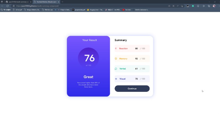
This is a solution to the Results summary component challenge on Frontend Mentor.
Overview
I am using Vue to structure this project and using Vite to build it. The preview page is deployed on GitHub Pages. You can visit it here.
The challenge
Users should be able to:
- View the optimal layout for the interface depending on their device’s screen size
- See hover and focus states for all interactive elements on the page
Screenshot
Links
- Solution URL: Results-summary-component
- Live Site URL: Demo page
My process
- whole design:

-
flexis used to lay out the page.
-
- This page has “left-card” and “right-card”.
-
- Two part mentioned above is wrapped by a “wrapper”
div.
- Two part mentioned above is wrapped by a “wrapper”
- right design:
-
- Four “dataBar”s are generated by
v-forcommand, and their style is controlled byv-bindcommand.
- Four “dataBar”s are generated by
Built with
- Semantic HTML5 markup
- CSS custom properties
- Flexbox
- vue.js – JS library
What I learned
- I learned how to use
v-forandv-bindto generate elements and control their style.
 <div class="card-right">
    <h2>Summary</h2>
    <div v-for=" (data, index ) in dataList" :key="data.category" class="dataBar" :style="colors[index]">
        <!-- img with path of data.icon -->
        <div class="icon" >
            <img :src=data.icon alt="icon">
        </div>
        <h3 :style="TextColors[index]">{{data.category}}</h3>
        <div class="score-end">
            <span class="strong">{{data.score}}</span>
            <span class="weak">/ 100</span>
        </div>
    </div>
    <button>Continue</button>
</div>
Author
- Website – pzq123456
- Frontend Mentor – @pzq123456
problems
- I have a problem with the “SVG” icons in the build stage.
-
- Solve: I put the icons in the
publicfolder and use the hard-code (http//…/*.svg) path insrcto load them.
- Solve: I put the icons in the
HELP ME:
- I think this is not a good way to solve this problem.
- If you have any good idea, please tell me in the issue part of my project.
Thank you very much!
