vuetify-use-dialog
Confirming user choice is a good thing to do, it should also be easy to do.
Simple confirmation dialog and snackbar composable built on top of Vuetify.
Demo: https://vuetify-use-dialog.vercel.app
Installation
npm install vuetify-use-dialog
Usage
Install the plugin (after vuetify)
import { createApp } from 'vue'
import { createVuetify } from 'vuetify'
import VuetifyUseDialog from 'vuetify-use-dialog'

import App from './App.vue'

const app = createApp(App)
const vuetify = createVuetify()

app.use(vuetify)
app.use(VuetifyUseDialog)

app.mount('#app')
Call the useConfirm or useSnackbar composable anywhere:
<script setup lang="ts">
import { useConfirm, useSnackbar } from 'vuetify-use-dialog'
const createConfirm = useConfirm()
const showSnackbar = useSnackbar()
async function handleConfirm() {
try {
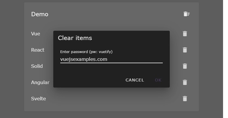
await createConfirm({ content: 'This action is permanent!' })
showSnackbar({ text: 'Confirmed' })
}
catch {
showSnackbar({ text: 'Cancelled' })
}
}
</script>
<template>
<VBtn @click="handleConfirm">
Confirm
</VBtn>
</template>
Options
useConfirm
| Name | Type | Default | Description |
|---|---|---|---|
title |
string |
'Are you sure?' |
Dialog title. |
content |
string |
'' |
Dialog content. |
confirmationText |
string |
'Ok' |
Confirmation button caption. |
cancellationText |
string |
'Cancel' |
Cancellation button caption. |
dialogProps |
object |
{} |
VDialog props. |
cardProps |
object |
{} |
VCard props. |
confirmationButtonProps |
object |
{} |
VBtn props for the confirmation button. |
cancellationButtonProps |
object |
{} |
VBtn props for the cancellation button. |
cardTitleProps |
object |
{} |
VCardTitle props for the dialog title. |
cardTextProps |
object |
{} |
VCardText props for the dialog content. |
confirmationKeyword |
string |
undefined |
If provided the confirmation button will be disabled by default and an additional textfield will be rendered. The confirmation button will only be enabled when the contents of the textfield match the value of confirmationKeyword. |
confirmationKeywordTextFieldProps |
object |
{} |
VTextField props for the confirmation keyword textfield. |
useSnackbar
| Name | Type | Default | Description |
|---|---|---|---|
text |
string |
'' |
Snackbar text. |
snackbarProps |
object |
{} |
VSnackbar props. |
showCloseButton |
boolean |
true |
Show the close button. |
closeButtonText |
string |
'Close' |
Close button text |
closeButtonProps |
object |
{} |
VBtn props. |
Global options:
app.use(VuetifyUseDialog, {
  confirmDialog: {
    // useConfirm options
    title: 'Are you sure?'
  },
  snackbar: {
    // useSnackbar options
    snackbarProps: {
      timeout: 2000,
    }
  }
})
License
MIT