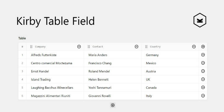
Tailwind Vue Data Table
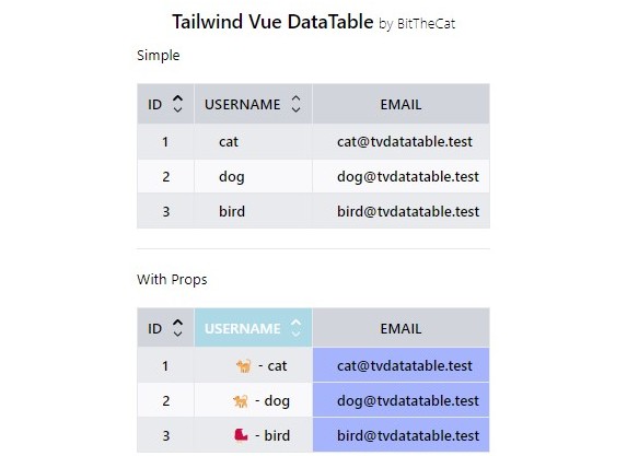
Simple DataTable with slots, class and style modification for tr and td, sortable by columns (only graphics with click event).
Contains the TVPaginator component that can be disabled via prop or used in stand-alone mode.

❗️ Documentation soon available
For now, check under dev/TableShow.vue to see the table in action
Install
npm i @bitthecat/tailwind-vue-data-table
Add this code inside tailwind.config.* to compile the css library
content: [
    ...
    './node_modules/@bitthecat/tailwind-vue-data-table/dist/*.js',
],
Use in Vue
import { TVTable } from '@bitthecat/tailwind-vue-data-table'
Next additions
- Pagination (can be disabled) ✔️

- Select row column (with checkbox) ✔️

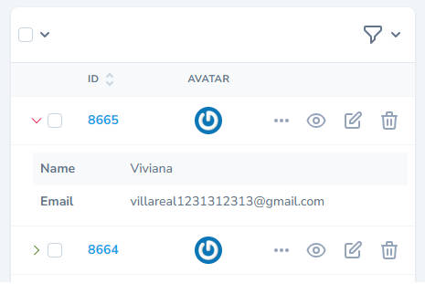
- Row detail ✔️

-
Row Clicked event ✔️
-
Busy state ✔️

-
Additional rows up the header ✔️
-
Select rows (visual) ✔️
-
Provide item from api url
-
Footer
-
Refresh table
-
…
Table
Props
| Props | Default | Description |
|---|---|---|
| currentPage | 1 | current displayed page (used by the paginator) |
| totalRows | 0 | total number of rows (used by the paginator) |
| perPage | 15 | number of rows displayed for page (used by the paginator) |
| hidePagination | false | enables for hide paginator |
| multipleSortable | false | enables multiple sortable for table header |
| enableCheck | false | enables checkbox for table row |
| busy | false | enables spinner for loading data |
Slots
| Props | Description |
|---|---|
| items | table data |
| fields | data fields |
| #cell:FIELD_NAME | used for overwrite |
| #row-details | row details, you need to use row.toggleDetails(row.item) within a template that contains an icon/button to toggle it |
| #header-row | used for additional rows up the header |
slot ‘cell:’ has item or data props
item retrieves the row value
    <template #cell:username="{ item }">
        {{ item.emoji }} - {{ item.username }}
    </template>
data retrieves the field value
    <template #cell:username="{ data }">
        {{ data }}
    </template>
Events
| Event | Description |
|---|---|
| updateSortable | emit the sortable field/fields |
| changePage | emit the page change |
| checkRow | emit the row item when user click on row checkbox |
| rowClicked | emit the row item when user click on row |
Notes
Any @click event of elements within the row triggers the rowClicked event, to get around this we need to use @click.stop to prevent the propagation of the event
Fields
Props
| Props | Description |
|---|---|
| key | th Title |
| label | index of value |
| sortable | the default setting is false, if set to true a symbol appears for sorting |
| thStyle | used for overwrite the th style |
| tdStyle | used for overwrite the td style |
| thClass | used for overwrite the th class |
| tdClass | used for overwrite the td class |
| _showDetails | used for show row details (default false) |
.