#vue3-drag-drop
Introduction
The Drag and Drop API is pretty jank. Here are a handful of annoying issues:
- Data transferred from a draggable element to a dropzone is only available in the dropzone’s
dropevent. Want to take a look at the draggable’s data during thedragoverevent? Say, to determine whether or not we can allow the drop? Sorry! No helpful UI feedback for your users! - Got an object or an array you want to transfer between a draggable and a dropzone? Tough. Gotta serialize it. Say goodbye to your references.
- Did you remember to do
event.preventDefault()ondragoverfor every element you want to be used as a dropzone?
And so on.
The goal of this package is to provide a simple, lightweight wrapper around the API so you don’t have to fiddle with all that nonsense. There are plenty of existing Vue components that provide rich handling of drag and drop, usually between or among lists and with tons of bells and whistles. They’re great, but sometimes you don’t need all that business, or it even gets in the way.
Installation
npm install --save vue3-drag-drop
Default import
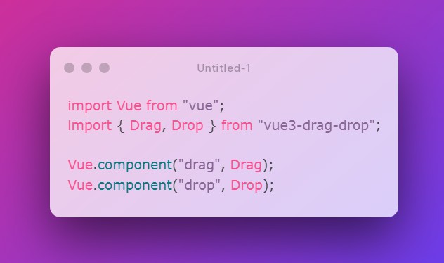
import Vue from "vue";
import { Drag, Drop } from "vue3-drag-drop";

Vue.component("drag", Drag);
Vue.component("drop", Drop);
Or install both:
import Vue from "vue";
import VueDragDrop from "vue3-drag-drop";

Vue.use(VueDragDrop);
Browser
<script src="vue.js"></script>
<script src="vue3-drag-drop/dist/vue3-drag-drop.browser.js"></script>
The plugin should be auto-installed. If not, you can install it manually with the instructions below.
Vue.component("drag", VueDragDrop.Drag);
Vue.component("drop", VueDragDrop.Drop);
Or install both:
Vue.use(VueDragDrop);
API
Components
Drag
A draggable element.
Drop
An element onto which a Drag can be dropped. All Drop elements accept all Drag elements, unless you change the behavior in your application.
Properties
The following properties apply to Drag components. Drop components don’t receive any properties.
draggable
validation Boolean
default: true
Whether or not the draggable is actually draggable. Useful if you need to disable it temporarily.
transfer-data
validation: none
default: null
The data to be transmitted from the Drag to the Drop via events. This is passed through to every Drop-fired event.
effect-allowed
validation: null or one of ['none', 'copy', 'copyLink', 'copyMove', 'link', 'linkMove', 'move', 'all', 'uninitialized']
default: null
See https://developer.mozilla.org/en-US/docs/Web/API/DataTransfer/effectAllowed.
drop-effect
validation: null or one of ['copy', 'move', 'link', 'none']
default: null
See https://developer.mozilla.org/en-US/docs/Web/API/DataTransfer/dropEffect.
image
validation: null, String
default: null
A URL for an image to be used for the drag image instead of the default. If you’d like to use HTML for the drag image instead, use the image slot. More details in the Slots section of this documentation.
If both the image prop and image slot are present, the prop will be used and the slot will be ignored.
image-x-offset, image-y-offset
validation: Number
default: 0, 0
By default, a custom drag image is positioned so that its top-left corner is anchored to the cursor. You can adjust that positioning with these values.
hide-image-html
validation: Boolean
default: true
If the Drag image slot is used, toggle whether or not the HTML is rendered off-screen. See the image slot documentation for more details.
tag
validation String
default: div
Drag or Drop element’s wrapper, defaults to div.
Events
All event are fired with the same arguments:
-
transferDataany This is the data set on theDrag‘stransferDataprop. It is available on allDrop-fired events, despite the official spec only permitting it ondrop. -
nativeEventDragEventThe native browser event. Useful particularly for retrieving thedataTransferobject, which is needed for handling dropped files.
If you need to pass additional arguments in your event listener, the preferred method is to use the ES6 spread operator with arguments:
<drag @drag="myListener('foo', ...arguments)">Drag Me</drag>
myListener(myArg, transferData, nativeEvent) {
  // myArg === 'foo'
}
If you don’t have the spread operator in your environment, you can use a wrapping function:
<drag
  @drag="
    function (transferData, nativeEvent) {
      myListener('foo', transferData, nativeEvent);
    }
  "
>
  Drag Me
</drag>
dragstart
components: Drag
Fired once when dragging starts.
drag
components: Drag
Repeatedly fired for the entire duration of the drag operation.
dragenter
components: Drag, Drop
Fired once every time a Drag is dragged over a Drop.
dragover
components: Drag, Drop
Repeatedly fired while a Drag is over a Drop.
dragleave
components: Drag, Drop
Fired once every time a Drag leaves a Drop.
drop
components: Drop
Fired once when a Drag is dropped on a Drop.
dragend
components: Drag
Fired once when the drag operation is completed. Occurs after drop.
Slots
default
components: Drag, Drop
example: <drag>I am the default slot</drag>
example: <drop>So am I</drop>
For Drag, the content that will be draggable. For Drop, the content over which a Drag can be dropped.
Note that this is a scoped slot. The scope contains a single key, transferData, which will contain exactly what you set in the transferData prop on the Drag. For Drag elements, this will be populated while a drag is in action, and for Drop elements, when a Drag is being dragged over. Checking for the transferData in the Drop scope is the simplest way to determine if a drag is in progress over it.
image
components: Drag
example: <drag>Drag Me<template slot="image"><div>I'm being dragged!</div></template></drag>
The contents of this slot will be used as the drag image instead of the browser default. Since the spec likes to be annoying, this content has to be visible in order for it to show up as the drag image, so it’s rendered off-screen for you using position: fixed. If you need this convenience turned off, or if you need to support a crummy browser that this doesn’t work well with, you can set the hideImageHtml prop to false, which will prevent any additional styling being added. Just be aware that doing so will cause this content to appear inside the Drag element. It’s up to you how to deal with it.
Multiple image slots do nothing; only the first will be used. If both the image prop and image slot are present, the prop will be used and the slot will be ignored.
Plugin Development
Installation
The first time you create or clone your plugin, you need to install the default dependencies:
npm install
Watch and compile
This will run webpack in watching mode and output the compiled files in the dist folder.
npm run dev
Use it in another project
While developing, you can follow the install instructions of your plugin and link it into the project that uses it.
In the plugin folder:
npm link
In the other project folder:
npm link vue3-drag-drop
This will install it in the dependencies as a symlink, so that it gets any modifications made to the plugin.
Manual build
This will build the plugin into the dist folder in production mode.
npm run build
