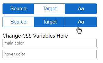
Linear Design Pillbar (Vue.js)
Simple Vue Pillbar. Allows you to create groups like radio buttons, or to select multiple pills.
Also threw in some CSS variable experimentation for kicks and giggles.
html
<div style="margin:16px;width: 300px;" class="container">
  <div class="mount"></div>
  <div class="mount"></div>
</div>


<div class="input"></div>
Css
:root {
  --selected-color: #106cc8;
  --active-color: #1e86ed;
}

$selected-color = #106cc8;
$active-color = #1e86ed;

html, body {
  margin:0px;
  height: 100%;
}
.container {
  .linear-pillbar {
    margin-top:8px;
  }
}
.linear-pillbar {
  font-family: 'Roboto', Arial;
  display: flex;
  border: 1px solid $selected-color;
  border: 1px solid var(--selected-color);
  min-height:32px;
  position:relative;
  border-radius:3px;
  .option {
    outline:none;
    font-size:1em;
    background:transparent;
    border:none;
    flex:1 1 auto;
    padding:4px;
    display:flex;
    align-items:center;
    justify-content:center;
    border-right: 1px solid $selected-color;
    border-right: 1px solid var(--selected-color);
    color:$selected-color;
    color:var(--selected-color);
    cursor:pointer;
    &.equal {
      flex:1;
    }
    &:hover, &:focus, &:active {
      color:$active-color;
      color:var(--active-color);
    }
    &.selected {
      background:$selected-color;
      background:var(--selected-color);
      color:white;
      border-right: 1px solid white;
      &:hover, &:focus, &:active {
        background:$active-color;
        background:var(--active-color);
      }
    }

    &:last-child {
      border-right:none;
    }
  }
}

.color-input {
  display:flex;
  flex-direction:column;
  width:300px;
  margin-left:16px;
  input {
    margin-bottom: 8px;
    padding:4px;
  }
}
JavaScript
const LinearPillbar = {
  el:".mount",
  template:`
    <div class="linear-pillbar">
      <button class="option" v-for="option of options" :class="{selected:option.selected, equal: equalWidth}" @click="select(option)">
        <i class="material-icons" v-if="option.icon">{{option.icon}}</i>
        <div v-else>{{option.name}}</div>
      </button>
    </div>
  `,
  props: {
    options: {
      type:Array,
      default:() => []
    },
    equalWidth: {
      type:Boolean,
      default:false
    },
    mainColor: {
      type:String,
      default:'#106cc8'
    },
    highlightColor: {
      type:String,
      default:'#1e86ed'
    },
  },
  mounted() {
    document.documentElement.style.setProperty(`--selected-color`, this.mainColor);
    document.documentElement.style.setProperty(`--active-color`, this.highlightColor);
  },
  methods: {
    select(option) {
      if(option.group && !option.selected) {
        Vue.set(option, 'selected', !option.selected);
        for(let otherOption of this.options) {
          if(otherOption.name !== option.name && option.group === otherOption.group) {
            Vue.set(otherOption, 'selected', false);
          }
        }
      }
      else if(!option.group) {
        Vue.set(option, 'selected', !option.selected);
      }
      this.$emit('change', this.options);
    }
  },
  propsData: {
    options: [
      {name:'Source', group:'type'},
      {name:'Target', group:'type'},
      {name:'Aa'}
    ],
    equalWidth:true,
 //   mainColor:'#10c86c',
 //   highlightColor:'#1eed86'
  }
};

new Vue(LinearPillbar);
//LinearPillbar.propsData.mainColor = 'red';//changing this for one component changes it for all
//LinearPillbar.propsData.highlightColor = 'pink';
LinearPillbar.propsData.options = [
      {name:'Source', group:'type'},
      {name:'Target', group:'type'},
      {name:'Aa'}
    ]
new Vue(LinearPillbar);

let ColorInput = {
  el:'.input',
  template:`
    <div class="color-input">
      Change CSS Variables Here
      <input placeholder="main color" v-model="mainColor" @input="updateMainColor">
      <input placeholder="hover color" v-model="hoverColor" @input="updateHoverColor">
    </div>`,
  data() {
    return {
      mainColor: '',
      hoverColor: ''
    }
  },
  methods: {
    updateMainColor() {
      document.documentElement.style.setProperty(`--selected-color`, this.mainColor);
    },
    updateHoverColor() {
      document.documentElement.style.setProperty(`--active-color`, this.hoverColor)
    }
  }
}

new Vue(ColorInput);
Author
Hyrum White
Demo
See the Pen Linear Design Pillbar (Vue.js) by Hyrum White (@hyrumwhite) on CodePen.