vue-update-message
Small Vuejs plugin to show update messages to the user.
Massage text supports HTML, so it can be styled the way you want.
Browser support
Chome, Firefox, Edge, IE(10+)
Install
npm intall vue-update-message
Usage
import Vue from 'vue';
import messageService from 'vue-update-message';

Vue.use(messageService);
...
//Success message
this.$message.success("This will dissapear in <strong>3 seconds</strong>", {
    duration: 3000
});
//Error message
this.$message.error("<h2>This will dissapear in 5 seconds </h2>",{
    duration: 5000
});
//Info message
this.$message.info("<h5>This is a sticky, dismissable message</h5>", {
    dismissible: true,
    isSticky: true
});
Methods
success(content, props)
error(content, props)
info(content, props)
content can be text ot HTML string, that will be diplayed in message body.
props is object that contains message props - see Props section below
Syntax
this.$message.success(
`<h3 class="myClass">
    <i claaa="fa fa-icon"></i>
    Some HTML ot text message
</h3>
<p>Some more message text</p>`, {
    ...some props
});
Props
Service props
These props can be set before the plugin is initialized.
import Vue from 'vue';
import messageService from 'vue-update-message';

const props = {
    position: 'fixed',
    width: '20vw',
    placement: 'top'
}

Vue.use(messageService, props);
...
| Prop | Default | Options |
|---|---|---|
| position | fixed | fixed, absolute |
| width | 20vw (20% sceen width) | any css width |
| mode | stack | single, stack |
| successText | '#155724' (default Bootstrap 4 success text color) | any css color |
| successBackground | '#d4edda' (default Bootstrap 4 success background color) | any css color |
| successBorder | '#c3e6cb' (default Bootstrap 4 success border) | any css color |
| errorText | '#721c24' (default Bootstrap 4 danger text color) | any css color |
| errorBackground | '#f8d7da' (default Bootstrap 4 danger background color) | any css color |
| errorBorder | '#f5c6cb' (default Bootstrap 4 danger border) | any css color |
| infoText | '#0c5460' (default Bootstrap 4 info text color) | any css color |
| infoBackground | '#d1ecf1' (default Bootstrap 4 info background color) | any css color |
| infoBorder | '#bee5eb' (default Bootstrap 4 info border) | any css color |
Position option behave the same as CSS 'position' property.
Single mode will display only one message on screen and when you create new message the old one will hide.
Stack mode will display multiple messages on screen. All messages will be shown on screeen and they will dissapear according to their settings (duration, dissmisable, etc...)
You can easily override the message dafault color, but it is possible only before plugin inicialization i.e. you can not change the color dynamically when creating a message.
import Vue from 'vue';
import messageService from 'vue-update-message';
const props = {
position: 'fixed',
width: '20vw',
placement: 'top',
successText: '#2e8441',
successBackground: '#e0dc68',
successBorder: '#52cc6d'
}
Vue.use(messageService, props);
...
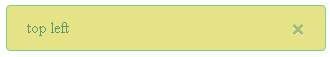
...
//in the Vue component after some operation you call the success message like this
methods: {
doSomething() {
...
this.$message.success("top left", {
dismissible: true,
isSticky: true,
placement: "top-left"
});
}
...
Here is the result:
Message props
These props can be set when the message is created.
this.$message.info("some message", {
    dismissible: true,
    isSticky: true
});
| Prop | Default | Options |
|---|---|---|
| duration | 3000 | |
| dismissible | false | true, false |
| isSticky | false | true |
| placement | top | top, top-left, top-right, bottom, bottom-left, bottom-right |
| container | css selector |
placement option is used to set the position of the message on screen
By setting isSticky option to true, duration option is ignored and the message will not dissapear from screen. To hide the message set dismissible option to true and this will add a close.
If you add css selector to container element prop, the messages will be displayed in that HTML element.
Note: When you use container element to show your messages, placement option is not available!