Sonner for Vue
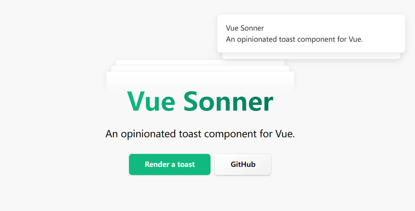
An opinionated toast component for Vue. It’s a Vue port of Sonner
Preview
Introduction
Vue Sonner is an opinionated toast component for React. It’s customizable, but styled by default. Comes with a swipe to dismiss animation.
Installation
To start using the library, install it in your project:
pnpm install vue-sonner
or
yarn add vue-sonner
Usage
<!-- App.vue -->
<template>
  <Toaster />
  <button
    @click="
      () => {
        toast('My first toast')
      }
    "
  >
    Render a toast
  </button>
</template>

<script lang="ts" setup>
  import { Toast, toast } from 'vue-sonner'
</script>
Types
Default
Most basic toast. You can customize it (and any other type) by passing an options object as the second argument.
toast('Event has been created')
With custom description:
toast('Event has been created', {
  description: 'Monday, January 3rd at 6:00pm'
})
Success
Renders a checkmark icon in front of the message.
toast.success('Event has been created')
Error
Renders an error icon in front of the message.
toast.error('Event has not been created')
Action
Renders a button.
toast('Event has been created', {
  action: {
    label: 'Undo',
    onClick: () => console.log('Undo')
  }
})
Promise
Starts in a loading state and will update automatically after the promise resolves or fails.
You can pass a function to the success/error messages to incorporate the result/error of the promise.
toast.promise(() => new Promise((resolve) => setTimeout(resolve, 2000)), {
  loading: 'Loading',
  success: (data: any) => 'Success',
  error: (data: any) => 'Error'
})
Custom Component
You can pass a Vue Component as the first argument instead of a string to render custom Component while maintaining default styling. You can use the headless version below for a custom, unstyled toast.
<script lang="ts" setup>
  import { defineComponent, h, shallowRef } from 'vue'

  const CustomDiv = defineComponent({
    setup() {
      return () =>
        h('div', {
          innerHTML: 'A custom toast with unstyling'
        })
    }
  })

  toast(shallowRef(CustomDiv))
</script>
Customization
Headless
You can use toast.custom to render an unstyled toast with custom jsx while maintaining the functionality.
<script lang="ts" setup>
import HeadlessToast from './HeadlessToast.vue'

toast.custom(shallowRef(HeadlessToast), { duration: 999999 })
</script>
Theme
You can change the theme using the theme prop. Default theme is light.
<Toaster theme="dark" />
Position
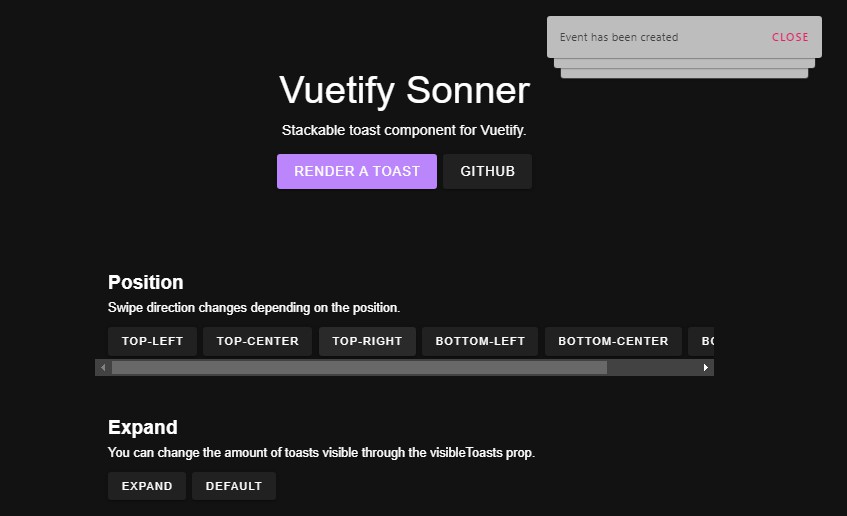
You can change the position through the position prop on the <Toaster /> component. Default is top-right.
<!-- Available positions -->
<!-- top-left, top-center, top-right, bottom-left, bottom-center, bottom-right -->

<Toaster position="top-center" />
Expanded
Toasts can also be expanded by default through the expand prop. You can also change the amount of visible toasts which is 3 by default.
<Toaster expand visibleToasts="{9}" />
Styling for all toasts
You can style your toasts globally with the toastOptions prop in the Toaster component.
<Toaster toastOptions={{ style: { background: 'red' }, className: 'my-toast',
descriptionClassName: 'my-toast-description' }} />
Styling for individual toast
toast('Event has been created', {
  style: {
    background: 'red'
  },
  className: 'my-toast',
  descriptionClassName: 'my-toast-description'
})
Close button
Add a close button to all toasts that shows on hover by adding the closeButton prop.
<Toaster closeButton />
Rich colors
You can make error and success state more colorful by adding the richColors prop.
<Toaster richColors />
Custom offset
Offset from the edges of the screen.
<Toaster offset="80px" />
Programmatically remove toast
To remove a toast programmatically use toast.dismiss(id).
const toastId = toast('Event has been created')

toast.dismiss(toastId)
You can also use the dismiss method without the id to dismiss all toasts.
toast.dismiss()
Programmatically remove toast
You can change the duration of each toast by using the duration property, or change the duration of all toasts like this:
<Toaster duration="{10000}" />
toast('Event has been created', {
  duration: 10000
})

// Persisent toast
toast('Event has been created', {
  duration: Infinity
})
On Close Callback
You can pass onDismiss and onAutoClose callbacks. onDismiss gets fired when either the close button gets clicked or the toast is swiped. onAutoClose fires when the toast disappears automatically after it’s timeout (duration prop).
toast('Event has been created', {
  onDismiss: (t) => console.log(`Toast with id ${t.id} has been dismissed`),
  onAutoClose: (t) =>
    console.log(`Toast with id ${t.id} has been closed automatically`)
})
Keyboard focus
You can focus on the toast area by pressing ⌥/alt + T. You can override it by providing an array of event.code values for each key.
<Toaster hotkey={['KeyC']} />
Inspiration
- sonner – An opinionated toast component for React.
License
MIT @xiaoluoboding
