vue-content-loader
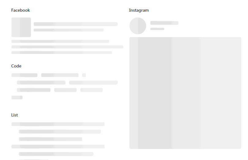
SVG component to create placeholder loading, like Facebook cards loading.
Features
This is a Vue port for react-content-loader.
- Completely customizable: you can change the colors, speed and sizes.
- Create your own loading: use the online tool to create your custom loader easily.
- You can use it right now: there are a lot of presets already.
- Performance:
- Tree-shakable and highly optimized bundle.
- Pure SVG, so it's works without any javascript, canvas, etc.
- Pure functional components.
Install
yarn add vue-content-loader
Usage
?? Demos: Storybook | with Nuxt.js
<template>
  <content-loader></content-loader>
</template>

<script>
import { ContentLoader } from 'vue-content-loader'

export default {
  components: {
    ContentLoader
  }
}
</script>
Built-in loaders
import {
  ContentLoader,
  FacebookLoader,
  CodeLoader,
  BulletListLoader,
  InstagramLoader,
  ListLoader
} from 'vue-content-loader'
ContentLoader is a meta loader while other loaders are just higher-order components of it. By default ContentLoader only displays a simple rectangle, here's how you can use it to create custom loaders:
<ContentLoader>
  <rect x="0" y="0" rx="3" ry="3" width="250" height="10" />
  <rect x="20" y="20" rx="3" ry="3" width="220" height="10" />
  <rect x="20" y="40" rx="3" ry="3" width="170" height="10" />
  <rect x="0" y="60" rx="3" ry="3" width="250" height="10" />
  <rect x="20" y="80" rx="3" ry="3" width="200" height="10" />
  <rect x="20" y="100" rx="3" ry="3" width="80" height="10" />
</ContentLoader>
API
Props
| Prop | Type | Default | Description |
|---|---|---|---|
| width | number | 400 |
|
| height | number | 130 |
|
| speed | number | 2 |
|
| preserveAspectRatio | string | 'xMidYMid meet' |
|
| primaryColor | string | '#f9f9f9' |
|
| secondaryColor | string | '#ecebeb' |
|
| uniqueKey | string | randomId() |
Unique ID, you need to make it consistent for SSR |
| animate | boolean | true |