Vue Responsiveness


Extremely light (< 1kb gzipped) plugin in terms of both size and runtime resource consumption.
I wrote it because I wanted something extremely easy to use but as light as possible. To be fair, I am a bit obsessed with both performance and ease of use. If curios, scroll down to “How it works”.
Installation
yarn
yarn add vue-responsiveness
npm
npm i vue-responsiveness
Usage
The default breakpoints value is set to Bootstrap 5’s responsiveness breakpoints preset:
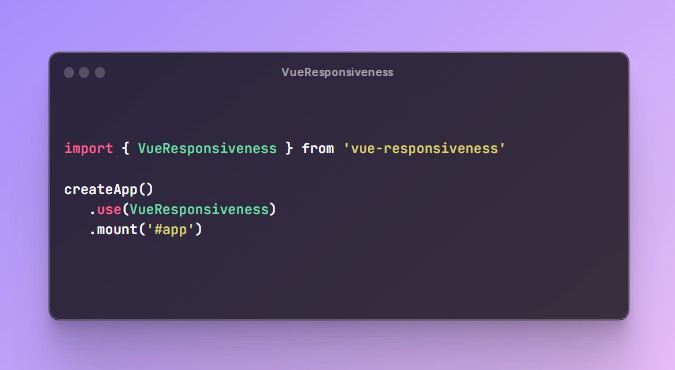
main.ts
import { VueResponsiveness } from 'vue-responsiveness'

createApp()
   .use(VueResponsiveness)
   .mount('#app')
in any <template />:
<!-- sm and above
  @media (min-width: 576px) -->
<template v-if="$matches.sm.min">
   ...content
</template>

<!-- sm and below
  @media (max-width: 767.9px) -->
<SomeComponent v-if="$matches.sm.max">
  ...content
</SomeComponent>

<!-- sm only
  @media (min-width: 576px) and (max-width: 767.9px) -->
<div v-if="$matches.sm.only">
  ...content
</div>
Available breakpoint presets
Usage:
import { VueResponsiveness, Presets } from "vue-responsiveness";

app.use(VueResponsiveness, Presets.Tailwind_CSS)
Available presets:
- Bootstrap_3
- Bootstrap_4
- Bootstrap_5
- Bulma
- Chakra
- Foundation
- Ionic
- Material_Design
- Materialize
- Material_UI
- Quasar
- Semantic_UI
- Skeleton
- Tailwind_CSS
- Vuetify
- Windi_CSS
Notes:
- If you maintain a CSS framework (or if you use one often) and you’d like its preset added, open an issue or even a PR.
- If you spot any inconsistency in the presets (either my typo or some library update), please, let me know, I’ll correct it.
Use your own breakpoints:
app.use(VueResponsiveness, {
  small: 0,
  medium: 777,
  large: 1234
})
<!-- medium only
  @media (min-width: 777px) and (max-width: 1233.9px) -->
<template v-if="$matches.medium.only">
  ...content
</template>
Hide components, (while still rendering them) – usage with v-show:
<SomeComponent /> below will be rendered at all screen sizes but will only be displayed on md and below:
<!-- rendered all the time,  but only displayed on:
  @media (max-width: 991.9px) -->
<SomeComponent v-show="$matches.md.max" />
Issues?
How it works:
- the plugin uses the native
window.matchMedia(queryString)and only reacts to changes in the query’smatchesvalue. It’s basically the same API powering the CSS media queries. - the listeners are placed on the returned
MediaQueryListinstances, which means they are removed/deleted as soon as the app is unmounted, without leaving anything bound on<body>orwindowobject. - having it placed on the app instance makes it a lot more performant than the alternative of having listeners placed by each component using the plugin.
- in terms of memory and/or CPU consumption, this approach is hundreds of times more performant than the “traditional”
resizeevent listener method.