vue-file-toolbar-menu
UI file/toolbar menus for Vue apps.
Features
- Reactive content is stored in Vue.js computed/data fields, not in template
- Easy styling
- Add your own custom components for menus and buttons
- Uses standard Material Icons
- Hotkey support
- Touch-device compatible
- Easy multi-language implementation (vue-i18n)
Installation
In your Vue.js project:
npm install vue-file-toolbar-menu
:speech_balloon: If you prefer static files, import assets from the dist folder
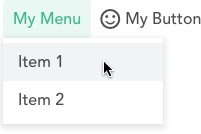
Basic example
MyComponent.vue
<template>
  <div> <vue-file-toolbar-menu :content="my_menu" /> </div>
</template>

<script>
import VueFileToolbarMenu from 'vue-file-toolbar-menu'

export default {
  components: { VueFileToolbarMenu },

  data () { return { happy: false } },

  computed: {
    my_menu () {
      return [
        { text: "My Menu", menu: [
          { text: "Item 1", click: () => alert("Action 1") },
          { text: "Item 2", click: () => alert("Action 2") }
        ] }, {
          text: "My Button",
          active: this.happy,
          icon: this.happy ? "sentiment_very_satisfied" : "sentiment_satisfied",
          click: () => { this.happy = !this.happy }
        }
      ]
    }
  }
}
</script>
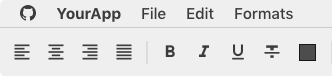
Should render this:
Complete example
See the Demo.vue file corresponding to the live demo. Also read the API.
Styling
Styling can be done either by writing CSS variables or by overloading CSS properties using !important. View the default stylesheet for reference.
:speech_balloon: If you need some variables that are missing, edit the stylesheet then submit a PR.
Docs-like:
View CSS variables
:root {
  --bar-font-color: rgb(32, 33, 36);
  --bar-font-family: Roboto, RobotoDraft, Helvetica, Arial, sans-serif;
  --bar-font-size: 15px;
  --bar-font-weight: 500;
  --bar-letter-spacing: 0.2px;
  --bar-padding: 3px;
  --bar-button-icon-size: 20px;
  --bar-button-padding: 4px 6px;
  --bar-button-radius: 4px;
  --bar-button-hover-bkg: rgb(241, 243, 244);
  --bar-button-active-color: rgb(26, 115, 232);
  --bar-button-active-bkg: rgb(232, 240, 254);
  --bar-button-open-color: rgb(32, 33, 36);
  --bar-button-open-bkg: rgb(232, 240, 254);
  --bar-menu-bkg: white;
  --bar-menu-border-radius: 0 0 3px 3px;
  --bar-menu-item-chevron-margin: 0;
  --bar-menu-item-hover-bkg: rgb(241, 243, 244);
  --bar-menu-item-padding: 5px 8px 5px 35px;
  --bar-menu-item-icon-size: 15px;
  --bar-menu-item-icon-margin: 0 9px 0 -25px;
  --bar-menu-padding: 6px 1px;
  --bar-menu-shadow: 0 2px 6px 2px rgba(60, 64, 67, 0.15);
  --bar-menu-separator-height: 1px;
  --bar-menu-separator-margin: 5px 0 5px 34px;
  --bar-menu-separator-color: rgb(227, 229, 233);
  --bar-separator-color: rgb(218, 220, 224);
  --bar-separator-width: 1px;
  --bar-sub-menu-border-radius: 3px;
}
macOS-like:
:microscope: (CSS backdrop filter is still experimental!)
View CSS variables
:root {
  --bar-font-color: rgba(0, 0, 0, 0.75);
  --bar-font-family: -apple-system, BlinkMacSystemFont, "Segoe UI", Roboto, Helvetica, Arial, sans-serif, "Apple Color Emoji", "Segoe UI Emoji", "Segoe UI Symbol";
  --bar-font-size: 15.5px;
  --bar-button-icon-size: 20px;
  --bar-button-padding: 4px 7px 5px 7px;
  --bar-button-radius: 0;
  --bar-button-hover-bkg: none;
  --bar-button-active-color: white;
  --bar-button-active-bkg: rgba(41, 122, 255, 0.9);
  --bar-button-open-color: white;
  --bar-button-open-bkg: rgba(41, 122, 255, 0.9);
  --bar-menu-bkg: rgba(255, 255, 255, 0.95);
  --bar-menu-backdrop-filter: saturate(180%) blur(20px);
  --bar-menu-backdrop-filter-bkg: rgba(255, 255, 255, 0.3);
  --bar-menu-border: solid 1px #BBB;
  --bar-menu-border-radius: 0 0 6px 6px;
  --bar-menu-item-chevron-margin: 0;
  --bar-menu-item-hover-color: white;
  --bar-menu-item-hover-bkg: rgba(41, 122, 255, 0.9);
  --bar-menu-item-padding: 1px 12px 2px 25px;
  --bar-menu-item-icon-size: 16px;
  --bar-menu-item-icon-margin: 0 4px 0 -20px;
  --bar-menu-padding: 3px 0;
  --bar-menu-shadow: 0 6px 13px 0 rgba(60, 60, 60, 0.4);
  --bar-menu-separator-height: 2px;
  --bar-menu-separator-margin: 5px 0;
  --bar-menu-separator-color: rgba(0, 0, 0, 0.08);
  --bar-sub-menu-border-radius: 6px;
}
Project development
npm run servecompiles and hot-reloads demo for developmentnpm run lintlints and fixes filesnpm run buildcompiles and minifies production files and demo