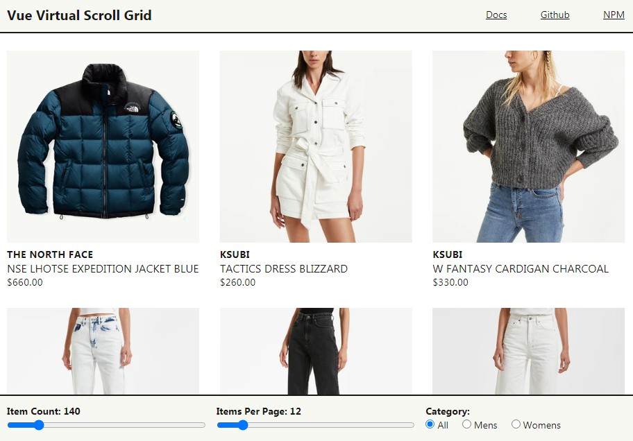
vue-virtual-scroll-grid
This is a reusable component for Vue 3 that renders a list with a huge number of items (e.g. 1000+ items) as a grid in a performant way.
Features
- Use virtual-scrolling / windowing to render the items, so the number of DOM
nodes is kept low. - Support using a paginated API to load the items in the background.
- Support placeholders for unloaded items and loaded items are cached for better
performance. - Just use CSS grid to style your grid. Minimum styling opinions form the
library.
Install
npm install vue-virtual-scroll-grid
Example
<template>
<!--
length: The number of items in the list.
pageSize: The number of items in each page returned by the page provider.
pageProvider: The callback that returns a page of items as a promise.
-->
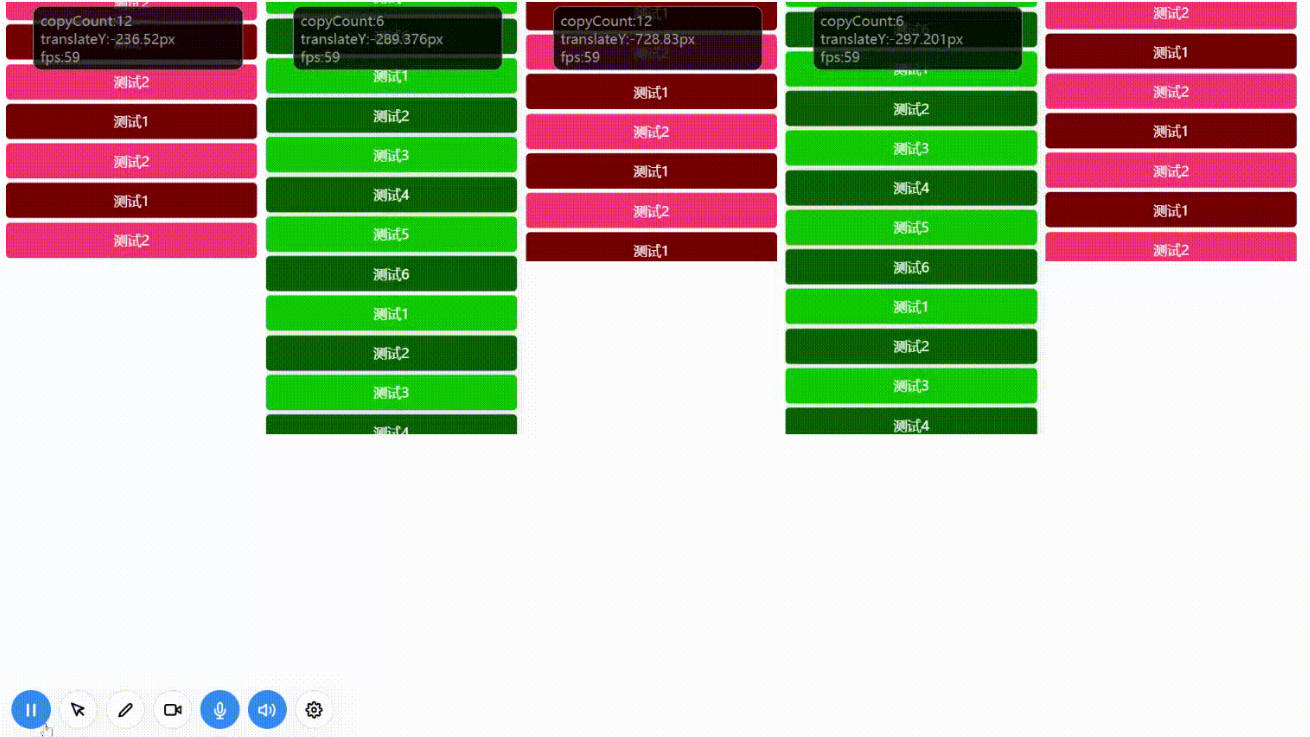
<Grid :length="1000" :pageSize="10" :pageProvider="pageProvider" class="grid">
<template v-slot:probe>
<div class="item">Probe</div>
</template>
<!-- When the item is not loaded, a placeholder is rendered -->
<template v-slot:placeholder="{ index, style }">
<div class="item" :style="style">Placeholder {{ index }}</div>
</template>
<!-- Render a loaded item -->
<template v-slot:default="{ item, style, index }">
<div class="item" :style="style">{{ item }} {{ index }}</div>
</template>
</Grid>
</template>
<script>
import Grid from "vue-virtual-scroll-grid";
export default {
name: "App",
components: { Grid },
setup: () => ({
// Return items for the given page after a 0-3 second randomly
pageProvider: (pageNumber, pageSize) =>
new Promise((resolve) =>
setTimeout(
() => resolve(new Array(pageSize).fill("Loaded Item")),
Math.round(3000 * Math.random())
)
),
}),
};
</script>
<style>
.grid {
display: grid;
grid-gap: 20px;
grid-template-columns: repeat(2, 1fr);
}
@media (min-width: 768px) { .grid { grid-template-columns: repeat(3, 1fr); } }
@media (min-width: 992px) { .grid { grid-template-columns: repeat(4, 1fr); } }
@media (min-width: 1280px) { .grid { grid-template-columns: repeat(4, 1fr); } }
@media (min-width: 1440px) { .grid { grid-template-columns: repeat(5, 1fr); } }
@media (min-width: 1650px) { .grid { grid-template-columns: repeat(6, 1fr); } }
@media (min-width: 1890px) { .grid { grid-template-columns: repeat(7, 1fr); } }
@media (min-width: 2530px) { .grid { grid-template-columns: repeat(8, 1fr); } }
.item {
background-color: lightgray;
padding: 100px 0;
text-align: center;
}
</style>
Available Props
interface Props {
  // The number of items in the list.
  // Required and must be an integer and greater than or equal to 0.
  length: number;

  // The callback that returns a page of items as a promise.
  // Required.
  pageProvider: (pageNumber: number, pageSize: number) => Promise<unknown[]>;

  // The number of items in a page from the item provider (e.g. a backend API).
  // Required and must be an integer and greater than 1.
  pageSize: number;
}
Example:
<Grid :length="1000"
      :pageSize="40"
      :pageProvider="async (pageNumber, pageSize) => Array(pageSize).fill('x')"
/>
Available Slots
There are 3 scoped slots: default, placeholder and probe.
The default slot
The default slot is used to render a loaded item.
Props:
item: the loaded item that is used for rendering your item
element/component.index: the index of current item within the list.style: the style object provided by the library that need to be set on the
item element/component.
Example:
<template v-slot:default="{ item, style, index }">
  <div :style="style">{{ item }} {{ index }}</div>
</template>
Theplaceholder slot
When an item is not loaded, the component/element in the placeholder slot will
be used for rendering. The placeholder slot is optional. If missing, the space
of unloaded items will be blank until they are loaded.
Props:
index: the index of current item within the list.style: the style object provided by the library that need to be set on the
item element/component.
Example:
<template v-slot:placeholder="{ index, style }">
  <div :style="style">Placeholder {{ index }}</div>
</template>
The probe slot
The probe slot is used to measure the visual size of grid item. It has no
prop. You can pass the same element/component for the
placeholder slot. If not provided, you must set a fixed height
to grid-template-rows on your CSS grid, e.g. 200px. Otherwise, the view
won't be rendered properly.
Example:
<template v-slot:probe>
  <div class="item">Probe</div>
</template>
Caveats
The library does not require items have foreknown width and height, but do
require them to be styled with the same width and height under a view. E.g. the
items can be 200px x 200px when the view is under 768px and 300px x 500px above
768px.
Development
- Setup:
npm install - Run dev server:
npm run dev - Lint (type check):
npm run lint - Build the library:
npm run build - Build the demo:
npm run build -- --mode=demo - Preview the locally built demo:
npm run serve