vue2-calendar
vue 2 calendar, datepicker component which supported lunar or date event.
-
This project is not only a vue component, but also a webpack multi-page project in action.
-
Support Boostrap 4
Install
$ npm install vue2-slot-calendar
Import using module
import 'bootstrap-sass' // alias css

// js file
import 'vue2-slot-calendar/lib/calendar.min.css';
import calendar from 'vue2-slot-calendar/lib/calendar';

// vue file
// in ES6 modules
import Calendar from 'vue2-slot-calendar';

// in CommonJS
const Calendar = require('vue2-slot-calendar');

// in Global variable
const VueCalendar = Calendar;
Import using script tag
<link rel="stylesheet" href="https://maxcdn.bootstrapcdn.com/bootstrap/3.3.7/css/bootstrap.min.css">
<link rel="stylesheet" href="../node_modules/vue2-slot-calendar/lib/calendar.min.css" >
<script src="../node_modules/vue2-slot-calendar/lib/calendar.min.js"></script>
Also see the demo file, example/demo.html
Build Setup
# install dependencies
npm install

# serve with hot reload at localhost:4000
npm run dev

# build for production with minification
npm run build

# run unit tests
npm run unit

# run all tests
npm test
Chinese user: 
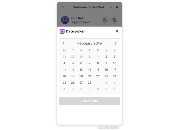
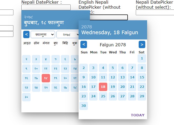
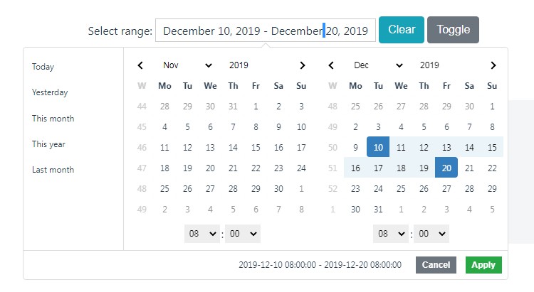
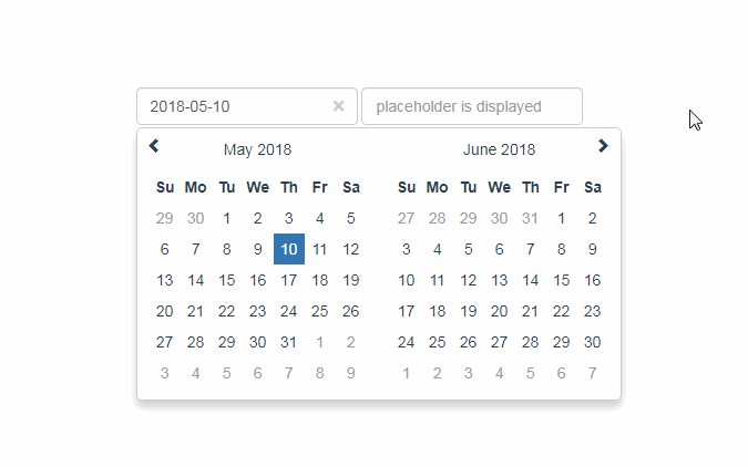
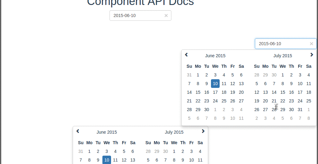
Screenshot
Usage
  <calendar
    :value="value"
    :disabled-days-of-week="disabled"
    :format="format"
    :clear-button="clear"
    :placeholder="placeholder"
    :pane="2"
    :has-input="false"
    :on-day-click="onDayClick2"
    :special-days="_dateMap"
  ></calendar>
Use slot to render async data
  <calendar class="event-calendar" :value="value" :disabled-days-of-week="disabled" :format="format" :clear-button="clear" :placeholder="placeholder" :pane="2" :has-input="false" :on-day-click="onDayClick3" :change-pane="changePane">
    <div v-for="evt in events" :slot="evt.date">
        ${{evt.content}} <i :class="{low : evt.low}" v-if="evt.low">↓</i>
    </div>
  </calendar>
Range Hover Status
  <calendar :value="value" :disabled-days-of-week="disabled" :format="format"
   :clear-button="clear" :placeholder="placeholder" :pane="2"
   :range-bus="getBus" :range-status="1"></calendar>

  <calendar :value="value" :disabled-days-of-week="disabled" :format="format"
   :clear-button="clear" :placeholder="placeholder" :pane="2"
   :range-bus="getBus" :range-status="2"></calendar>
Props
Options/Props
| Name | Type | Default | Description |
|---|---|---|---|
| value | String |
'' | Value of the input DOM |
| width | String |
'200px' | Width of the input DOM |
| format | String |
MMMM/dd/yyyy |
The date format, combination of d, dd, M, MM, MMM, MMMM, yyyy. |
| disabled-days-of-week | Array |
Days of the week that should be disabled. Values are 0 (Sunday) to 6 (Saturday). Multiple values should be comma-separated. | |
| clear-button | Bollean |
false | If true shows an × shaped button to clear the selected date. Usefull in forms where date entry is optional. |
| placeholder | String |
Placeholder to put on the input field when no date (null or empty) is set | |
| hasInput | Boolean |
true | Default is has-input style, if don't have input will show pane directly |
| pane | Number |
1 | pane count |
| borderWidth | Number |
2 | This value is for calculating the pane width |
| onDayClick | Function |
Only for hasInput set false |
|
| specialDays | Object |
To repalce the day text | |
| changePane | Function |
For pane change parameter (year, month, pane) month[0,11], demo /src/modules/Docs.vue |
|
| rangeBus | Function |
should return new Vue() as sibling component communication events bus |
|
| rangeStatus | Number |
0 | Default is disabled range hover effect, currently only support [0,1,2] 1 will communicate with 2 |
| onDrawDate | Function |
DrawDate Function allowSelect to update date cell style |
|
| showDateOnly | Boolean |
false | show date pane only |
| transfer | Boolean |
false | transfer popup to document.body |
| elementId | String |
elementId for label tag for attribute |
Events
| Name | Description |
|---|---|
| drawdate | drawdate Event like onDrawDate |
  props: {
    value: {
      type: String
    },
    format: {
      default: 'MM/dd/yyyy'
    },
    disabledDaysOfWeek: {
      type: Array,
      default () {
        return []
      }
    },
    width: {
      type: String,
      default: '200px'
    },
    clearButton: {
      type: Boolean,
      default: false
    },
    lang: {
      type: String,
      default: navigator.language
    },
    placeholder: {
      type: String
    },
    hasInput: {
      type: Boolean,
      default: true
    },
    pane: {
      type: Number,
      default: 1
    },
    borderWidth: {
      type: Number,
      default: 2
    },
    onDayClick: {
      type: Function,
      default () {}
    },
    changePane: {
      type: Function,
      default () {}
    },
    specialDays: {
      type: Object,
      default () {
        return {}
      }
    },
    rangeBus: {
      type: Function,
      default () {
        // return new Vue()
      }
    },
    rangeStatus: {
      type: Number,
      default: 0
    },
    onDrawDate: {
      type: Function,
      default () {}
    },
    showDateOnly: {
      type: Boolean,
      default: false
    },
    transfer: {
      type: Boolean,
      default: false
    },
    elementId: [String]

  }