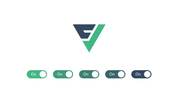
toggle
Vue 3 toggle component with Tailwind support.
Toggle features
- Vue 2 & 3 support
- Tailwind & utility class support
- No dependencies
- Lightweight (<2 kB gzipped)
- 100% coverage
- TypeScript support
- Accessibility support
- ESM support
- Configrable styles via CSS vars
- On / Off labels
Installation
npm install @vueform/toggle
Usage with Vue 3
<template>
  <div>
    <Toggle v-model="value" />
  </div>
</template>

<script>
  import Toggle from '@vueform/toggle'

  export default {
    components: {
      Toggle,
    },
    data() {
      return {
        value: true
      }
    }
  }
</script>

<style src="@vueform/toggle/themes/default.css"></style>
Using with Vue 2
When using Vue 2 install @vue/composition-api via npm/yarn first:
npm i @vue/composition-api --save-dev
Then install the plugin for Vue:
import Vue from 'vue'
import VueCompositionAPI from '@vue/composition-api'

Vue.use(VueCompositionAPI)
After that make sure to change the imported Toggle module to:
import Toggle from '@vueform/toggle/dist/toggle.vue2.js'
Using with Nuxt.js
First you need install @nuxtjs/composition-api:
npm i @nuxtjs/composition-api --save-dev
Then you need to enable it as a module in nuxt.config.js:
{
  buildModules: [
    '@nuxtjs/composition-api'
  ]
}
After that make sure to change the imported module to Vue 2 version of Toggle, as Nuxt.js still depends on that:
import Toggle from '@vueform/toggle/dist/toggle.vue2.js'
Styling with CSS vars
The following CSS variables can be used to customize the toggle button when using default.css:
--toggle-width: 3rem;
--toggle-height: 1.25rem;
--toggle-border: 0.125rem;
--toggle-font-size: 0.75rem;
--toggle-duration: 150ms;
--toggle-bg-on: #10b981;
--toggle-bg-off: #e5e7eb;
--toggle-bg-on-disabled: #d1d5db;
--toggle-bg-off-disabled: #e5e7eb;
--toggle-border-on: #10b981;
--toggle-border-off: #e5e7eb;
--toggle-border-on-disabled: #d1d5db;
--toggle-border-off-disabled: #e5e7eb;
--toggle-text-on: #ffffff;
--toggle-text-off: #374151;
--toggle-text-on-disabled: #9ca3af;
--toggle-text-off-disabled: #9ca3af;
--toggle-handle-enabled: #ffffff;
--toggle-handle-disabled: #f3f4f6;
You might override them globally:
:root {
  --toggle-bg-on: red;
  --toggle-border-on: red;
}
Or on an instance level:
<Toggle v-model="value" class="my-toggle-red" />
<Toggle v-model="value" class="my-toggle-blue" />
.my-toggle-red {
  --toggle-bg-on: red;
  --toggle-border-on: red;
}

.my-toggle-blue {
  --toggle-bg-on: blue;
  --toggle-border-on: blue;
}
Styling with Tailwind CSS
The Toggle component accepts a classes property where you can override default class names. In this case you don't need to required default.css. Here's a default styling for Tailwind CSS:
<Toggle v-model="value" :classes="{
  container: 'inline-block',
  toggle: 'flex w-12 h-5 rounded-full relative cursor-pointer transition items-center box-content border-2 text-xs leading-none',
  toggleOn: 'bg-green-500 border-green-500 justify-start text-white',
  toggleOff: 'bg-gray-200 border-gray-200 justify-end text-gray-700',
  toggleOnDisabled: 'bg-gray-300 border-gray-300 justify-start text-gray-400 cursor-not-allowed',
  toggleOffDisabled: 'bg-gray-200 border-gray-200 justify-end text-gray-400 cursor-not-allowed',
  handle: 'inline-block bg-white w-5 h-5 top-0 rounded-full absolute transition-all',
  handleOn: 'left-full transform -translate-x-full',
  handleOff: 'left-0',
  handleOnDisabled: 'bg-gray-100 left-full transform -translate-x-full',
  handleOffDisabled: 'bg-gray-100 left-0',
  label: 'text-center w-8 border-box whitespace-nowrap select-none',
}" />
If the button is enabled and on the toggle and toggleOn classes will be added to the toggle div:
flex w-12 h-5 rounded-full relative cursor-pointer transition items-center box-content border-2 text-xs leading-none bg-green-500 border-green-500 justify-start text-white
Likewise if the the button is disabled and on the toggle and toggleOnDisabled classes will be added:
flex w-12 h-5 rounded-full relative cursor-pointer transition items-center box-content border-2 text-xs leading-none bg-gray-300 border-gray-300 justify-start text-gray-400 cursor-not-allowed
The same is true off states and handle.
This way you can customize the parts of the toggle button without having to worry about over-riding the same type of utility classes, like backgrounds or text colors.
Accessibility
By default the on and off labels are being read by the screenreaders. If you provide the labelledby property that will be read instead of the labels. You might also add a describedby property to provide further description.
<div>
  <label id="toggle-label">Turn on notifications</label>
  <Toggle v-model="value" labelledby="toggle-label" describedby="toggle-description" />
</div>
<small id="toggle-description">Turn this on if you'd like to receive in-app notifications.</small>
Basic props
| Name | Type | Default | Description |
|---|---|---|---|
| id | string |
toggle |
The id attribute of input field. Make sure to customize when using more toggles on a single page. |
| name | string |
toggle |
The name attribute of input field. |
| disabled | boolean |
false |
Whether the toggle should be disabled. |
| required | boolean |
false |
Whether the HTML5 required attribute should be used for toggle (using an invisible fake input). |
| falseValue | string\|number\|boolean |
false |
The value when the toggle is off. |
| trueValue | string\|number\|boolean |
true |
The value when toggle is on. |
| offLabel | string |
The label when toggle is off. |
|
| onLabel | string |
The label when toggle is on. |
|
| labelledby | string |
The aria-labelledby attribute. |
|
| describedby | string |
The aria-describedby attribute. |
|
| classes | object |
The object of classes to be applied for different parts of the toggle. Default: {container: 'toggle-container',toggle: 'toggle',toggleOn: 'toggle-on',toggleOff: 'toggle-off',toggleOnDisabled: 'toggle-on-disabled',toggleOffDisabled: 'toggle-off-disabled',handle: 'toggle-handle',handleOn: 'toggle-handle-on',handleOff: 'toggle-handle-off',handleOnDisabled: 'toggle-handle-on-disabled',handleOffDisabled: 'toggle-handle-off-disabled',label: 'toggle-label',}.The default value can be used with default.css and style can be customized with CSS variables. Alternatively this can be overridden with utility classes like Tailwind CSS. |
Events
| Event | Attributes | Description |
|---|---|---|
| @change | value |
Emitted when the toggle changes. |
Slots
| Slot | Attributes | Description |
|---|---|---|
| label | checked, classList |
The label of the toggle element. The checked attribute determines whether the toggle is on or off so you can display the label accordingly. The classList contains the resolved class names. |
Default toggle
<Toggle
  v-model="value"
/>
Toggle with labels
<Toggle
  v-model="value"
  on-label="On"
  off-label="Off"
/>
Toggle with custom value
<Toggle
  v-model="value"
  true-value="on"
  false-value="off"
/>
Toggle with custom labels
<Toggle
  v-model="value"
>
  <template v-slot:label="{ checked, classList }">
    <span :class="classList.label">{{ checked ? 'On' : 'Off' }}</span>
  </template>
</Toggle>