vue-ads-pagination
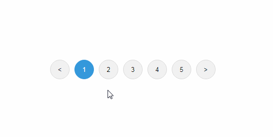
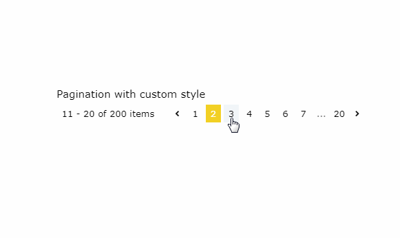
Vue ads pagination is a vue js pagination component. On the left side you find some information about the shown items. On the right side you can select a specific, the first, last, next or previous page.
All the components can be overriden by your own components, or you can add your own styles to the default components.
Installation
You can install the package via npm or yarn.
NPM
npm install vue-ads-pagination --save
YARN
yarn add vue-ads-pagination
Usage
You can add the vue-ads-pagination component by using the following code in your project.
<template>
    <div id="app">
        <vue-ads-pagination
            :total-items="200"
            :max-visible-pages="5"
            :page="page"
            :loading="loading"
            @page-change="pageChange"
            @range-change="rangeChange"
        >
            <template slot-scope="props">
                <div class="vue-ads-pr-2 vue-ads-leading-loose">
                    Items {{ props.start }} tot {{ props.end }} van de {{ props.total }}
                </div>
            </template>
            <template
                slot="buttons"
                slot-scope="props"
            >
                <vue-ads-page-button
                    v-for="(button, key) in props.buttons"
                    :key="key"
                    v-bind="button"
                    @page-change="page = button.page"
                />
            </template>
        </vue-ads-pagination>
    </div>
</template>

<script>
import '../node_modules/@fortawesome/fontawesome-free/css/all.css';
import '../node_modules/vue-ads-pagination/dist/vue-ads-pagination.css';

import VueAdsPagination, { VueAdsPageButton } from 'vue-ads-pagination';

export default {
    name: 'App',

    components: {
        VueAdsPagination,
        VueAdsPageButton,
    },

    data () {
        return {
            loading: false,
            page: 5,
        };
    },

    methods: {
        pageChange (page) {
            this.page = page;
            console.log(page);
        },

        rangeChange (start, end) {
            console.log(start, end);
        },
    },
};
</script>
Components
VueAdsPagination
Properties
page: (type: number, default: 0) A zero-based number to set the page.
Be aware you need to update the page property by the result of the page-change action!items-per-page: (type: number, default: 10) The maximum amount of items on one page.max-visible-pages: (type: number, default: 5) The maximum number of pages to be visible if their are too many pages.total-items: (type: number, required) The total amount of items.loading: (type: boolean, default: false) Indicates if the current page is loading.
Events
-
page-change: Emitted on creation, to know the initial state, and if another page is clicked. It contains the following parameters:page: (type: number) The zero-based current page.
-
range-change: Emitted on creation, to know the initial state, and if another page is clicked or the total items change and you're on the last page.
It contains the following parameters:start: (type: number) A zero-based number to identify the first item.end: (type: number) A zero-based number to identify the last item.
Templates
Default
You can add a default template to use a custom pagination detail box.
The scope contains 3 variables:
start: (type: number) The included start item.end: (type: number) The included end item.total: (type: number) The total number of visible items.
<template slot-scope="props">
    {{ props.start }} - {{ props.end }} : Total {{ props.total }}
</template>
Buttons
If you want to use your own buttons, control their behaviour our style them in a different way.
You can create your own button component and loop over it in this slot or use the predefined VueAdsPageButton.
This is a scoped slot that contains an array of buttons.
buttons: (type: Array) A list of all buttons currently used. One button is an object that contains the following attributes:page: (type: number||string) This is the zero based page or the string '...'.
Note that the value of this attribute for the next and previous icons is calculated by the current page.
If the current page is 2, the previous page will be 1 and the next page is 3.active: (type: boolean) Is the current page active?disabled: (type: boolean) Is the current button disabled?html: (type: string) This string is shown in the button. So you can use icons for the previous and next button.title: (type: string) If you want to add a title to the button, you can fill this attribute.loading: (type: boolean) Indicates if the button has to show a loading icon.
<template
    slot="buttons"
    slot-scope="props"
>
    <vue-ads-page-button
        v-for="(button, key) in props.buttons"
        :key="key"
        v-bind="button"
        @page-change="page = button.page"
    />
</template>
VueAdsPageButton
This is the default button. If you want to add extra classes. Add the template above and add the class attribute.
Properties
page: (type: number||string, default: 0) A zero-based number that represents the page or '...'.active: (type: boolean, default: false) Is the current button active?disabled: (type: boolean, default: false) Is the current button disabled?html: (type: string, required) This string is shown in the button.title: (type: string, default: '') If you want to add a title to the button, you can fill this attribute.loading: (type: boolean, default: false) Indicates if the button has to show a loading icon.disable-styling: (type: boolean, default: false) Remove all styling classes.
Events
page-change: Emitted when the button is clicked.
Testing
We use the jest framework for testing this pagination component. Run the following command to test it:
npm run test:unit