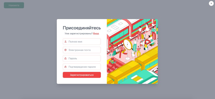
Vue Tailwind Modal
Vue component for creating modal using Tailwind CSS.
Project setup
npm install --save @ocrv/vue-tailwind-modal
Usage
Import styles from library (for example, in main.js file)
import '@ocrv/vue-tailwind-modal/styles'
Global installation
In your main.js file:
import VueTailwindModal from "@ocrv/vue-tailwind-modal"
Vue.component("VueTailwindModal", VueTailwindModal)
Inside the component
In your component (.vue file):
import VueTailwindModal from '@ocrv/vue-tailwind-modal'

export default {
  components: {
	VueTailwindModal,
	...
  },
  ...
After installation, use like any other component:
<vue-tailwind-modal
  :showing="true"
  :showClose="true"
  @update:showing="showing = $event"
  @close="afterClose()"
>
<!-- Вставьте здесь содержимое вашего модального окна -->
</vue-tailwind-modal>
To show and hide a modal window, just pass the appropriate boolean true or false to the: showing attribute.
By default, the component will display the close button of the modal window in the upper right corner of the screen.
You can remove the button by passing a boolean false to the: showClose attribute.
Closing a modal window with a standard button (with: showClose = "true") generates 2 events:
- update: showing event with value false.
- close event
You can handle both of these events as in the example above.