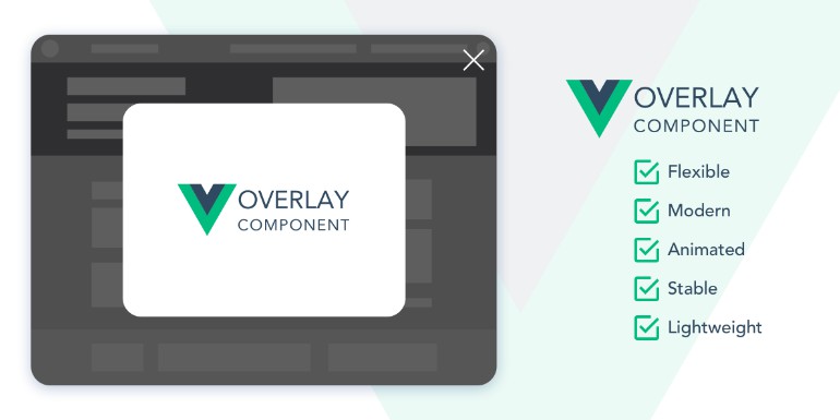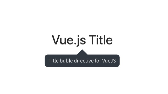
Popper for Vue
Simple, powerful, configurable. Popper v2.x!!
Positions a popup element close to the reference object.
It will always position itself automagically into a visible position. Supports adding an "arrow" element.
Install
yarn
yarn add @soldeplata/popper-vue
npm
npm i @soldeplata/popper-vue
Usage
VueJS single file component
<script>
import PopperVue from '@soldeplata/popper-vue';
export default {
components: {
PopperVue,
},
...
};
</script>
<template>
...
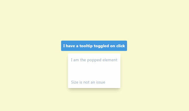
<PopperVue
:show="show"
:options="options"
>
<button @click="show = !show">
I have a popup on click
</button>
<template #popper>
I am the popped element
</template>
</PopperVue>
...
</template>
Props
| Prop | Required | Type | Default | Description |
|---|---|---|---|---|
| show OR v-model | no | Boolean |
false | Toggles the popper element with a v-show directive (animations must take this into account) |
| arrow | no | Boolean |
false | Adds an arrow to the popped component (default background is transparent) |
| arrowClass | no | Object, Array, String |
undefined | It's bound to :class of the arrow wrapper. Useful to set background color |
| options | no | Object |
undefined | Sets the options to the popper instance. See popper documentation |
| popperClass | no | Object, Array, String |
undefined | It's bound to :class of the popper wrapper |
Events
| Event | Payload | Description |
|---|---|---|
| @popper | Instance from '@popperjs/core' | Emitted on mount. Popper native methods can be used. See popper documentation |
Slots
| name | Description |
|---|---|
| default | Reference element over which the popup will be positioned |
| popper | Popper element that will be positioned around the Reference |
Advanced example to build a tooltip
Tooltip component
<script lang="ts">
  import Vue from 'vue';
  import _ from 'lodash';
  import PopperVue from '@soldeplata/popper-vue';

  export default Vue.extend({
    name: 'TooltipExample',
    components: {
      PopperVue,
    },
    props: {
      show: {
        type: Boolean,
      },
      options: {
        type: Object,
        default: () => {},
      },
      boundaryId: {
        type: String,
      },
    },
    data() {
      return {
        tooltipOptions: _.merge(
          {
            placement: 'right',
            modifiers: [
              {
                name: 'offset',
                options: {
                  offset: [0, 10], // separation from reference object
                },
              },
              {
                name: 'arrow',
                options: {
                  padding: 4, // 4px from the edges of the popper
                },
              },
            ],
          },
          this.options,
        ),
      };
    },

    mounted() {
      if (this.boundaryId) {
        const boundary =
          document.getElementById(this.boundaryId) ?? document.body;
        const boundaryModifier = {
          name: 'preventOverflow',
          options: {
            boundary,
            rootBoundary: 'document',
          },
        };
        this.tooltipOptions.modifiers.push(boundaryModifier);
      }
    },
  });
</script>

<template>
  <popper-vue
    popper-class="fade"
    arrow
    arrow-class="black-and-white"
    :show="show"
    :options="tooltipOptions"
  >
    <slot />
    <template #popper>
      <section class="black-and-white tooltip">
        <slot name="tooltip" />
      </section>
    </template>
  </popper-vue>
</template>

<style lang="scss">
  .fade {
    display: inherit !important; /* override v-show display: none */
    transition: opacity 0.3s;

    &[style*='display: none;'] {
      pointer-events: none; /* disable user interaction */
      user-select: none; /* disable user selection */
      opacity: 0;
    }
  }

  .black-and-white {
    color: white;
    background-color: black;
  }

  .tooltip {
    border-radius: 4px;
    padding: 8px;
  }
</style>
Using the tooltip
<script lang="ts">
  import Vue from 'vue';
  import Tooltip from './tooltip.vue';
  export default Vue.extend({
    components: {
      Tooltip,
    },
    data() {
      return {
        show: false,
      };
    },
  });
</script>

<template>
  <div>
    ...
    <article id="tooltipContainer">
      ...
      <Tooltip
        :show="show"
        boundary-id="tooltipContainer"
        :options="{ placement: 'auto-start' }"
        @mouseenter.native="() => (show = true)"
      >
        I have a tooltip activated on mouse enter
        <template #tooltip>
          <div @mouseleave="show = false">
            I am the tooltiped element, closed on mouse leave
          </div>
        </template>
      </Tooltip>
      ...
    </article>
    ...
  </div>
</template>