Vue Custom Range Slider Component for Volume or Audio/Video progress control.
This is a default range slider alternative created with Vue Js. Stop using input type=”range” for volume or audio/video progress control in a audio/video platform. To help you, I made a Custom Range Slider Component in Vue 3 with it’s powerful composition API. You can customize the look, widths, heights, colors and even show/hide any parts based on your needs, in short you can customize anything without even editing the component itself.
See examples here: Vue Custom Range Slider Examples
How to use it?
It’s so easy? Just download or copy the component from the src folder and put it in your project. Then simply import the component and use it as like any other vue js components.
Getting the progress value and setting it as needed
You can use v-model directive on the component to get the slider position value and use it to set the volume or video/audio progress as per your need. You’ll get more clear idea if you visit the example above.
Available Props:
id – It is required. Must be unique for each instance loaded.
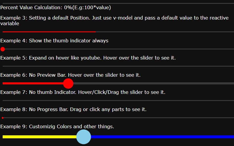
defaultPosition – previous/default progress already. default: 0 NOTE: it’s type is number. So, pass float/integer but no string. And it must be between 0 to 1
rangeContainerHeight – Set the height of the range slider container. default: 7px.
NOTE: Set the height bigger than the range slider height. since it’s the background of the slider and will be used for hover effect/animation
rangeHeight – Set the height of the range slider itself. default: 3px.
thumbHeight – Set the height of the thumb indicator. default: 200%.
NOTE: Remember to use percentage value to keep the ratios
rangeBgColor – Range Slider background color. default: `rgba(100, 100, 100, .5)`
thumbColor – Thumb Indicator color. default: `red`
previewColor – Preview Bar Color. default: rgb(150, 150, 150).
progressColor – Progress Bar Color(Main Indicator). default: red.
expandOnHover – hover effect animation as like in youtube video player. default: false.
AlwaysShowThumb – show the thumb indicator always. default: false.
noPreviewBar – hide the preview indicator. default: false.
noProgressBar – hide the Progress/Main Indicator bar. default: false.
noThumb – hide the thumb indicator always. default: false.