VueSx
CSS-in-JS for Vue
vue-sx is a simple library that allows you to write clean CSS-in-JS for Vue


Introduction
vue-sx is using styled-system and emotion to allow you to write simple and clean css-in-js for Vue components. Inspired by sx prop from @mui/material
Some of the key features are:
- Customize styles inline with the
sxprop - Ergonomic responsive array-based values
- Styled System props
- Themeable and compatible with the Theme Specification
- Built with Emotion css prop
Getting Started
npm i vue-sx
<script>
import { defineComponent } from 'vue'
import { Box, styled } from 'vue-sx'
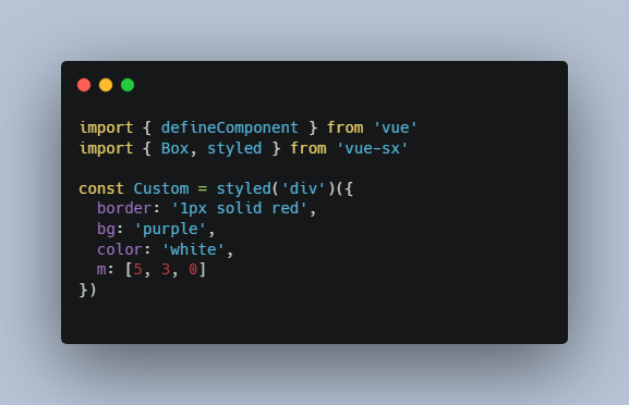
const Custom = styled('div')({
border: '1px solid red',
bg: 'purple',
color: 'white',
m: [5, 3, 0]
})
export default defineComponent({
components: { Box, Custom }
})
</script>
<template>
<Custom>
<Box
sx={{
bg: (theme) => theme.colors.primary,
color: 'white',
p: 2, // theme.space[2],
mt: 2
}}
as="button"
>
Click me
</Box>
</Custom>
</template>
sx Prop
The Box components accepts a sx prop that works with no additional setup required.
The sx prop is similar to Emotion’s css prop, but allows you to use values derived from the theme object.
Box follows the Theme Specification, which means that any theme created for use with Theme UI, Styled System, or other similar libraries will work out-of-the-box.
This allows you to share design constraints for typography, color, and layout throughout your application using a theming context.
<Box
  :sx="{
    p: 4,
    color: 'primary',
  }"
/>
Theming
To add a theme to an application, import the ThemeProvider component from vue-sx and pass a custom theme object in.
<script>
import { ref, defineComponent } from 'vue'
import { Box, ThemeProvider } from 'vue-sx'

const theme = {
  breakpoints: [
    '40em', '52em', '64em',
  ],
  colors: {
    text: '#000',
    background: '#fff',
    primary: '#07c',
  },
  space: [
    0, 4, 8, 16, 32, 64, 128, 256,
  ],
}

export default defineComponent({
  components: { Box, Custom },
  setup() {
    const currentTheme = ref(theme)
    return { currentTheme }
  }
})
</script>

<template>
  <ThemeProvider :theme="currentTheme">
    <Box
      :sx="{
        border: '1px solid red',
        bg: theme => theme.colors.primary,
        p: 4,
        mr: 4
      }">
      It works
    </Box>
  </ThemeProvider>
</template>