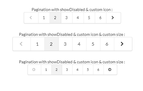
Material components for Vue.js
Material-components-vue integrates the mdc-web vanilla components following the simple approach.
main goals
- decoupled components - can be cherry picked!
- implementing just the specs not more or less
- keep the components as simple as possible (KISS, DRY)
- keep in sync with changes in the mdc-web repository
installation
npm install --save material-components-vue

yarn add material-components-vue
usage
CDN
<html>
  <head>
    <link rel="stylesheet" href="https://cdnjs.com/libraries/normalize">
    <link rel="stylesheet" href="https://fonts.googleapis.com/css?family=Roboto:300,400,500" type="text/css">
    <link rel="stylesheet" href="https://fonts.googleapis.com/icon?family=Material+Icons">
    <link rel="stylesheet" href="https://unpkg.com/material-components-vue/dist/material-components-vue.css">
  </head>
  <body>
    <div id="app">
      <m-typography>
        <m-button interactive>Example</m-button>
        <m-button interactive raised>Example</m-button>
        <m-button interactive stroked>Example</m-button>
      </m-typography>
    </div>
    <script src="https://unpkg.com/vue"></script>
    <script src="https://unpkg.com/material-components-vue"></script>
    <script>
      const app = new Vue({
        el: '#app'
      })
    </script>
  </body>
 </html>
bundler
You have to set up your own build workflow with webpack (see demo) or something else
to compile the components.
import all components
import MaterialComponentsVue from 'material-components-vue'

Vue.use(MaterialComponentsVue)
cherry pick components
import Button from 'material-components-vue/components/button'
import Card from 'material-components-vue/components/card'

Vue.use(Button)
Vue.use(Card)
theming
SASS
Import the SASS file in the root component of app for maximal customization.
<style lang="scss">
  $mdc-theme-primary: #2196f3;
  $mdc-theme-secondary: #ff1744;
  $mdc-theme-background: #f5f5f5;
  @import '~material-components-vue/components/Theme/theme.scss';
  @import url('https://cdnjs.com/libraries/normalize');
  @import url('https://fonts.googleapis.com/css?family=Roboto:300,400,500');
  @import url('https://fonts.googleapis.com/icon?family=Material+Icons');
</style>
CSS custom properties
Integrate a theme component in your template und pass in an object with CSS custom properties, but keep browser compatibilty in mind.
<m-theme :customStyle="material">
  themed content
</m-theme>
data() {
    return {
        material: {
            '--mdc-theme-primary-light': '#9162e4',
            '--mdc-theme-primary':  '#5e35b1',
            '--mdc-theme-primary-dark': '#280680',
            '--mdc-theme-secondary': '#ff5722',
            '--mdc-theme-secondary-light': '#ff8a50',
            '--mdc-theme-secondary-dark': '#c41c00',
            '--mdc-theme-background': '#ffffff',
            '--mdc-theme-text-primary-on-primary': '#ffffff',
            '--mdc-theme-text-secondary-on-secondary': '#000000'
        }
    }
}