Vuetiful-Board
A Beautiful Chart Using Draggable Grid For Vue.js.

Install
npm install vuetiful-board
import VuetifulBoard from 'vuetiful-board'

Vue.use(VuetifulBoard)
Usage
  <vuetiful-board
    :theme="classic"
    :dark-mode="true"
    :col-num="12"
    :row-height="30"
    :layout-editable="true"
    :datasets="[
      {
          chartInfo: {
            series: [200, 12, 40, 25, 34, 6, 23],
            options: {
              chart: {
                type: 'pie',
              },
              title: {
                text: 'The recent inflow route',
                align: 'center',
                style: {
                  fontSize: '18px',
                  fontWeight: 'bold',
                },
              },
              labels: [
                'SNS',
                'Recommend',
                'Homepage',
                'Blog',
                'Kakaotalk Channel',
                'Rumor',
                'ETC',
              ],
              fill: {
                opacity: 1,
              },
              legend: {
                position: 'bottom',
              }
            }
          },
          gridInfo: {
            x: 6, y: 0, w: 6, h: 12, i: '1', static: false
          },
        },
    ]"
  />
Properties
? Grids
colNum
Numbertrue12Says how many columns the grid has.
The value should be a natural number.
rowHeight
Numbertrue30Says what is a height of a single row in pixels.
The value should be a natural number.
layoutEditable
BooleantruetrueSays when to decide whether to edit the layout.
The default value is true, and layout editing is basically possible.
And if the default is changed to false, layout editing becomes impossible.
? Charts
datasets
ArraytruetrueThis is where you have to enter the direct data you will use.
Dataset requires basic information on charts and elements related to grids.
Datasets basically takes this form.
datasets: {
  chartInfo: {},
  gridInfo: {}
}
If no content is entered into the dataset, a basic chart form with no information will appear.
theme
Stringpalette[0].nameUse it if you want to change the theme of the chart fluidly.
Basically, there are five themes provided: classic, retro, green, vintage, and rainbow.
As in the example below, a color palette may be set as desired.
If you want to use color palette for theme, you can refer this page palette.json
[
  {
    "name": "classic",
    "colors": [
      "#5975fe",
      "#54d2d2",
      "#ffcb00",
      "#ff6150",
      "#1360bf",
      "#62a1b3",
      "#ffa395",
      "#b37268",
      "#5cd184",
      "#ffff00"
    ]
  },
  {
    "name": "rainbow",
    "colors": [
      "#e74645",
      "#fb7756",
      "#facd60",
      "#38ada9",
      "#1e3799",
      "#6a4fa5",
      "#faa3ba",
      "#ffc145",
      "#264e70",
      "#679186"
    ]
  },
  {
    "name": "vintage",
    "colors": [
      "#004e89",
      "#6b51a4",
      "#fcba04",
      "#a50104",
      "#590004",
      "#3867d6",
      "#3cbbb1",
      "#fab1a0",
      "#fdcb6e",
      "#4b6584"
    ]
  },
  {
    "name": "retro",
    "colors": [
      "#38e0ec",
      "#5b9279",
      "#8fcb9b",
      "#324376",
      "#8f8073",
      "#dd614a",
      "#fa824c",
      "#6b6ed1",
      "#f7c548",
      "#63d2ff"
    ]
  },
  {
    "name": "green",
    "colors": [
      "#277f8e",
      "#77AD78",
      "#365c8d",
      "#4ac16d",
      "#46337e",
      "#9fda3a",
      "#3867d6",
      "#440154",
      "#1fa187",
      "#4b6584"
    ]
  }
]
darkMode
BooleanfalseSays if you want to set the dark mode (switch effect of background and font color).
Explanation
Chart
? You can easily create variable charts.
series
This contains the direct data essential for the chart. You can specify the type or name of each chart data.
//Example
series: [
          {
            name: 'Women',
            data: [25, 30, 64, 57, 50]
          },
          {
            name: 'Men',
            data: [30, 27, 56, 39, 70]
          }
        ],

        ...
options
This determines the shape of the chart and includes style elements such as the title or font size of the chart.
Vuetiful-board basically follows the internal configuration of apexchart.
Therefore, please refer to this page if you want more detailed information. apexchart
//Example
options: {
          chart: {
            type: 'line',
          },
          title: {
            text: 'Growth Rate',
            align: 'center',
            style: {
              fontSize: '20px',
              fontWeight: 'bold',
            },
          },

          ...
Grid
? You can easily create a dragable and resized grid.
x
This means the initial horizontal position of the item (as to which column to be placed).
The value must be a number.
y
This means the initial vertical position of the item (in which row to be placed).
The value must be a number.
w
This refers to the initial width of the item.
h
This refers to the initial height of the item.
i
This each serves as a unique identifier for grid items.
The value must be a string and not overlap.
static
This determines whether to modify (draggable & resize) the item.
If you want the item to be fixed, it should be false, otherwise, it should be true.
//Example
x: 0, y: 0, w: 6, h: 12, i: '0', static: false
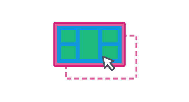
Features
Drag & Drop / Resize
Vuetiful-board supports drag & drop and resize functions.
You can drag it in the desired direction and adjust the size freely.
:layout-editable="layoutEditable"

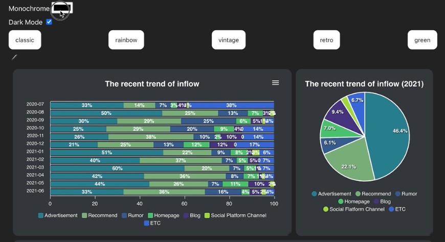
Color Theme
Vuetiful-board can specify the theme color.
You can freely decorate the chart with the color theme of the palette you want.
If you're curious about how to designate a pallet, please refer to this page. properties
:theme="theme"
switchTheme(themeName) {
      this.theme = themeName;
    },

Dark Mode
Vuetiful-board supports dark mode.
When dark mode is selected, both the chart, grid, and background colors become dark, and the font color is reversed to white.
:dark-mode="darkMode"

MonoChrome
Vuetiful-board can be painted with monochrome.
When monochrome is selected, the chart color changes to saturation and brightness of the corresponding color.
setMonochromeColor(event) {
      this.theme = event.target.value;
    },